
The secret to a captivating gallery wall isn’t following rigid rules, but mastering a few core principles of visual storytelling.
- Most home decorators hang art too high, breaking the visual connection with the room’s human scale and furniture.
- Negative space, or “breathing room,” is an active element that directs the eye and prevents visual clutter, making it as crucial as the art itself.
Recommendation: Start by choosing your “gravitational anchor”—the one piece that grounds your collection—and build the narrative around it, rather than trying to fill space.
That vast, empty wall staring back at you isn’t just blank space; it’s an opportunity. Yet for many homeowners, it’s a source of paralysis—the fear of the first nail, of making a mistake, of creating a jumbled mess instead of a cohesive statement. The internet is filled with advice about paper templates and uniform frames, treating the process like a sterile equation. But this approach misses the point entirely. A gallery wall is not a mere assembly of pictures; it’s a visual autobiography, a curated glimpse into your life, your passions, and your aesthetic journey.
To truly succeed, you must shift your mindset from that of a decorator to that of a curator. A curator doesn’t just fill a space; they orchestrate it. They understand that the relationships *between* the pieces—and the space around them—are what create a powerful narrative. They know that a collection’s energy comes from a thoughtful balance of harmony and contrast, rhythm and pause. It’s about creating a visual dialogue on your wall, where every piece has a voice.
This guide is designed to give you that curatorial confidence. We will move beyond the common platitudes to explore the foundational principles of composition. We will deconstruct the rules to understand the ‘why’ behind them, empowering you to hang art with intention, whether it’s a priceless original, a child’s drawing, or a three-dimensional mask from your travels. By the end, you’ll see your walls not as a challenge to be conquered, but as a canvas waiting for your story.
To help you master this art, this guide is structured to walk you through the essential principles of curating a personal gallery, from foundational rules of placement to advanced techniques in composition and lighting.
Summary: Mastering the Art of the Personal Gallery Wall
- The “museum height” rule: why you are likely hanging your art too high?
- Grid vs. Salon style: which layout suits your collection type best?
- Why leaving empty wall space is as important as filling it?
- Plates and Masks: how to hang non-flat objects securely?
- Command strips vs. Monkey hooks: which actually holds weight without damage?
- Landscapes vs. Abstracts: can you mix genres on the same wall?
- French cleat vs. Wire: how to hang a 20kg mirror so it doesn’t kill someone?
- Light Fixtures: Choosing Sculptural Pieces That Define Your Room’s Style
The “Museum Height” Rule: Why You Are Likely Hanging Your Art Too High?
One of the most common and jarring mistakes in home decor is hanging art too high, forcing it to float disconnectedly near the ceiling. To combat this, curators and galleries follow a simple principle: the 57-inch rule. This measurement isn’t arbitrary; an industry-wide analysis confirms that 57 inches represents the average human eye-height, a standard used by museums globally. The goal is to position the artwork so that its center point falls at this height, creating an immediate and comfortable visual connection with the viewer.
However, a true curator knows that rules are merely starting points. The 57-inch standard is designed for open, empty walls where viewers are standing. Your home is not a museum. The rule must be adapted to the reality of your living space. For instance, if you’re hanging a piece above a sofa, console, or headboard, the “above furniture” rule takes precedence. Here, the bottom of the frame should be just 6-8 inches above the furniture’s top, visually linking the two objects into a single, cohesive unit. Hanging it any higher severs this connection, making both the furniture and the art feel isolated.
Furthermore, consider the room’s primary function. In a dining room or living room where people are mostly seated, the center of the art should be lowered to align with a seated eye-level, often closer to 50-54 inches. It’s about creating a compositional relationship with the people in the space, not just with the architecture. This adaptability is the first step toward thinking like a curator.
Action Plan: Applying the Adjusted 57-Inch Rule
- Establish Baseline: For an open, unobstructed wall, measure 57 inches from the floor and mark it. This is your starting center point. For rooms with very high ceilings (10+ feet), you can adjust this up to 60-62 inches for better scale.
- Assess Furniture Context: If hanging art above furniture, ignore the floor measurement. Instead, position the piece so its bottom edge is 6-8 inches above the sofa, console, or bed.
- Consider Viewpoint: In spaces where you primarily sit (like a living room or breakfast nook), lower the artwork’s center to approximately 50-54 inches to align with a seated sightline.
- Mind the Scale: Apply the 2/3 width rule for pieces above furniture. The artwork (or art grouping) should ideally span about two-thirds of the furniture’s width to feel properly scaled and balanced.
- Break the Rule with Intent: Use height variation for dramatic effect. Hang a piece unusually high on a tall, narrow wall to draw the eye upward, or lean an oversized piece against the wall for a casual, studio-like feel.
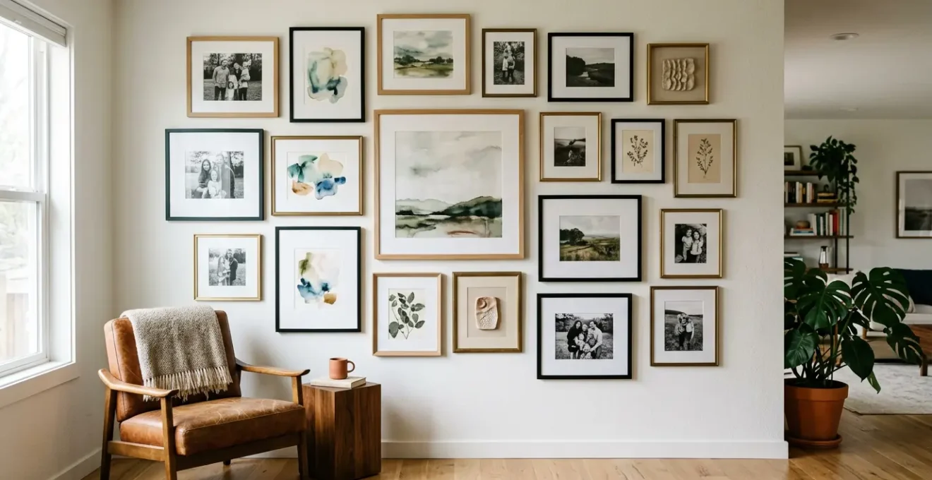
Grid vs. Salon Style: Which Layout Suits Your Collection Type Best?
Once you’ve mastered height, the next curatorial decision is layout. This choice is deeply personal and should reflect both your collection’s nature and your room’s personality. The two dominant philosophies are the structured Grid and the eclectic Salon style. The Grid layout is the epitome of order and modernism. It requires identical frames and precise, uniform spacing (typically 2-3 inches) between each piece. This creates a clean, symmetrical, and formal look, perfect for a series of photographs, architectural prints, or any collection where the pieces are uniform in size and style.
On the other end of the spectrum is the Salon style. Born from the crowded walls of 17th-century Parisian Salons, this layout is dynamic, personal, and celebrates eclecticism. It involves arranging a diverse collection of art in various sizes, shapes, and frame styles into a single, dense composition. This style feels collected over time and is brilliant for showcasing a mix of paintings, drawings, photos, and even 3D objects. It’s more forgiving of imperfect placement and can be easily expanded, making it a living, evolving part of your home.
Choosing between them is a matter of intent. Do you want to create a sense of calm and order, or one of energy, history, and creative abundance? Your answer will define the entire compositional rhythm of your wall, as a detailed comparison of layout styles reveals.
| Aspect | Grid Layout | Salon Style |
|---|---|---|
| Visual Impact | Clean, minimal, symmetrical | Dynamic, personal, collected over time |
| Frame Requirements | Identical frames essential | Mixed sizes, materials, and colors welcome |
| Spacing | Uniform 2-3 inches between all pieces | Variable spacing, organic arrangement |
| Best For | Modern spaces, photography series, botanical prints | Eclectic collections, stairwells, creative studios |
| Installation Difficulty | Requires precise measuring and alignment | More forgiving of imperfect placement |
| Emotional Feel | Order, calm, formality | Energy, history, eclecticism |
Why Leaving Empty Wall Space Is as Important as Filling It?
A novice decorator seeks to fill space. A curator understands how to sculpt it. The most overlooked element in gallery wall composition is the empty space itself—what designers call negative space. Far from being a void, this “breathing room” is an active component that brings balance, focus, and sophistication to your arrangement. Without sufficient negative space, even the most beautiful art collection can devolve into a cluttered, overwhelming mess where no single piece can be properly appreciated.
Think of negative space as the pauses in a piece of music or the silence in a conversation; it provides rhythm and emphasis. By creating intentional gaps between groupings of art, you allow the eye to rest and process what it’s seeing. This prevents visual fatigue and helps to highlight your most important pieces. An intentional, wide gap can even create a visual dialogue between two smaller pieces, making them feel like a deliberate diptych. As a general guideline, aim for your artwork to cover roughly 60-70% of the designated wall area, leaving the rest as active, breathing room.
This principle is beautifully articulated by the core tenets of modern gallery design, which treat space not as a background, but as a tool. As interior design principles suggest:
Negative space as an active framing device: use empty space to ‘sculpt’ the gallery. An intentional wide gap can make two smaller pieces feel like a deliberate diptych.
– Interior design principles, Modern gallery wall design theory
Don’t be afraid of emptiness. Use it to create punctuation on your wall, separating different themes or color stories. This intentional asymmetry is a hallmark of professional curation, drawing focus to your key pieces and creating a composition that feels balanced yet dynamic, not just crowded.
Plates and Masks: How to Hang Non-Flat Objects Securely?
A truly personal gallery wall tells a story, and stories are rarely flat. Integrating three-dimensional objects—heirloom plates, travel masks, sculptural pieces, or even a favorite hat—is what elevates a collection from a simple display to a rich, personal narrative. However, hanging these non-flat items requires different techniques to ensure both security and aesthetic harmony. The key is to see these objects as adding texture, depth, and a touch of the unexpected to the composition.
For items like decorative ceramic plates, spring-loaded plate hangers are the go-to solution. They grip the plate securely and come in various sizes rated for specific weights. For bulkier objects that can’t be hung directly, install shallow floating shelves (4-8 inches deep) within your gallery wall. These shelves act as small stages, allowing you to display sculptures or vases. To prevent these items from vibrating off their perch, a small amount of museum putty or earthquake wax provides invisible but firm security.
From a curatorial perspective, use these 3D objects as “gravitational anchors.” Position a heavier or more texturally interesting piece first, then arrange the lighter, 2D framed works around it. This creates a natural focal point and a sense of visual balance. For example, a rustic basket of dried flowers can soften the hard, rectangular lines of surrounding frames, adding an organic touch. Finally, consider lighting. A small, directional spotlight aimed at a mask or sculpture can create dramatic shadow play, turning the object into a dynamic focal point.
Command Strips vs. Monkey Hooks: Which Actually Holds Weight Without Damage?
The final practical hurdle—and the source of much anxiety—is the hardware. The fear of a treasured piece crashing to the floor, or of leaving a wall pockmarked with holes, is real. Choosing the right hanging hardware is not just about convenience; it’s about matching the tool to the weight of your art and the type of your wall. This is a non-negotiable aspect of safe and responsible curation. The two most talked-about modern solutions are adhesive strips and minimalist hooks, but they serve very different purposes.
Command Strips are the champion of damage-free hanging on smooth, painted drywall. They are ideal for renters or those who love to frequently rearrange their art. The large strips can hold up to 16 lbs, which covers a significant range of lightweight to medium-weight framed prints. Their main limitation is surface type; they fail on textured, brick, or wallpapered walls. Monkey Hooks, on the other hand, are a brilliant and simple solution for drywall. These sharp, curved steel hooks are pushed directly into the wall by hand, creating a tiny, self-supporting anchor. They can hold a surprising amount of weight (35-50 lbs) with only a pin-sized hole, but they are not repositionable and are only for drywall.
Understanding the full spectrum of options, from traditional nails to heavy-duty wall anchors, is crucial for making confident decisions. The right choice depends entirely on a simple equation: object weight + wall type = correct hardware, as this hardware comparison guide highlights.
| Hardware Type | Weight Capacity | Best Wall Type | Damage Level | Repositionable |
|---|---|---|---|---|
| Command Strips (Large) | Up to 16 lbs | Smooth painted drywall | None | Yes, easily |
| Monkey Hooks | 35-50 lbs | Drywall, plaster | Small hole | No |
| Picture Wire + Nail | 10-20 lbs | Any | Small hole | Limited |
| Wall Anchors | 50-75 lbs | Drywall | Larger hole | No |
| Adhesive Hooks | 5-10 lbs | Smooth surfaces | None | Yes |
Landscapes vs. Abstracts: Can You Mix Genres on the Same Wall?
Absolutely. In fact, the most compelling and personal gallery walls are often those that create a visual dialogue between different styles, eras, and genres. Mixing a traditional landscape painting with a bold abstract piece is not a design sin; it’s an advanced curatorial move that can create incredible energy and depth. The secret is not to seek uniformity, but to find or create a thread of connection that ties the disparate pieces together into a cohesive narrative.
One of the most effective methods is the “bridge piece” technique. If you have a classic oil landscape and a graphic, minimalist print, find a third piece that shares qualities of both—perhaps a semi-abstract landscape or a piece of graphic art with an organic color palette. This bridge piece acts as a visual translator, making the conversation between the other two feel intentional. Another powerful strategy is to maintain one unifying element across all pieces. This could be a consistent frame color (e.g., all black frames), a uniform mat width, or a shared dominant color that appears in each artwork.
Ultimately, a curator groups by feeling and story, not just by style. Don’t be afraid to position contrasting pieces next to each other to create a dynamic tension. A rigid architectural drawing can make an adjacent, flowing abstract feel even more organic and free. You are telling the story of your aesthetic taste, which is rarely confined to a single genre. The goal is to create a collection that reflects your multifaceted personality, not a page from a catalog.
Key Takeaways
- Intentionality Over Rules: Your personal narrative and the room’s context should guide placement, not rigid, one-size-fits-all measurements.
- Balance Is an Active Art: The interplay between filled and empty space (“breathing room”) is what creates a professional, uncluttered look. Space is a tool.
- Secure With Knowledge: Choosing the right hardware for the object’s weight and your wall type is non-negotiable for the safety of your art and your home.
French Cleat vs. Wire: How to Hang a 20kg Mirror So It Doesn’t Kill Someone?
When you move from hanging framed prints to heavy items like a large mirror (over 10kg or ~22 lbs), the stakes change dramatically. This is no longer just about aesthetics; it’s about safety. The most common mistake is using standard picture wire and a single hook, which creates a single, high-pressure point on the wall. For drywall, this is a recipe for disaster. A senior carpenter warns that this setup creates a downward shear force that can crush the gypsum over time, causing the fixing to pull loose with catastrophic results.
For any heavy object, you must distribute the weight. The undisputed champion for this task is the French cleat. This simple but brilliant system consists of two interlocking brackets with 45-degree angled edges. One is mounted to the wall (ideally into studs), and the other to the back of the mirror. When you hang the mirror, the two cleats lock together using gravity, distributing the weight evenly across the entire width of the cleat. This system is incredibly secure; in fact, professional galleries rely on them, as a single pair of heavy-duty aluminum cleats can support up to 750 lbs.
Beyond its immense strength, the French cleat offers two other significant curatorial advantages. First, it ensures the mirror hangs perfectly flush against the wall, unlike a wire which causes it to tilt forward. Second, it allows for easy lateral adjustment. You can slide the mirror left or right along the cleat to get the centering perfect without having to drill new holes. For any item of significant weight or value, forgoing a wire in favor of a cleat or a similar interlocking bracket system is the only responsible choice.
Light Fixtures: Choosing Sculptural Pieces That Define Your Room’s Style
The final layer of a truly masterful gallery wall is lighting. The right light doesn’t just illuminate your art; it brings it to life, enhancing colors, creating mood, and directing the viewer’s eye. Poor lighting can flatten textures and wash out colors, undoing all your careful curatorial work. The professional approach is a layered lighting system, combining ambient, accent, and decorative fixtures to create a rich and adaptable environment.
Start with general ambient light from ceiling fixtures to provide overall illumination. Then, add dedicated accent lighting. This could be hardwired picture lights installed above key pieces, or a flexible track lighting system positioned 24-30 inches from the wall. The ideal angle for accent lights is 30 degrees, which highlights texture without creating distracting glare or long shadows. For maximum control, always opt for dimmable fixtures, allowing you to adjust the intensity from bright, daytime viewing to a soft, intimate evening mood.
Finally, a curator sees the light fixture itself as part of the installation. Don’t be afraid to choose a sculptural chandelier, a series of elegant sconces, or a dramatic floor lamp that acts as a piece of art in its own right. This fixture can become the “gravitational anchor” for the entire room. As a core principle of lighting design states:
The light fixture should be positioned as an active part of the gallery – a dramatic chandelier can be the ‘sun’ that your art collection ‘orbits’, dictating the entire mood.
– Interior lighting design principles, Gallery lighting best practices
By treating light as a final, transformative brushstroke, you elevate your collection from a simple wall display to an immersive, gallery-quality experience. It’s the element that completes your story and makes it shine.
Now that you are armed with the principles of a curator, that blank wall is no longer a challenge, but a canvas. Begin the process today by selecting the one piece that speaks to you most and let its story guide the rest of your composition.