
The biggest mistake in furnishing a small apartment is using small furniture.
- Properly-scaled ‘hero’ pieces reduce visual clutter and define functional zones more effectively than multiple small items.
- Prioritizing clear traffic flow and claiming vertical ‘air rights’ for storage yields more usable space than simply cramming in furniture.
Recommendation: Adopt an architect’s mindset: design for perception and movement, not just for the constraints of your floor space.
Living in a compact urban apartment often feels like a puzzle with pieces that just don’t fit. The daily experience of navigating a space under 600 square feet can be a constant battle for efficiency, where every inch is precious. The common advice is predictable: use mirrors, paint walls white, and buy multi-functional furniture. While not wrong, these tips only scratch the surface and often fail to address the core issue of a layout that feels cramped and dysfunctional, no matter how much you declutter.
The most pervasive myth is that a small room demands small furniture. We’re told to find petite sofas, tiny tables, and delicate chairs to avoid overwhelming the space. But what if this conventional wisdom is the very thing making your apartment feel smaller? What if the key to unlocking a spacious, functional home isn’t about shrinking everything down, but about understanding the psychology of perception and the physics of movement within a confined area?
This guide will dismantle that flawed logic. As a small-space architect, I’ll show you how to think about your apartment not as a floor plan to be filled, but as a volume to be sculpted. We will explore how a few bold, strategic choices can create a sense of openness and order that a dozen small, scattered pieces never could. Prepare to abandon the generic tips and embrace a counterintuitive, solution-oriented framework for transforming your home.
To help you navigate these innovative strategies, this article breaks down the core principles of small-space architecture into a clear, actionable plan. The following sections will guide you from foundational concepts to advanced techniques, empowering you to reclaim your space.
Summary: Smart Layouts for Apartments Under 600 Sq Ft: Maximizing Every Inch
- Why Using Small Furniture in a Small Room Actually Makes It Look Smaller?
- How to Create Distinct Zones in a Studio Without Building Walls?
- Traffic Flow vs. Storage: Which Priority Matters More in Narrow Spaces?
- The Layout Mistake That Blocks Natural Light and Shrinks Your Room Visually
- In What Order Should You Furnish a Small Room to Avoid Gridlock?
- Studio Apartments: Transforming One Room Into Four Distinct Living Areas
- Walkway Width vs. Storage Depth: Which Should You Sacrifice in a Narrow Room?
- Vertical Storage Units: How to Double Your Storage Capacity Without Losing Floor Space?
Why Using Small Furniture in a Small Room Actually Makes It Look Smaller?
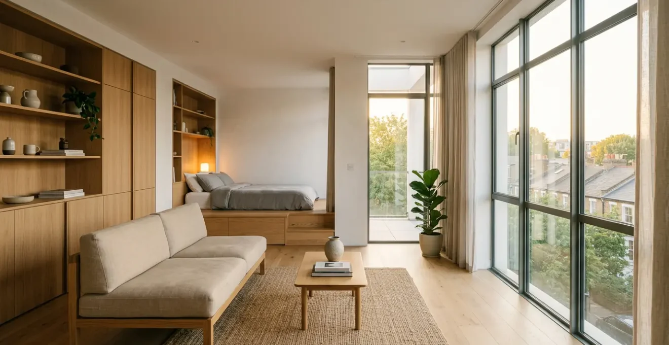
The instinct to furnish a small room with small furniture is understandable, but it’s a fundamental design error. Instead of creating an open feel, this approach leads to what architects call “visual fragmentation.” A collection of undersized pieces—a tiny loveseat, a small coffee table, multiple little chairs—forces the eye to jump from one object to the next. This choppy visual experience makes the brain register the space as cluttered and, paradoxically, smaller. As expert Jennifer Beget of J Beget Designs notes, this is a common trap.
As wild as it sounds, small, undersized, underscaled furniture that does not fill a space correctly actually makes a room feel smaller.
– Jennifer Beget, J Beget Designs, Apartment Therapy
The solution is to think bolder. Instead of many small items, select one or two properly scaled “hero pieces” that anchor the room and state its purpose clearly. For a living area, this could be a full-sized, comfortable sofa. This single, substantial piece creates a calm, unified focal point. It tells the eye, “This is the living room,” and allows the surrounding negative space to feel more generous and intentional. According to interior designers, multiple small furniture pieces create visual fragmentation rather than a sense of spaciousness. Choosing furniture with exposed legs, like a sofa on tall, slender feet, further enhances this effect by allowing light and sightlines to pass underneath, preventing the piece from feeling like a heavy, solid block.
How to Create Distinct Zones in a Studio Without Building Walls?
In a studio or open-plan apartment, the challenge is to create functional, separate areas for living, sleeping, and working without erecting view-blocking walls. The key is “psychological zoning”—using subtle cues to signal a change in function. This technique relies on manipulating light, level, and texture to create invisible boundaries that the mind instinctively recognizes. Instead of physical separation, you create experiential separation.
For instance, a sleeping area can be defined by placing the bed on a low, 4 to 6-inch platform, instantly setting it apart. Combining this with a shift in lighting—from bright, cool light in the “work” zone to a warm, soft glow in the “sleep” zone—reinforces the boundary. A large, well-defined area rug can anchor a living zone, clearly delineating it from a dining or kitchen space. Sheer curtains hung from ceiling tracks or open-backed bookcases can also serve as semi-transparent dividers, suggesting separation without sacrificing the flow of light and air.
This strategy proves that extreme efficiency is achievable even in the most compact homes. A powerful real-world example shows how a Manhattan couple with three children successfully carved out four distinct zones in their 600 sq ft apartment. They used a combination of loft beds for vertical zoning, strategic lighting, and furniture placement to create a functional and harmonious living environment without building a single wall, proving that creative layout solutions can overcome square footage limitations.
Traffic Flow vs. Storage: Which Priority Matters More in Narrow Spaces?
In a narrow apartment, every inch of width is a battleground between storage and movement. The temptation is to line the walls with the deepest possible shelving to maximize storage capacity. However, this is a critical error that sacrifices livability for capacity. The undisputed priority in any small space, especially a narrow one, must be traffic flow. A clear, comfortable path for movement is non-negotiable; without it, the space becomes a frustrating obstacle course, feeling cramped and dysfunctional regardless of how much you can store.
Architectural and ergonomic standards provide clear guidance. For a main thoroughfare—the path from the entrance to the living area, for instance—you must preserve a width of at least 36 to 40 inches. This allows for comfortable passage without turning sideways or bumping into furniture. For secondary routes, such as the space between a bed and a wall, a minimum of 24 inches is acceptable, though more is always better. In fact, specific furniture arrangement guidelines recommend pathways of at least 36 to 40 inches for comfortable movement in primary circulation areas.
This means you must be ruthless in your choice of storage. Opt for shallower units (12-15 inches deep) along main pathways. If you have a wider area or a “destination” wall that isn’t part of a main route, that is where you can place deeper storage units. Sacrificing a few inches of shelf depth to gain a clear, wide walkway will make the entire apartment feel more spacious, organized, and pleasant to inhabit. The feeling of effortless movement is a luxury that outweighs the benefit of a slightly deeper cabinet.
The Layout Mistake That Blocks Natural Light and Shrinks Your Room Visually
Natural light is the most powerful tool for making a small space feel larger, yet it’s often the first casualty of a poor layout. The single biggest mistake is placing tall, solid furniture—bookcases, wardrobes, entertainment centers—anywhere that obstructs the journey of light from the window into the room. This creates dark corners and harsh shadows, effectively shrinking the perceived size of the space. To avoid this, you must treat sunlight as a precious resource and design a clear “path of light.”
This means mapping where the light falls throughout the day and keeping that trajectory free of high-profile obstacles. Position taller pieces against walls that are perpendicular to the windows, not opposite them. Whenever possible, choose furniture that is low-profile or visually lightweight. Open-backed shelving units are far superior to solid bookcases because they allow light to pass through. Similarly, furniture with exposed legs feels lighter and less obstructive than pieces that sit flat on the floor.
Mirrors are a classic tool for amplifying light, but their placement is key. A mirror positioned directly opposite a window will effectively double the amount of light and create a powerful illusion of depth. As designer Thornton states in the Apartment Therapy Design Guide, “Mirrors bounce light around, open up dark corners, and trick the eye into feeling like there’s more space.” Using light-colored paint, especially on the wall opposite the window, will further help to reflect and diffuse light deeper into the room.
Your Action Plan: The Path of Light Strategy
- Map the Trajectory: Observe and map the sun’s path through your apartment at different times of the day to identify the primary light channels.
- Clear the Path: Audit your current layout and move any tall, solid furniture that obstructs this natural light trajectory.
- Position Mirrors Strategically: Place a large mirror on the wall directly opposite your main window to double the ingress of natural light and create an illusion of depth.
- Elevate Furniture: Prioritize furniture with exposed legs (sofas, consoles, side tables) over solid, blocky pieces to allow light to flow underneath.
- Reflect and Amplify: Use light, reflective colors on walls, particularly those opposite windows, and consider furniture with glossy or metallic finishes to bounce light deeper into the room.
In What Order Should You Furnish a Small Room to Avoid Gridlock?
Furnishing a small room can quickly lead to “gridlock,” a state where pieces don’t fit, traffic flow is blocked, and the entire layout feels forced and immovable. This happens when you acquire furniture without a clear, sequential plan. The correct approach is to build your room layer by layer, starting with the most important piece and working outward. This method ensures that function dictates form and prevents costly, space-wasting mistakes.
Step 1: The “Hero” Piece. Before you buy anything else, identify the room’s primary function and select its single most important piece of furniture—the “hero.” In a studio’s living zone, it’s the sofa. In a bedroom, it’s the bed. This piece should be properly scaled (not too small!) and placed in its optimal position first. This anchors the entire layout.
Step 2: The Primary Functionality. Next, add the essential items that directly support the hero piece. For a sofa, this might be a slim C-table or a narrow console behind it. For a bed, it would be nightstands. These pieces should be chosen for their utility and minimal footprint.
Step 3: Storage and Surfaces. With the core function established, you can now integrate storage. This is when you decide where a bookcase, a media unit, or a dresser can fit without compromising the traffic flow established in the previous steps.
Step 4: The Finishing Touches. Finally, add lighting, rugs, and decor. A rug should be large enough to sit under the front legs of your hero piece to unify the zone. This sequential, function-first approach prevents you from ending up with a beautiful armchair that blocks the only logical place for a much-needed bookcase. It’s about building a functional ecosystem, not just filling space. This is perfectly illustrated by the journey of a Toronto family’s evolving 660 sq ft condo, where a modular, adaptable approach to furnishing allowed their space to grow with their needs, avoiding gridlock entirely.
Studio Apartments: Transforming One Room Into Four Distinct Living Areas
The ultimate test for a small-space architect is the studio apartment: a single room tasked with performing the functions of many. The goal is to transform this one space into a cohesive home with distinct areas for sleeping, living, dining, and working. While it sounds ambitious for a footprint under 600 sq ft, it is entirely achievable through a combination of multi-functional furniture, verticality, and the psychological zoning techniques discussed earlier.
The first step is to mentally partition the floor plan. Typically, the sleeping area is placed furthest from the entrance for privacy, often occupying a corner. The living area, anchored by a sofa, becomes the central hub. The dining and work zones are often the most flexible. A “dining area” might be a slim counter-height table against a wall that doubles as a food prep surface, with two stools that tuck neatly underneath. A “workspace” could be a wall-mounted fold-down desk or a dedicated corner with targeted task lighting.
The key to making this work is overlap and transformation. A coffee table might rise to become a dining table. An ottoman contains storage and also serves as extra seating. A bed might fold up into the wall (a Murphy bed) to completely free up floor space during the day, allowing the “bedroom” to merge with the “living room.” By choosing pieces that can serve two or three purposes, you reduce the total number of items needed, which is critical for maintaining a sense of openness. It’s about programming the space for different activities at different times of the day, rather than dedicating a fixed patch of floor to each function permanently.
Walkway Width vs. Storage Depth: Which Should You Sacrifice in a Narrow Room?
When confronted with a narrow room, the instinct is to maximize storage by choosing the deepest cabinets and shelves possible. However, as we’ve established, prioritizing traffic flow is paramount. The question then becomes: how do you make an intelligent sacrifice? The answer lies in a “frequency of access” storage strategy. Not all stored items are created equal; some you need daily, others only seasonally. Your storage depth should reflect this reality.
As Kim White, whose highly-efficient Brooklyn studio was featured on Apartment Therapy, explains her strategy: “Before I moved in I knew that every inch of the place needed purpose, so I outfitted the kitchen with basic IKEA cabinets up to the ceiling to store kitchenwares as well as other less-used items.” This highlights the core principle: high-access items get prime, easy-to-reach placement in shallow storage, while low-access items are stored in less convenient, deeper, or higher places.
This strategy can be broken down into a clear system, ensuring that your most valuable, high-traffic floor space is not wasted on storing things you rarely use. A detailed analysis based on frequency of access provides a practical framework for making these trade-offs intelligently.
| Storage Type | Access Frequency | Ideal Depth | Placement Priority |
|---|---|---|---|
| Daily Items | Multiple times/day | 6-8 inches | Wide walkways |
| Weekly Items | Few times/week | 12-15 inches | Secondary paths |
| Seasonal Items | Few times/year | 18-24 inches | Destination zones |
| Long-term Storage | Rarely | 24+ inches | Above doorways/high shelves |
By adopting this tiered approach, you sacrifice depth only where it has the least impact on your daily life. You keep your main walkways wide and clear by lining them with slim, 6-to-8-inch-deep storage for everyday essentials, while relegating the bulky winter coats and holiday decorations to deeper, less accessible “destination zones.”
Key Takeaways
- Reject small furniture; choose one properly-scaled “hero piece” per zone to create a calm, unified focal point and reduce visual fragmentation.
- Create “psychological zones” using strategic shifts in lighting, area rugs, and low platforms instead of building walls that block light and flow.
- Always prioritize clear traffic flow (a minimum of 36 inches for main paths) over deep, inaccessible storage; a feeling of effortless movement is a luxury.
Vertical Storage Units: How to Double Your Storage Capacity Without Losing Floor Space?
In small-space design, the floor plan is only one dimension. The most underutilized asset in any apartment is its volume—the space between your head and the ceiling. By learning to think vertically, you can effectively double or even triple your storage capacity without sacrificing a single extra square inch of floor. This is the concept of claiming your “air rights,” and it’s the ultimate solution for extreme efficiency.
This means going up. Install shelving high on the walls, especially in the often-wasted space above doorways and windows. These “sky shelves” are perfect for storing books, archival items, and seasonal decor that you don’t need to access daily. In the kitchen, extend your cabinets all the way to the ceiling; the top shelves can hold specialty cookware or bulk supplies. Use wall-mounted systems that allow you to add components as needed, creating a custom floor-to-ceiling storage solution that perfectly fits your space and needs.
The most ingenious applications of this principle often involve custom solutions. Adrian Penny’s transformation of his 110 sq ft micro-apartment is a masterclass in this, featuring a lofted bed with a desk and storage integrated below, showcasing that the most radical efficiency comes from custom-fitting elements to the room’s total volume. To make these tall units blend in, paint them the same color as the walls. This reduces their visual weight, making them recede into the background rather than loom over the space. By drawing the eye upward, you also create an illusion of higher ceilings, further enhancing the sense of spaciousness.
Frequently Asked Questions About Smart Layouts for Apartments Under 600 Sq Ft
Can a 600 sq ft studio really accommodate four distinct living areas?
Yes, with smart planning. A 600 sq ft studio can include a sleeping area, living zone, compact dining setup, and workspace by using vertical zoning, multi-functional furniture, and psychological dividers like curtains or open bookcases.
What’s the best way to separate a bedroom area in an open studio?
Use a combination of techniques: elevated platforms (4-6 inches), ceiling-mounted curtain tracks, open-backed bookcases as dividers, or different lighting temperatures to create psychological separation without blocking light.
How much space should each zone occupy in a 600 sq ft studio?
Typical allocation: sleeping area (150-200 sq ft), living area (200-250 sq ft), kitchen/dining (100-150 sq ft), with remaining space for circulation and bathroom. Overlap zones with convertible furniture to maximize efficiency.
Ultimately, transforming a small apartment is not about finding the perfect tiny furniture. It’s about a paradigm shift in how you perceive space. By prioritizing flow, mastering psychological zoning, and claiming your vertical “air rights,” you move beyond the limitations of your floor plan and start designing with the full volume of your home. These architectural principles empower you to create a space that is not only hyper-efficient but also feels expansive, calm, and uniquely yours. Start applying these strategies today to transform your compact apartment from a space you simply inhabit into a space that truly works for you.