
In summary:
- True Scandinavian warmth is a sensory strategy, not just adding cozy items. It focuses on psychological comfort.
- Embrace “Swedish Death Cleaning” to mindfully declutter, keeping only what brings joy or has purpose.
- Avoid the “white box” sterile feel by layering warm lighting, natural materials, and imperfect objects.
- Use a three-texture formula (rough, smooth, plush) and monochromatic color rules (60-30-10) to add depth.
- Incorporate natural wood, as its presence is scientifically shown to reduce stress and create a calming environment.
The dream of a Scandinavian minimalist home is seductive: clean lines, open spaces, and a life free from clutter. Yet, a common fear holds many back. How do you achieve that serene, organized look without your home feeling like a sterile, cold, and impersonal gallery? Many articles will tell you to simply add a fluffy blanket or a scented candle, but these are merely finishing touches, not the foundation.
The real secret to warmth lies deeper, in a philosophy that prioritizes psychological comfort and sensory experience. It’s about moving beyond pure, rigid minimalism and embracing the Danish concept of *hygge*—a feeling of cozy contentment and well-being. This isn’t achieved by buying more “cozy” things, but by making deliberate, mindful choices about what stays in your home and how you combine light, color, and texture.
The key is to shift your perspective. Instead of seeing minimalism as an act of subtraction, view it as an act of intentional curation. The warmth doesn’t come from what you add to a white box, but from crafting the box itself with materials and tones that feel inherently comforting. This guide will walk you through this sensory strategy, from the psychological principles behind the style to the practical steps for layering textures and colors that create a home that is both calm and deeply inviting.
This article provides a comprehensive look at how to infuse your space with genuine warmth. We will explore the core philosophies of Scandinavian design, provide actionable steps for decluttering and decorating, and delve into the science of how materials and colors affect our mood.
Summary: A Guide to Warm Scandinavian Minimalism
- Why Scandinavian design has dominated interiors for over 20 years?
- How to apply “Death Cleaning” principles to organize your living room?
- Danish vs. Swedish design: which approach suits your lifestyle better?
- The “white box” error that makes minimalist homes feel like hospitals
- How to layer 3 different textures to warm up a white room instantly?
- Why touching natural wood lowers blood pressure in home environments?
- How to layer 3 shades of the same color without it looking boring?
- Muted Color Schemes: Using Low-Saturation Tones to Reduce Household Stress
Why Scandinavian design has dominated interiors for over 20 years?
The enduring appeal of Scandinavian design isn’t an accident of trends; it’s rooted in deep psychological principles that resonate with our modern desires for simplicity, functionality, and well-being. At its core, the style champions the idea that your home should be a serene sanctuary that supports your life, not complicates it. This focus on human-centric design—beautiful, functional objects that last—offers a powerful antidote to the fast-paced, disposable culture that surrounds us.
Furthermore, there’s a unique psychological investment that often comes with this aesthetic. The popularity of flat-pack furniture, a hallmark of Scandinavian accessibility, triggers a cognitive bias known as the “IKEA Effect.” Self-assembly can increase the perceived value of an item by as much as 63%, according to research from Harvard Business School. When you build your own furniture, you infuse it with your effort and time, creating a stronger personal connection to your belongings. This sense of ownership and pride is a cornerstone of creating a home that feels truly yours.
This philosophy of intentionality is what gives the style its longevity. As lifestyle expert Benita Larsson advises, sticking to “three colours throughout your home will make it feel more calm and cohesive.” It’s not about restriction but about creating a deliberate, harmonious visual language. This thoughtful curation, combined with the psychological satisfaction of building and choosing items with care, transforms a house into a deeply personal and restorative home, ensuring its relevance for decades.
How to apply “Death Cleaning” principles to organize your living room?
The term “Swedish Death Cleaning,” or *Döstädning*, may sound morbid, but its philosophy is profoundly life-affirming. Popularized by Margareta Magnusson, it’s a mindful approach to decluttering that encourages you to consider the legacy of your possessions. As Magnusson states, “Death cleaning is not about dusting or mopping up; it is about a permanent form of organization that makes your everyday life run more smoothly.” The goal is to unburden yourself—and your loved ones—from a lifetime of accumulated clutter, leaving only items that are a source of joy or practical use.
Death cleaning is not about dusting or mopping up; it is about a permanent form of organization that makes your everyday life run more smoothly.
– Margareta Magnusson, The Gentle Art of Swedish Death Cleaning
Applying this to your living room means shifting your mindset from “What can I get rid of?” to “What is truly worthy of keeping?” Start with the least sentimental categories, like excess electronics, old magazines, or decorative items that no longer reflect your taste. Ask yourself: does this object make my daily life better or more beautiful? If the answer is no, it’s time to let it go. For sentimental items, the process is not about discarding memories but curating them. Gather cherished photos, letters, and keepsakes into a designated “memory box.” This act of corralling clutter, as Benita Larsson suggests, makes many small items feel like a single, treasured collection, providing instant visual relief.
This process of mindful organization is a powerful way to create a calm and intentional living space. By thoughtfully selecting what remains, you not only reduce clutter but also elevate the importance of the items you choose to keep, making your living room a true reflection of your life and values.
Danish vs. Swedish design: which approach suits your lifestyle better?
While often grouped together, Danish and Swedish design represent two distinct philosophies for living. Understanding their nuances is key to creating a home that aligns with your personality. Danish design is defined by *Hygge*, an untranslatable word that encapsulates a feeling of coziness, comfort, and intimate contentment. It’s about creating moments of joy through your surroundings—think plush textures, warm candlelight, and small, convivial gatherings. In contrast, Swedish design is guided by *Lagom*, which means “just the right amount.” It is a philosophy of balance, moderation, and sustainability, favoring functionality and a more measured, less-is-more approach to life and decor.
The choice between them often comes down to your social style and aesthetic preferences. A *Hygge*-driven home is perfect for those who love to host intimate dinners and curl up with a book, using multiple soft layers and bolder color accents to create a warm embrace. A *Lagom*-inspired space, with its muted tones and focus on what is essential, appeals to those who value a calm, balanced, and efficient life. The recent global interest in Swedish practices, like death cleaning, has even inspired a 2023 TV show on the Peacock streaming service, highlighting the appeal of this moderated lifestyle.
This table helps clarify the core differences to guide your choice. It’s a comparison of two approaches to achieving a serene and beautiful home.
| Aspect | Danish Hygge | Swedish Lagom |
|---|---|---|
| Core Philosophy | Comfort and coziness | ‘Just right’ – balance and moderation |
| Color Palette | Bolder, more contrasting hues | Muted, ethereal tones |
| Social Style | Intimate dinners, small gatherings | Balanced social interactions |
| Texture Approach | Multiple soft layers for warmth | Minimal but functional textures |
| Lifestyle Focus | Creating cozy moments | Sustainable, measured living |
Ultimately, you don’t have to choose just one. The most compelling Scandinavian homes often blend the cozy heart of *Hygge* with the mindful balance of *Lagom*, creating a space that is both personally comforting and beautifully functional.
The “white box” error that makes minimalist homes feel like hospitals
One of the most common pitfalls in minimalist design is the “white box” effect. In the quest for a clean and uncluttered space, people often paint everything in a stark, cool white, remove all personal touches, and end up with a room that feels sterile, cold, and devoid of personality—more like a hospital waiting room than a home. This happens when minimalism is interpreted as mere emptiness rather than intentional simplicity. The warmth of a Scandinavian home doesn’t come from clutter; it comes from the subtle interplay of light, texture, and intentional imperfection.
To counteract this, the first step is to reconsider your whites. Instead of a clinical, blue-toned white, opt for a warm white with yellow or pink undertones (look for a color temperature around 2700K). This simple switch instantly removes the sterile feel. Next, introduce varied light sources. A single, harsh overhead light creates flat, uninviting space. Layer multiple low-level lamps—floor lamps, table lamps, and accent lights—to create soft pools of light and gentle shadows, which add depth and intimacy after sunset.
Finally, embrace imperfection. A room where everything is perfectly new and flawlessly arranged can feel impersonal. Incorporate elements with history and character: a worn vintage rug, a hand-thrown ceramic vase with its subtle irregularities, or a linen blanket with a natural, slightly frayed edge. These pieces tell a story and provide the sensory richness that makes a space feel lived-in and loved. It is the texture and a sense of history that transform a white box into a warm sanctuary.
Your Action Plan: Escaping the Sterile White Box
- Identify Cold Spots: Walk through your room and list all the areas or surfaces that feel flat, cold, or impersonal.
- Inventory Existing Textures: Make a quick list of the materials already present. Is everything smooth and new, or is there a mix of textures?
- Confront with Your Vision: Ask yourself if the room’s feeling aligns with your goal of a warm sanctuary. Does it feel more like a showroom?
- Spot the Unique vs. Generic: Identify at least one mass-produced item you could replace with something personal, handmade, or vintage.
- Create a Warmth Plan: Prioritize one action to take this week: adding a natural wood element, bringing in a new low-level lamp, or painting a wall in a warm off-white.
How to layer 3 different textures to warm up a white room instantly?
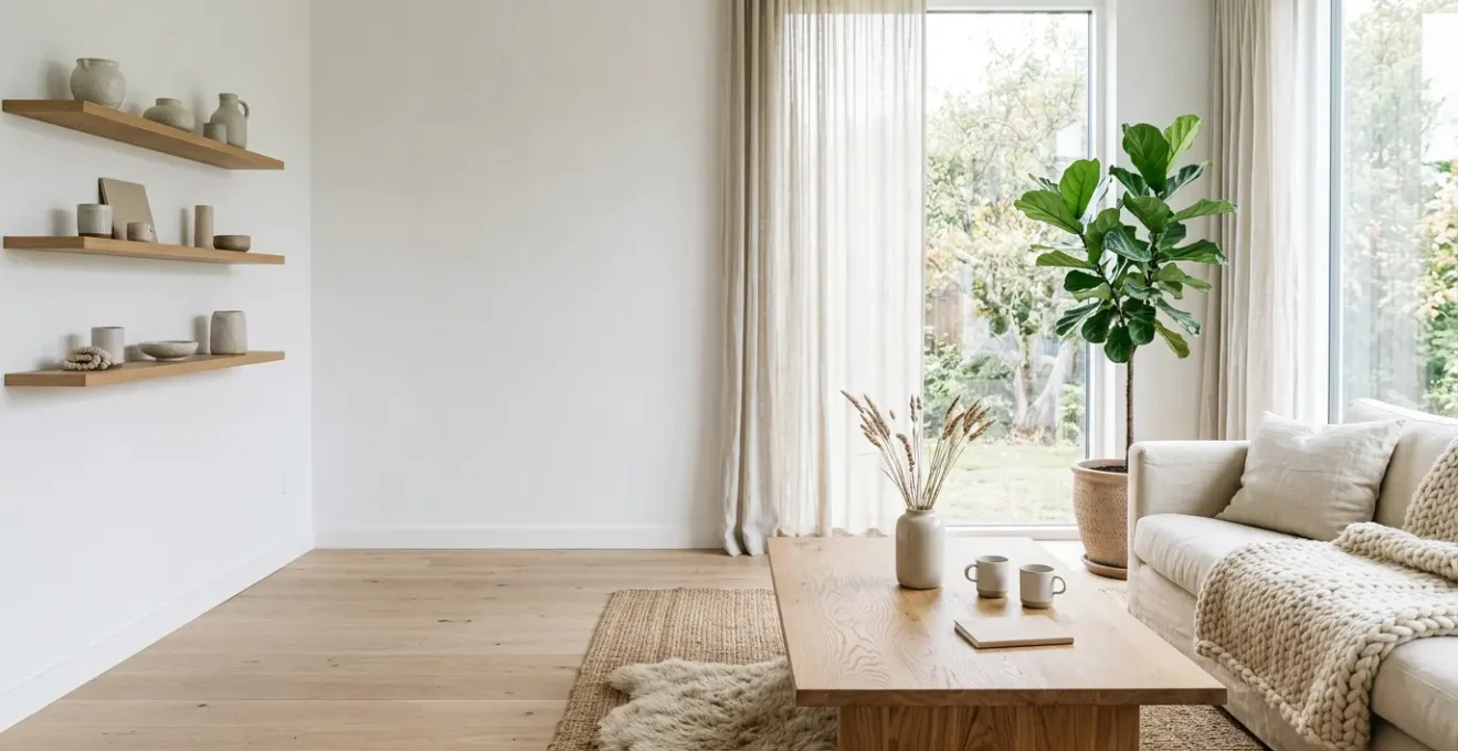
Texture is the single most powerful tool for adding warmth and depth to a minimalist space, transforming it from flat and cold to rich and inviting. It’s a form of sensory layering that engages more than just our eyes; it invites touch and creates a feeling of comfort and security. In a predominantly white or neutral room, texture does the work that a busy color palette might do in another style, creating visual interest and preventing monotony without adding clutter. The key is to create contrast not with color, but with feel.
A foolproof formula often cited by designers is to combine three core textures: something rough, something smooth, and something plush. This trio creates a balanced sensory experience. For example:
- Rough Texture: This provides a rustic, organic feel. Think of a jute or sisal rug, a coarse linen curtain, a raw wood coffee table, or a water hyacinth basket. These elements connect the room to the natural world.
- Smooth Texture: This adds a touch of modern refinement and reflects light. Examples include a ceramic vase, a leather armchair, a metal-framed mirror, or a polished concrete floor.
- Plush Texture: This is the element of pure comfort and *hygge*. Introduce it with a chunky wool knit blanket, a faux fur or sheepskin throw, velvet cushions, or a high-pile rug.
As one A-frame cabin owner demonstrates in her design, “a cozy sheepskin rug draped over a tripolina chair” is a perfect example of this principle in action. It “provides warmth and comfort to the chair, but also adds texture.” By consciously layering these different materials, you create a dynamic and tactile environment. Your eyes have more to explore, and the space instinctively feels more welcoming and complete, proving that warmth is a matter of touch, not just sight.
Why touching natural wood lowers blood pressure in home environments?
The calming effect of natural wood in an interior is not just a stylistic preference; it is a scientifically-backed phenomenon rooted in our evolutionary history. This concept, known as biophilia, suggests that humans have an innate tendency to seek connections with nature and other forms of life. Bringing natural elements like wood into our homes taps into this deep-seated need, creating a sense of peace and reducing stress. When we are surrounded by natural materials, our bodies respond positively on a physiological level.
Remarkably, this effect is measurable. Studies in the field of environmental psychology have shown that interaction with wood surfaces can have a direct impact on our nervous system. The visual and tactile experience of wood grain can lower sympathetic nervous activity, which is responsible for the “fight-or-flight” stress response. This leads to tangible health benefits, including a reduction in blood pressure and heart rate. In fact, recent neuroscience research shows that even passive viewing of wood-paneled interiors can reduce cognitive stress, as confirmed by fNIRS neuroimaging.
This biophilic connection is why wood is a non-negotiable element in creating a warm Scandinavian interior. Whether it’s the legs of a chair, a simple picture frame, a stack of birch logs by the fireplace, or the floor beneath your feet, the presence of wood provides an unconscious signal of safety and natural calm. It breaks the monotony of man-made materials and grounds the space, making it feel organic and restorative. Choosing wood isn’t just an aesthetic decision; it’s a choice for a healthier, more serene home environment.
How to layer 3 shades of the same color without it looking boring?
A monochromatic color scheme is a hallmark of minimalist design, but it carries the risk of appearing flat or uninspired. The secret to a sophisticated, layered look lies in understanding how to work with subtle variations of a single hue. The goal is to create depth and visual interest without sacrificing the serene, cohesive feel of the space. This is achieved not just through color, but through strategic allocation, finish, and undertone.
The most effective and easy-to-follow guideline is the 60-30-10 rule. This classic design principle provides a simple framework for creating a balanced monochromatic palette:
- 60% Main Shade: This is your dominant color, used for large surfaces like walls and major furniture pieces (e.g., a sofa). This shade sets the overall tone of the room.
- 30% Secondary Shade: This slightly lighter or darker version of your main color is used for secondary items like curtains, accent chairs, or rugs. It provides gentle contrast and starts building depth.
- 10% Accent Shade: This is your boldest shade—either the darkest or lightest variation. Use it sparingly on small decorative objects like throw pillows, vases, or artwork to create focal points that draw the eye.
Beyond the 60-30-10 rule, varying the sheen is crucial. Using the same color in different finishes—such as matte on the walls, satin on the trim, and a high-gloss on a decorative vase—makes each surface reflect light differently, creating subtle and elegant contrast. It’s also vital to ensure all shades share the same undertone (all warm or all cool) to maintain harmony. For instance, a bedroom design might use light blue on the walls, a crisp white on the bedding, and a deep navy in accent cushions to create a tranquil atmosphere that feels layered and intentional, not boring.
Key Takeaways
- Warmth is Psychological: True Scandinavian warmth comes from creating a sense of safety and calm through sensory strategies, not just adding “cozy” objects.
- Embrace Imperfection: The most inviting minimalist homes incorporate vintage, handmade, or natural elements that have character and tell a story, preventing a sterile feel.
- Master Light and Texture: Layering multiple warm light sources and combining rough, smooth, and plush textures are the most effective ways to add depth and comfort to a neutral space.
Muted Color Schemes: Using Low-Saturation Tones to Reduce Household Stress
The color palette of a warm minimalist home is perhaps its most defining feature, and it extends beyond simple neutrals. The key is using low-saturation tones—colors that have been softened with grey, white, or black. Think of dusty rose, sage green, soft terracotta, and muted blues. These colors have a lower intensity and are inherently easier on the eyes and the nervous system. Unlike bright, high-saturation colors that can feel energizing or even agitating, muted tones promote a sense of tranquility and calm, making them ideal for creating a restorative home sanctuary.
A powerful technique for using these colors is “color drenching.” This involves painting the walls, ceiling, trim, and even doors in the same muted shade. Far from feeling monotonous, this approach creates a deeply immersive and cocoon-like effect. It blurs the boundaries of the room, making it feel more expansive and seamless. The continuous color wraps around you, fostering a feeling of safety and serenity. As seen in modern Nordic farmhouse designs, these neutral tones harmonize beautifully with both vintage pieces and modern furniture, creating a timeless backdrop.
By choosing a palette of low-saturation colors, you are making a conscious decision to design for well-being. These tones reduce the visual “noise” in your home, allowing your mind to relax. They provide the perfect canvas for the textures and natural materials to stand out, ensuring that your home is not only visually beautiful but also a true balm for the soul. This is the ultimate expression of *hygge*: a space that actively contributes to your peace of mind.
Begin today by selecting one room and applying these principles. Start not by buying, but by editing and observing. Notice the light, feel the textures, and curate a space that brings you genuine psychological comfort and a deep sense of home.