
The most successful pendant lighting installations treat fixtures as tools for spatial engineering, not just decoration.
- Effective lighting balances visual weight with functional needs, using composition rules to create harmony and focus.
- Material choice is critical: it directly controls glare, dictates maintenance, and determines whether a fixture obstructs or enhances a room’s sightlines.
Recommendation: Before selecting a pendant, first define its primary function—anchoring a zone, providing focused task light, or preserving an open view—then choose the form that best serves that purpose.
Choosing a pendant light often feels like a purely aesthetic decision, the final piece of jewelry for a well-designed room. Planners and homeowners scroll through endless options, focusing on finish, shape, and style. While these elements are important, this approach misses the fundamental power of a pendant light. The true mark of an expert installation lies not in how a light looks, but in what it *does*. It’s a functional workhorse tasked with defining space, directing focus, and shaping the very atmosphere of a room. Fleeting trends may come and go, but the principles of effective task lighting and spatial definition are timeless.
The common advice—”match your decor” or “measure the height”—is merely the starting point. The real challenge is understanding the subtle physics of light and perception. How does a trio of lights create a more pleasing visual rhythm than a pair? How can the right glass shade diffuse light to prevent blinding glare at eye level while still illuminating a workspace? This is where we move beyond decoration and into the realm of functional anchoring and strategic illumination. It’s about engineering the light to serve the life that happens beneath it, whether that’s chopping vegetables on an island, reading in bed, or sharing a meal with family.
This guide will deconstruct the principles of professional lighting strategy. We will explore how to use pendants as tools to sculpt your environment, focusing on the functional impact of every choice—from material and number to placement and scale. By the end, you will be equipped to select fixtures that not only complete your space aesthetically but elevate its functionality to a professional standard.
This article provides a structured approach to mastering pendant lighting. The following sections break down the key considerations, from compositional rules to material science, to help you make informed and effective decisions for your space.
Summary: A Strategic Guide to Pendant Lighting
- The “odd number” rule: why 3 pendants look better than 2 over a kitchen island?
- Glass vs. Metal shade: which pendant type prevents blinding glare at eye level?
- Why hanging pendants instead of table lamps frees up critical nightstand space?
- The dust trap reality of clear glass globes and how to manage it
- How to choose a pendant that doesn’t block the view across the room?
- Sink on island vs. cooktop on island: which configuration is more social?
- Myth: do round tables really save more space than rectangular ones?
- Modern Kitchens: Achieving a Sleek Aesthetic With High-Functionality for Chefs
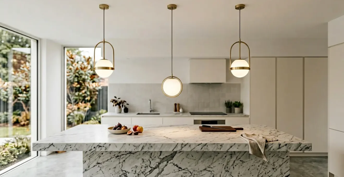
The “odd number” rule: why 3 pendants look better than 2 over a kitchen island?
The preference for odd numbers in design, particularly groups of three, is rooted in fundamental principles of visual composition. An even number of objects, like two pendants, creates symmetry. The eye naturally pairs them up, creating a line of tension between them and potentially dividing the space. In contrast, a group of three creates a more dynamic and balanced arrangement. Your brain perceives the central object as an anchor, with the other two flanking it, forming a stable pyramid or a visual focal point. This creates a sense of harmony and completeness that is inherently more pleasing and less static than a simple pair.
This “rule of threes” is a powerful tool for spatial engineering. Over a kitchen island, a trio of pendants establishes a clear visual anchor, defining the zone without building a wall. It guides the eye and holds attention, making the island feel like a purposeful destination within the larger room. This is especially effective for long islands, where two pendants might feel sparse and disconnected. The key is to achieve the right scale and spacing to create a cohesive unit.
To implement this correctly, designers follow established guidelines. A key principle is that the total width of your pendant lights should span approximately two-thirds the length of your kitchen island. This prevents the lights from looking either lost or overwhelming. For specific numbers, the approach is clear:
- For islands over 7 feet long, a series of 3 small or medium pendants is the standard choice for balanced composition.
- For islands between 5 and 6 feet, 2 medium pendants can work well, provided they are substantial enough to have presence.
- For smaller islands (3-4 feet), a single large, statement pendant is often more effective than trying to crowd in multiple smaller lights.
Proper spacing is just as critical as the number of pendants. To ensure they read as a group, you should space pendants approximately 24-30 inches apart, measured from the center of each fixture. It’s also vital to maintain at least 6 inches of clearance from where the pendant hangs to each end of the island. This prevents the arrangement from feeling cramped and gives the composition room to breathe, solidifying the island’s role as the kitchen’s functional heart.
Glass vs. Metal shade: which pendant type prevents blinding glare at eye level?
The choice between a glass and a metal shade is a critical functional decision that goes far beyond style; it directly dictates the quality and direction of light. The primary factor to consider is glare control, especially for pendants hung at eye level over an island or dining table. A metal shade is the ultimate tool for directing light. By its very nature, it is opaque, forcing all illumination downwards in a focused cone. This makes it an exceptional choice for task lighting—illuminating a cutting board or a dining plate without any distracting side glare. The light is contained and purposeful, minimizing light pollution into the surrounding space.
Conversely, a glass shade is designed for light diffusion and ambient glow. A clear glass shade offers no diffusion, exposing the bulb directly and creating the highest potential for harsh, uncomfortable glare. While stylistically popular, this choice requires careful bulb selection (e.g., frosted or low-lumen vintage-style bulbs) to be functional. A better option for managing glare while retaining an open feel is textured or frosted glass. As one kitchen design case study highlights, ribbed glass pendants bring texture and visual interest while naturally diffusing light, effectively reducing harshness without sacrificing overall illumination. This approach combines the best of both worlds: widespread light and controlled comfort.
The material’s effect on light quality is profound. Metal provides a high-contrast, dramatic effect, creating bright pools of light and deep shadows. This is ideal for tasks requiring precision. Glass, particularly translucent or textured types, provides a softer, more uniform ambient light that contributes to the overall brightness of the room. When choosing, consider the primary function: if the goal is focused work, a metal shade is superior. If you need to add to the room’s general light level while creating a warm atmosphere, a diffusing glass shade is the more effective choice.
Why hanging pendants instead of table lamps frees up critical nightstand space?
In the bedroom, surface area on a nightstand is prime real estate. Between a book, a glass of water, a phone, and other personal items, a traditional table lamp can consume a significant footprint, leading to a cluttered and impractical surface. Hanging a pendant light on either side of the bed is a strategic design move that completely eliminates this problem. By suspending the light source from the ceiling, you reclaim the entire surface of the nightstand for functional use. This immediately creates a cleaner, more organized, and visually spacious look.
This approach transforms the pendant from a kitchen-centric fixture into a versatile, space-saving solution for the bedroom. The effect is not just practical but also aesthetic. A pair of hanging pendants frames the bed, adding a layer of vertical interest and a touch of hotel-like sophistication. It draws the eye upward, which can make a room with average ceiling height feel taller. The hanging cords or chains become a deliberate design element, adding a linear, sculptural quality to the space. This is a perfect example of functional anchoring, where the lights define the sleeping zone while simultaneously solving a common storage problem.
The key to success is planning the installation with user convenience in mind. Unlike a table lamp that you simply plug in, a bedside pendant requires forethought about placement and control. Getting this right is crucial for making the solution practical for everyday use. Proper planning ensures the light is both beautiful and effortless to live with.
Your Bedside Pendant Planning Checklist
- Points of Contact: Confirm the location of the ceiling junction box. Is it centered over the nightstand? Plan for a dedicated wall switch or smart control that is easily accessible from the bed.
- Component Inventory: List all necessary parts before installation: the pendant fixture, a bulb with the appropriate warmth (2700K is ideal for bedrooms), and, most importantly, a compatible dimmer switch.
- Aesthetic Coherence: Check that the pendant’s scale is appropriate for the nightstand and headboard. Ensure its metal finish and style are consistent with other fixtures in the room.
- Functionality and Mood: Does the shade direct light downward for reading without creating glare? Test the dimmer to ensure it provides a full range from bright task light to a soft, ambient glow.
- Integration Plan: Create a clear brief for your electrician. Specify the exact hanging height (low enough to be useful, high enough not to be a hazard), the type of switch, and the bulb specifications.
The dust trap reality of clear glass globes and how to manage it
Clear glass pendants, especially open globes or bowls, are notoriously difficult to maintain. Their transparent surfaces act as a display case for every speck of dust, fingerprint, and kitchen grease particle that settles on them. Because the bulb illuminates the shade itself, this accumulation is highly visible, quickly turning a chic fixture into a dusty eyesore. This is a practical reality that is often overlooked during the design phase but becomes a constant chore once the lights are installed. The combination of static electricity and ambient grease in a kitchen environment makes these surfaces dust magnets.
The problem is exacerbated by the type of bulb used. Older halogen bulbs generate significant heat, which can effectively “bake” a fine layer of dust and grease onto the glass, making it much harder to clean. A major advantage of modern lighting is that an analysis of bulb technology shows how modern LED pendant technology eliminates the dust-baking issue by operating at cooler temperatures. While this doesn’t prevent dust from settling, it does make routine cleaning significantly easier, as the dust can be wiped away without requiring harsh scrubbing.
For those who love the look of glass but dread the maintenance, there are smarter material choices. Textured, seeded, or ribbed glass is an excellent compromise. These surfaces are designed to obscure minor imperfections and dust, effectively camouflaging accumulation between cleanings. A case study of a kitchen-diner renovation noted that the designer chose vintage ribbed glass pendants specifically because their design naturally conceals dust better than smooth alternatives. This allowed them to maintain a clean aesthetic in a high-traffic cooking area with less frequent cleaning, proving that material choice can be a strategic defense against maintenance headaches.
Ultimately, managing dust on glass pendants comes down to a few key strategies. First, choose LED bulbs to prevent heat-related build-up. Second, consider textured or frosted glass over perfectly clear options. Third, if you must have clear glass, be prepared for a regular cleaning routine. Using a microfiber duster weekly and a glass cleaner monthly can keep them looking their best. It’s a trade-off between a specific aesthetic and the practical demands of upkeep.
How to choose a pendant that doesn’t block the view across the room?
In modern open-plan living spaces, maintaining clear sightlines is paramount. A poorly chosen pendant light, particularly over a central kitchen island, can act as a visual barrier, interrupting the flow and making the space feel smaller and more compartmentalized. The key to avoiding this is to select a fixture with high “visual permeability”—in other words, one that the eye can easily see through. The concept of visual weight is crucial here: you want a pendant with a low visual weight, one that defines the space without dominating or obstructing it.
The material and structure of the pendant are the primary determinants of its visual weight. Solid, opaque fixtures, like heavy metal domes or thick concrete pendants, have the highest visual weight and are the most likely to block a view. They are best used against a solid wall or in a corner where they won’t interfere with sightlines. For open spaces, the best options are fixtures made from transparent materials or with open-frame construction. A wireframe or open-cage design is the ultimate choice for preserving a view, offering almost 100% transparency while still creating a strong sculptural and architectural presence.
Clear glass is another excellent option, offering a high degree of transparency that allows you to see right through it. However, it still has more visual substance than a wireframe fixture. For a balance of style and transparency, different materials offer varying levels of permeability. A recent comparative analysis of pendant materials provides a helpful hierarchy for making this choice:
| Material Type | Visual Permeability Rating | Best Application |
|---|---|---|
| Wireframe/Open cage | Excellent (90-100%) | Open-plan spaces, maintaining sightlines |
| Clear glass | Very Good (70-90%) | Balance of style and transparency |
| Seeded/Textured glass | Good (50-70%) | Privacy with light transmission |
| Translucent fabric | Moderate (30-50%) | Soft ambient lighting |
| Solid metal | Poor (0-10%) | Focused task lighting only |
Choosing a visually light fixture allows you to have the best of both worlds: a defined, anchored zone over your island or table, and an uninterrupted, expansive view across your living area. It’s a strategic decision that supports the very concept of open-plan design, ensuring that your lighting enhances the space rather than dividing it.
Sink on island vs. cooktop on island: which configuration is more social?
The decision to place a sink or a cooktop on a kitchen island has a profound impact on the room’s social dynamics. While both can be functional, an island with a sink is inherently more social. Preparation and cleanup activities around a sink are typically low-profile and allow for easy face-to-face interaction with guests or family seated at the island. You can wash vegetables, mix a drink, or load the dishwasher while maintaining eye contact and conversation. The surfaces around a sink are also cooler and safer, making the island a more welcoming spot for others to gather, work on a laptop, or for children to do homework.
In contrast, an island with a cooktop creates a physical and psychological barrier. Cooking involves heat, steam, and splattering oil, which naturally makes people keep their distance. More importantly, a cooktop on an island almost always requires a large, overhead ventilation hood. This hood can be a significant visual obstruction, breaking the very sightlines that open-plan living aims to preserve. It hangs directly in the line of sight between the cook and anyone else in the room, disrupting conversation and creating a division. Even with downdraft ventilation systems, the act of cooking is more inwardly focused and less conducive to casual interaction.
From a lighting perspective, the choice also matters. An island with a sink is more forgiving. As noted in a project featuring traditional lanterns over an island sink, the fixtures can be more decorative and provide diffused light, as the surfaces are often reflective and the tasks less visually demanding than cooking. The open design of lantern-style pendants preserves sightlines, reinforcing the island’s role as a social hub. As designer Sallie Lord of GreyHunt Interiors states, “Kitchen pendants are like a great pair of earrings. They finish off the look and give that layered look. They also are very functional.” Over a sink, that function can lean more towards ambiance and style.
Lighting over a cooktop, however, must be purely functional and often secondary to the powerful task lighting built into the ventilation hood. Pendants can interfere with the hood’s placement and are susceptible to collecting grease. Therefore, for a kitchen designed around social interaction and gathering, placing the sink on the island and the cooktop against a wall is the superior layout, allowing for lighting choices that enhance both function and connection.
Myth: do round tables really save more space than rectangular ones?
It’s a common belief in interior design that a round table is the ultimate space-saver. The myth suggests that by “cutting off the corners,” a round table fits more easily into tight spaces. While it’s true that a round table has a smaller overall surface area than a rectangular table of the same width, it often requires a larger functional footprint. The chair clearance zone around a round table is a perfect circle, which can be awkward to fit into a square or rectangular room. A rectangular table, on the other hand, can be pushed neatly against a wall or into a corner, maximizing usable floor space when not fully occupied.
The real advantage of a round table is not in saving space, but in fostering conversation and creating a more intimate dining experience. With no head of the table, everyone is equidistant and can easily see and speak to one another. This makes it ideal for social gatherings. From a lighting perspective, a round table is also simpler to illuminate effectively. It requires just one central anchor point, which can be a single, large statement pendant or a tight cluster of smaller ones. This creates a natural focal point and evenly distributes light to all diners.
Choosing the right pendant configuration depends entirely on the table shape. The goal is to create a harmonious relationship between the fixture and the surface it illuminates. The following guidelines are standard practice:
- Round Tables: Use one large, centered pendant or an odd-numbered cluster (e.g., three small pendants) hung at varying heights for a dynamic effect.
- Rectangular Tables: A long linear suspension fixture that echoes the table’s shape is ideal. Alternatively, a series of three or more individual pendants spaced evenly along the table’s centerline works perfectly.
- Square Tables: These can be treated like round tables with a single statement pendant, or you can create a more structured look with four smaller pendants arranged in a square formation over the table.
Regardless of shape, the hanging height is a critical, non-negotiable measurement for function and comfort. To avoid blocking sightlines or creating glare, most interior designers recommend hanging pendants 30-36 inches above the table surface. This ensures the light is close enough to be effective but high enough to be out of the way, perfectly balancing the fixture’s roles as both a task light and a decorative anchor.
Key Takeaways
- Treat pendant lighting as a functional tool for spatial engineering, focusing on composition, scale, and sightlines, not just style.
- The material of a pendant’s shade is a critical choice that directly controls glare, dictates maintenance, and defines the quality of light (directed vs. diffused).
- In open-plan spaces, prioritize pendants with low visual weight (e.g., wireframe or glass) to define zones without obstructing views.
Modern Kitchens: Achieving a Sleek Aesthetic With High-Functionality for Chefs
In a modern, chef-inspired kitchen, aesthetics and functionality are inextricably linked. The goal is a sleek, uncluttered environment where every element serves a purpose. Here, pendant lighting is not an afterthought but a critical component of a layered lighting scheme designed for high performance. The “sleek aesthetic” is achieved by eliminating visual noise and focusing on clean lines, and the lighting must follow suit. This often means choosing minimalist fixtures, like linear bar pendants or simple geometric forms, that integrate seamlessly into the architecture of the space.
For a chef, task lighting is not optional; it’s essential. The light over a prep area must be bright, clear, and shadow-free. This requires a technical approach to selecting pendants. According to professional guidelines, professional chef-grade kitchen lighting requires 400-800 lumens per pendant. This ensures ample brightness for intricate tasks like chopping and plating. Equally important is the color temperature. A range of 2700-3500K (Kelvin) provides a clean, natural-looking light that renders the color of food accurately without feeling cold or clinical like an operating room.
One case study of a contemporary kitchen illustrates this principle perfectly. The design featured a sleek black bar pendant over the island, its linear form creating clean lines that echoed the modern cabinetry. This single fixture provided high-performance task lighting essential for food preparation, casting an even wash of light across the entire work surface. This minimalist pendant was part of a larger strategy, working in concert with under-cabinet LED strips to create multiple layers of light. This layered approach is key in a high-function kitchen, as it eliminates shadows and allows the user to adjust the lighting based on the task at hand—bright and focused for prep, softer and more ambient for dining or socializing.
Achieving this balance of sleek form and high function means prioritizing performance specifications over purely decorative features. It’s about choosing a pendant that delivers the right amount of lumens and the correct color temperature in a form that is clean, unobtrusive, and easy to clean. In the modern kitchen, the most beautiful fixture is the one that works the best.
Now that you are equipped with the principles of strategic pendant lighting, the next step is to apply this knowledge. Begin by assessing your own space, defining the primary function for each lighting zone, and you can start to engineer a solution that is both beautiful and perfectly suited to your needs.