
Your oversized media unit, home to a massive TV and multiple consoles, doesn’t have to be a visual black hole that dominates the room.
- Master its visual weight by treating it as an architectural element, using paint, light, and materials to blend it into your space.
- Engineer its interior by creating dedicated ‘technical plenums’ for flawless cable management and ‘thermal envelopes’ to protect your high-end electronics from overheating.
Recommendation: Shift your mindset from simply ‘hiding a problem’ to consciously designing an integrated piece of functional architecture that serves both your technology and your home’s aesthetic.
For families today, the media center is the undisputed heart of the living room. It houses a vast television, powerful gaming consoles, soundbars, and a collection of streaming devices. The result is often an oversized media unit that, while functional, becomes an overwhelming focal point—a bulky monolith that dictates the room’s entire aesthetic. The common advice often circles around using decorative bins or choosing a neutral color, but these are merely bandages on a much larger design challenge.
These surface-level fixes ignore the core of the issue. They fail to address the three-dimensional problem: the chaotic web of cables, the heat generated by powerful electronics, and the sheer visual mass of the furniture itself. We meticulously curate our homes to be places of comfort and style, yet we surrender a significant portion of our living space to a piece of furniture that often feels more like a necessary evil than a deliberate design choice.
But what if the solution wasn’t to simply hide the unit, but to fundamentally rethink its role in the room? The key is to stop seeing it as furniture and start treating it as a piece of integrated technical architecture. This approach moves beyond simple clutter control and embraces a holistic strategy, balancing visual harmony with the complex technical demands of modern entertainment systems. It’s about designing a system that manages cables with precision, dissipates heat intelligently, and manipulates visual perception to reduce its own dominance.
This guide will walk you through that architectural mindset. We will deconstruct the oversized media unit, tackling its challenges one by one—from its internal wiring to its external finish—to transform it from an eyesore into a sophisticated, intentional, and fully integrated component of your home.
Summary: Balancing the Modern Media Monolith
- How to route cables behind a massive unit so they are invisible but accessible?
- The overheating risk of enclosing your console in a cabinet door
- Wall-mount vs. Stand: which setup looks more proportional on a large unit?
- Open shelves vs. Doors: how to hide the clutter while displaying the treasures?
- How to paint a large unit to make it “disappear” into the wall?
- How to secure tall units to walls to prevent dangerous tipping accidents?
- Why glass tables make a small room feel 20% larger?
- Sectional Sofas: How to Position Large Seating for Maximum Comfort and Flow?
How to route cables behind a massive unit so they are invisible but accessible?
The “rat’s nest” of cables behind a media unit is more than an eyesore; it’s a functional and safety liability. Poorly managed cords can cause signal interference, become a fire hazard, and make upgrading a single component an archaeological dig. The architectural solution is to design a dedicated technical plenum—a hidden, organized space specifically for routing and managing your system’s nervous system. This isn’t just about drilling a hole; it’s about creating an intentional void.
This can be achieved by creating a false back panel on your unit, set 3 to 4 inches deep. This plenum provides a completely concealed channel where power strips can be mounted and cables can be run without compression or tangling. Within this space, organization is key. Separate power cords from signal cables (HDMI, optical) to prevent electromagnetic interference. Using wide cable conduits or sleeves allows for future additions without having to undo all your hard work. This structured approach is not only safer—improperly managed cords are a significant hazard, with the U.S. Consumer Product Safety Commission estimating around 4,000 extension-cord injuries annually—but it also ensures long-term serviceability.
The final layer of a professional setup is a clear labeling system. Using color-coded tags on each end of a cable, paired with a numbered legend kept inside a cabinet door, transforms a confusing mess into a logical map. This turns a 30-minute task of finding the right HDMI port into a 30-second one. By designing a technical plenum, you’re not just hiding wires; you’re engineering a clean, safe, and accessible backbone for your entire entertainment ecosystem.
The overheating risk of enclosing your console in a cabinet door
Placing a state-of-the-art gaming console like a PlayStation 5 or Xbox Series X inside a closed cabinet is tempting for a clean look, but it can be a death sentence for your hardware. These consoles are powerful computers that generate a tremendous amount of heat. Enclosing them without proper airflow creates a thermal envelope of stagnant, hot air that forces the internal fans to work overtime and can lead to performance throttling, system crashes, and a drastically shortened lifespan. Just 2-3 hours of continuous gameplay can push temperatures to critical levels in a poorly ventilated space.
Modern console design reflects the seriousness of this issue. Manufacturers have integrated advanced cooling systems, some even incorporating liquid cooling technology once reserved for high-end PCs, to manage internal temperatures. These systems are designed to pull cool air from the front and sides and exhaust hot air from the back. When you place a console in a tight cabinet, you choke this engineered airflow. The device ends up recycling its own hot exhaust, leading to a rapid temperature increase.
To safely enclose a console, you must architect an active or passive ventilation solution. The simplest passive method is to completely remove the back panel of the cabinet section housing the console, allowing hot air to escape. For a more robust solution, consider installing USB-powered cooling fans, typically used in AV racks, into the back or side of your cabinet. These fans create active airflow, pulling cool air in and pushing hot air out, ensuring the console operates within its intended temperature range. Never assume a “slightly ajar” door is enough; you must provide a clear and consistent path for heat to escape the thermal envelope.
Wall-mount vs. Stand: which setup looks more proportional on a large unit?
The choice between placing your TV on its stand or mounting it to the wall above the unit is a critical decision that dictates the room’s entire visual balance. It’s not just about preference; it’s about manipulating the room’s visual horizon line. A standing TV connects directly to the media unit, creating a single, heavy block of visual mass. In contrast, wall-mounting the TV separates it from the unit, creating negative space that allows the eye to see the wall behind it. This simple act “lifts” the visual horizon, making the entire setup feel lighter and the room feel more spacious.
Scientific research backs this up. A recent study on spatial perception confirmed that design elements creating more “view access”—like a larger window or, in this case, more visible wall space—have a significant impact on how large a room feels. As the study on perceived spaciousness using VR and eye-tracking shows, our brains interpret unobstructed vertical lines and open planes as indicators of a larger environment. By wall-mounting, you are essentially creating a “window” of space between the TV and the console, breaking up the visual mass and reducing its dominance.
| Feature | Wall-Mounted Unit | Standing Unit |
|---|---|---|
| Visual Impact | Creates floating effect, raises visual horizon | Provides strong anchor point, grounds the space |
| Floor Space | Maximizes floor visibility | Takes up floor footprint |
| Cleaning | Easy access underneath | Can create dust trap beneath |
| Storage | Limited to wall-mounted capacity | Can include base storage shelf |
| Installation | Requires wall anchoring | Simple placement, no drilling |
For an oversized media unit, wall-mounting is almost always the superior choice for achieving a proportional, integrated look. It establishes the media unit not as a mere stand, but as a deliberate, floating credenza. This allows the unit to serve its storage purpose while the TV becomes a separate, framed element on the wall, creating a more sophisticated and architecturally balanced composition.
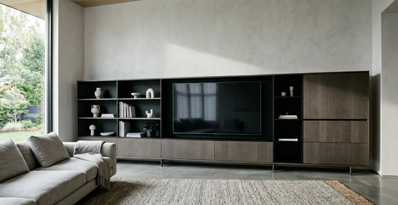
Open shelves vs. Doors: how to hide the clutter while displaying the treasures?
An oversized media unit presents a dual-purpose storage challenge: you need to conceal the necessary clutter (cables, controllers, old DVDs) while artfully displaying the items that bring you joy (books, photos, art). The solution lies in strategic concealment, a design philosophy that rejects the all-or-nothing approach of fully open or fully closed storage. It’s about creating a visual rhythm that guides the eye towards the beautiful and away from the mundane.
A good rule of thumb is to aim for a ratio of approximately 70% closed storage to 30% open shelving. This provides ample space for hiding mess while creating curated vignettes for your treasures. Instead of a simple alternating pattern of open and closed, create a more dynamic visual rhythm, such as Door-Door-Open-Door-Door. This grounds the unit and makes the open section feel more intentional, like a purpose-built display niche. To further enhance this effect, consider installing discreet LED strip lighting within the open sections to highlight your chosen objects and add a layer of warmth and sophistication.
For the closed sections, you can play with levels of opacity. While solid doors offer maximum concealment, they can add to the unit’s visual heaviness. Materials like fluted glass or smoked acrylic offer a perfect compromise. They obscure the specific shapes of what’s inside, turning clutter into a soft, textural pattern, while still allowing light to pass through. This maintains a sense of lightness and depth that solid doors cannot achieve.
Action Plan: Auditing Your Storage Balance
- Inventory Items: List everything currently on or in your media unit. Categorize each item as either ‘display-worthy’ (treasures) or ‘to be concealed’ (clutter).
- Check Your Ratios: Measure your current open shelf space versus closed cabinet space. How does it compare to the recommended 70/30 closed-to-open ratio?
- Assess Visual Rhythm: Look at the pattern of your doors and shelves. Does it feel balanced and intentional, or random and chaotic? Consider if a different arrangement could create a stronger focal point.
- Evaluate Concealment: Are your solid doors making the unit feel too heavy? Could you replace some fronts with fluted glass or another semi-opaque material to lighten the visual load?
- Plan for Highlights: Examine your ‘display-worthy’ items. Are they given prominence? Plan where you could install integrated LED lighting to turn open shelves into deliberate showcases.
How to paint a large unit to make it “disappear” into the wall?
The most effective way to reduce the overwhelming visual mass of an oversized media unit is to make it “disappear.” This architectural camouflage trick goes beyond simply choosing a neutral color; it involves a careful selection of paint finish and a tone-on-tone approach to blur the lines between furniture and wall. By painting the unit the exact same color as the wall behind it, you prevent the eye from registering its edges, causing it to recede into the background.
The choice of paint finish is crucial to the success of this illusion. A matte or flat finish is the ultimate tool for camouflage. It absorbs light and diffuses reflections, which softens the unit’s hard edges and makes it feel less like a solid, distinct object. For a more sophisticated effect, you can create an architectural niche. As designer Kristin Fine of 1818 Collective demonstrated, building a niche for the TV and then covering it with sliding panels plastered and painted to match the wall can turn a media unit into a piece of kinetic art. This approach transforms the unit from a bulky piece of furniture into an integrated, textural part of the wall’s architecture.
| Paint Finish | Visual Effect | Best Use Case |
|---|---|---|
| Matte | Absorbs light, blurs edges, makes unit recede | Maximum camouflage effect |
| Satin | Subtle sheen with durability | Balance of practicality and visual softness |
| High-gloss | Reflects room, creates illusion of space | Small rooms needing visual expansion |
| Tone-on-tone | Creates subtle architectural depth | Sophisticated dimensional effect |
Even the hardware plays a role. Opt for handleless, push-to-open cabinet doors or choose hardware in the same color as the paint. Every element that would normally create contrast and draw attention to the unit should be neutralized. By unifying color, finish, and hardware, you dissolve the unit’s visual boundaries, allowing it to provide its essential function without visually dominating your living space.
How to secure tall units to walls to prevent dangerous tipping accidents?
While we focus on aesthetics, the structural integrity and safety of an oversized media unit cannot be overlooked, especially in a home with children or pets. These large, often top-heavy pieces of furniture pose a serious tipping hazard if not properly secured. The combination of a tall unit and a modern, thin flat-panel TV, which is itself highly susceptible to tipping according to safety advocates like TVSafety.org, creates a significant risk. Anchoring the unit to the wall is not an optional step; it is a fundamental safety requirement.
Securing the unit requires choosing the correct anchor for your specific wall type. Using the wrong hardware is as dangerous as using none at all. The goal is to connect the unit not just to the drywall, but to the solid structure behind it. If you have any doubt, consulting a professional is always the safest course of action. A secure installation provides peace of mind, ensuring your media center is a source of entertainment, not a household hazard.
Checklist: Securing Your Unit by Wall Type
- For Drywall: Do not rely on screws alone. Use toggle bolts or snap toggles that open up behind the drywall to distribute the load over a wider area.
- For Plaster Walls: These can be brittle. Locate the wooden wall studs using a stud finder and install heavy-duty lag bolts directly into them for a secure hold.
- For Brick or Concrete: Use sleeve anchors or concrete screws. These are designed to expand within the masonry when tightened, creating an extremely strong anchor point.
- For Wide or Tall Units: Don’t rely on a single anchor. Install two or more anchor points, spaced apart, to provide robust stability and prevent any twisting or rocking.
- Annual Check-up: Mark your calendar to check the tightness of all anchors once a year. Small vibrations from daily life or sound systems can cause them to loosen over time.
The process is straightforward: locate the wall studs, attach anti-tip brackets or straps to the top back edge of the unit, and firmly secure them to the studs with the appropriate screws or bolts. For very large or tall units, using multiple anchor points is essential. This simple, 30-minute task is one of the most important things you can do to ensure the safety of your family.
Why glass tables make a small room feel 20% larger?
The principle that makes a glass coffee table a classic choice for small apartments is directly applicable to taming an oversized media unit: visual transparency reduces perceived mass. A glass table works because it doesn’t block sightlines to the floor, allowing the eye to see the full expanse of the room and creating an illusion of more space. We can apply this exact same logic to our media unit by strategically replacing solid, opaque elements with transparent ones.
Light, neutral colors reflect more light and make walls seem to recede, giving the illusion of a more expansive room.
– Olivia Wendel, Small Living Room Ideas with TV Guide
This principle of light and reflection is the key. While painting the unit helps it blend in, incorporating glass actively works to make it feel smaller and lighter. The most impactful application is to replace solid wooden or MDF shelves with thick, tempered glass shelves. This allows light from the room—and any integrated lighting within the unit—to pass through the structure vertically. It breaks up the solid block of color and material, introducing an element of airy sophistication and dramatically reducing the unit’s visual density.
This technique is especially effective for the open, display-oriented sections of your unit. A solid shelf can cast a dark shadow on the section below it, but a glass shelf allows light to flow freely, illuminating your displayed objects from above and below. As home design experts note, clear glass is perfect for a minimalist aesthetic, while frosted or textured glass can offer a degree of concealment while still providing that crucial sense of lightness. By borrowing this principle from other furniture, you can subtract visual weight from your media unit without sacrificing a single inch of storage.
Key Takeaways
- An oversized media unit should be treated as ‘technical architecture,’ not just furniture, balancing aesthetics and function.
- Engineer dedicated spaces like a ‘technical plenum’ for cables and a ‘thermal envelope’ for consoles to ensure safety and longevity.
- Reduce the unit’s visual mass through strategic use of paint, finish, and transparent materials like glass to make it blend into the room.
Sectional Sofas: How to Position Large Seating for Maximum Comfort and Flow?
The relationship between your oversized media unit and your large sectional sofa defines the entire living room. Poor positioning can create a space that feels cramped, with awkward viewing angles and poor traffic flow. The key is to think of them as two counterbalancing forces. Instead of pushing both large pieces against opposite walls—which can feel like a standoff and exaggerate the distance—consider “floating” the sectional in the middle of the room.
Placing the sofa several feet away from the wall creates a walkway behind it, which paradoxically makes the room feel larger and more organized. This arrangement establishes a dedicated “viewing zone” and a separate “traffic zone.” It also helps to create a more intimate and cohesive seating area. When floating a sectional, ensure the main seating axis is centered on the TV. The ideal TV height, with the center of your screen at eye level when seated, typically 36-42 inches from the floor, is crucial for ergonomic comfort in this dedicated zone.
The shape of your sectional also plays a role. A chaise or L-shaped corner can create suboptimal viewing angles for anyone seated at the ends. This is where a high-quality articulating TV wall mount becomes an invaluable tool. It allows the screen to be swiveled and tilted, ensuring that every seat on the sectional has a perfect view. This small piece of hardware provides the flexibility needed to make a large, fixed seating arrangement work harmoniously with a large, fixed media center. The goal is to create an “entertainment triangle” where the TV, main seating, and supplemental seating (if any) are all positioned for maximum comfort, conversation, and clear sightlines.
By adopting an architectural mindset, you can transform your oversized media unit from a source of frustration into a sophisticated and highly functional centerpiece. The next logical step is to audit your own setup using these principles and begin implementing the changes that will bring balance and harmony back to your living space.