
In summary:
- Defining zones in an open-concept space is about creating psychological boundaries, not physical ones.
- Use area rugs to anchor furniture and create “invisible walls,” establishing clear functional zones.
- Master lighting layers and dimmers to visually “turn off” areas like the kitchen during dining or relaxation.
- Maintain a cohesive flow by limiting your core material palette to three finishes and unifying your flooring.
- Employ flexible room dividers for acoustic and visual privacy without sacrificing the open feel.
The promise of an open-concept home is one of light, flow, and boundless space. Yet, for many, the reality is a single, cavernous room where the kitchen bleeds into the living area, and noise travels unimpeded. You may feel like your home is a large, messy, and undefined space, lacking the coziness and order of a traditional layout. The common advice is to simply use furniture or an accent wall, but these solutions often feel clumsy and fail to address the underlying issue of sensory overload.
The true challenge isn’t a lack of walls; it’s a lack of intentional visual cues. If the real key to taming the open-concept chaos wasn’t about adding barriers, but about mastering the art of visual suggestion? It’s about creating psychological boundaries that the mind perceives and respects, guiding both the eye and the foot without a single physical obstruction. This is achieved by strategically manipulating texture, light, sightlines, and even sound to craft distinct zones that feel purposeful and serene.
This guide moves beyond generic tips to provide a structured, expert-led approach. We will explore the science behind why open layouts can feel chaotic and then dive into actionable strategies—from the precise placement of rugs to the choreography of smart lighting—that will empower you to reclaim your space, creating a harmonious and beautifully defined home.
To help you navigate these expert techniques, this article is structured to tackle each aspect of spatial definition one by one. The following summary outlines the key areas we will cover to transform your open-plan living experience.
Summary: Define Zones in an Open-Concept Home
- Why open-concept homes often feel noisier and more chaotic than expected?
- How to use area rugs to create invisible “walls” between living and dining?
- Paint blocking vs. physical dividers: which zoning method saves more space?
- The visual clutter mistake that ruins the flow of open-concept living
- How to unify your flooring to make the open space feel 30% larger?
- Myth: is knocking down every wall really the best way to modernize a home?
- How to use dimmers to “turn off” a kitchen visually while eating in the dining room?
- Room Dividers: Flexible Solutions for Privacy in Shared Living Spaces
Why open-concept homes often feel noisier and more chaotic than expected?
The allure of open-concept living—uninterrupted sightlines and a sense of expansive freedom—often masks its primary drawback: the lack of sensory boundaries. Without walls to absorb and block sound, noise from the kitchen clatter, the television, and conversations all merge into a constant hum. This environment is not just loud; it’s psychologically taxing. In fact, studies of open-plan offices show that ambient noise levels can consistently reach 60-70 decibels, comparable to a busy restaurant, making concentration difficult.
However, the issue runs deeper than mere volume. A groundbreaking 2025 study on open-plan spaces revealed a critical insight: the feeling of chaos is often more about a lack of privacy than pure noise disturbance. Researchers found that the inability to control one’s auditory environment and the feeling of being constantly “on display” accounted for acoustic dissatisfaction 25% more than the noise itself. Without designated zones, every activity infringes upon the others, creating a sense of perpetual intrusion and preventing any single area from feeling truly restful or focused.
This “acoustic chaos” is compounded by visual overstimulation. When there are no clear perimeters, the eye doesn’t know where to rest. The visual information from the dining area, living room, and kitchen competes for attention, creating an impression of clutter even in a tidy space. This lack of defined zones prevents the creation of peaceful, single-purpose nooks, turning the entire home into one functionally blended and psychologically demanding environment.
How to use area rugs to create invisible “walls” between living and dining?
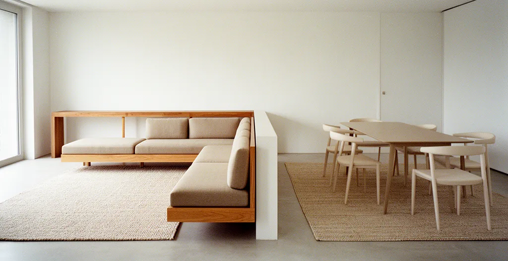
One of the most powerful tools for creating psychological boundaries is the area rug. A well-placed rug doesn’t just add color or texture; it acts as a visual anchor that claims a specific territory for a dedicated function, such as conversation or dining. Its edges form an “invisible wall” that our brains instinctively recognize as a perimeter. The key is to move beyond simply placing a small rug in the middle of a seating area and instead use it as a foundational platform for the entire zone.
The “front-leg rule” is a fundamental principle here: at a minimum, the front legs of all major furniture pieces in a zone (like a sofa and armchairs) must sit firmly on the rug. This visually unifies the pieces into a cohesive group, separating them from the rest of the open space. The rug should extend at least 6 inches beyond the sides of the furniture to avoid looking undersized. For a dining area, the rug must be large enough so that when you pull the chairs out to sit down, all four legs remain on the rug. This prevents a wobbly, unpleasant experience and maintains the integrity of the zone.
This technique is not just about placement but also about creating deliberate transitions. By leaving a “path” of bare floor between the living room rug and the dining room rug, you create an intentional flow for traffic. This “invisible hallway” guides movement naturally without the need for furniture to block the way. The contrast in texture underfoot—moving from a plush, high-pile rug in the living area to a durable, low-pile flat-weave in the dining zone—further reinforces this sensory shift, signaling a change in function from relaxation to dining.
As you can see in this layout, the distinct rugs anchor their respective zones, while the negative space between them becomes a clear and intuitive pathway. This strategic use of flooring defines each area’s purpose far more effectively than any physical object could, maintaining the open and airy feel of the space.
Paint blocking vs. physical dividers: which zoning method saves more space?
When seeking to define a zone, the immediate impulse might be to add a physical divider like a bookcase or screen. While effective, these solutions consume valuable floor space. An increasingly popular and space-efficient alternative is paint blocking—using a bold swath of color on a wall, floor, or even the ceiling to visually segregate a nook or a functional area. This method creates a powerful graphic statement and carves out a zone with zero physical footprint, making it ideal for smaller open-concept homes.
Paint blocking works by creating a strong focal point that draws the eye and signals a shift in purpose. Imagine a home office nook where the wall behind the desk and a corresponding rectangle on the floor are painted a deep charcoal gray. This creates a “room within a room” that feels distinct and intentional, yet occupies no more space than the furniture itself. However, the visual impact must be carefully considered; dark or overly saturated colors can make a zone feel smaller, even if the physical volume of the room is unchanged. It’s a trade-off between visual weight and perceived space.
Physical dividers, on the other hand, offer functional benefits beyond simple demarcation. A well-placed bookcase, for instance, not only separates the living area from a hallway but also provides significant vertical storage. As shown in the comparison below, a physical divider might use a few square feet of floor space but can add substantial utility, making it a practical choice if storage is a priority.
To help you decide, this table breaks down the spatial and functional trade-offs of different zoning methods, based on a detailed analysis of modern zoning techniques.
| Zoning Method | Floor Space Used | Visual Impact | Functional Benefits |
|---|---|---|---|
| Paint Blocking | 0 sq ft | Can visually shrink room volume with dark colors | Pure aesthetic division, no storage |
| Physical Bookcase Divider | 5 sq ft | Adds vertical interest and perceived height | 30 sq ft of vertical storage gained |
| Suspended/Ceiling Dividers | 0 sq ft | Maintains open feel while defining zones | Acoustic benefits, no floor footprint |
| Slatted Wood Screens | 2-3 sq ft | Light passes through, maintains airiness | Semi-transparent privacy, moveable |
Ultimately, the choice between paint and a physical divider depends on your primary goal. If maximizing every square inch is the priority, paint blocking is unbeatable. If you need to combine zoning with function, a carefully chosen physical divider offers a dual-purpose solution.
The visual clutter mistake that ruins the flow of open-concept living
The single biggest mistake that undermines an open-concept space is a lack of material cohesion. When each “zone”—kitchen, dining, living—is designed in isolation with different wood tones, metal finishes, and color palettes, the result is not a series of charming, distinct areas. Instead, it creates visual static and fragmentation. The eye jumps from one competing element to the next, making the entire space feel chaotic, smaller, and unintentionally cluttered. Without a unifying thread, there is no flow, only a collection of disparate ideas forced into one room.
To combat this, design professionals often employ a simple but powerful guideline: the “Three-Material Rule.” This principle dictates that you should select a restrained palette of just three core materials or finishes and use them consistently throughout the entire open-concept area. This doesn’t mean everything has to be identical. The key is in repetition and variation. For example, your three materials could be natural oak, matte black metal, and a specific shade of warm gray.
Case Study: The Three-Material Rule in Practice
In a 2024 design analysis, Kadilak Homes demonstrated the power of this rule in their Renovation Rekindle project. They unified a large kitchen and dining space using just three core elements: natural wood, charcoal grays, and white surfaces. The charcoal appeared in the kitchen island, the dining chairs, and the living room sofa. The natural wood was present in the flooring, the dining table, and open shelving in the kitchen. This repetition created a seamless visual journey, while texture variations (a polished marble countertop, a rustic wooden table, a plush sofa) added depth and prevented monotony. The result was a space that felt both unified and richly layered.
By repeating your chosen materials across different zones, you create a sense of rhythm and connection. The oak of your kitchen cabinets can be echoed in the legs of your living room armchair, and the matte black of your dining table base can reappear in your picture frames and light fixtures. This subtle consistency is what allows the space to feel cohesive and intentionally designed, enabling a smooth visual flow from one area to the next.
Your Action Plan: The Visual Harmony Audit
- Establish a consistent ‘horizon line’ by aligning the tops of major furniture like sofas, consoles, and bookcases at similar heights.
- Create clear anchor points in each zone using oversized artwork or a statement pendant light to act as a focal point.
- Apply the texture repetition rule: ensure each noticeable texture (e.g., velvet, linen, reclaimed wood) is repeated at least twice across different zones.
- Choose ‘leggy’ furniture with visible legs to maintain the continuity of the visual floor plane, enhancing the sense of space.
- Use lighting layers to define zones—a pendant over the dining table, task lighting in the kitchen, and ambient floor lamps in the living area.
How to unify your flooring to make the open space feel 30% larger?
One of the most effective strategies for making an open-concept space feel larger and more cohesive is to use a single, continuous flooring material throughout. Chopping up the space with different flooring—like tile in the kitchen and hardwood in the living area—creates visual breaks that effectively shrink the perceived size of the room. A unified floor, by contrast, creates an uninterrupted plane that draws the eye across the entire expanse, making it feel significantly more spacious and integrated.
But the material itself is only half the story. The direction in which the flooring is laid has a profound impact on the perception of space. Laying long planks or tiles parallel to the longest wall of the room or toward the main source of natural light (like a large window or glass door) creates powerful leading lines. These lines guide the eye forward, elongating the space and enhancing the feeling of depth. Installing them perpendicularly, on the other hand, can make a room feel wider but shorter, often working against the goal of creating an expansive feel.
Case Study: The Power of Directional Flooring
A 2025 guide by the interior design platform Foyr used 3D modeling to demonstrate this effect. Their simulations showed that when a single flooring material was used and the planks were laid to draw the eye toward the primary light source, the space appeared up to 30% larger than when the flooring was laid in the opposite direction or when multiple flooring types were used. The effect was further amplified by using ‘leggy’ furniture, which allows the floor to be seen underneath, preserving the unbroken visual plane and reinforcing the sense of continuity and openness.
This simple, foundational decision to unify your flooring material and orient it strategically is one of the most impactful choices you can make in an open-concept home. It sets the stage for a clean, expansive, and harmonious environment upon which all other zoning strategies can be built.
The continuous lines of the flooring in this image naturally guide the eye, creating an illusion of greater depth and flow. This technique forms the visual foundation of a well-designed open space.
Myth: Is knocking down every wall really the best way to modernize a home?
For decades, the sledgehammer has been the symbol of home modernization, with the prevailing wisdom being that a truly contemporary home is a fully open one. This trend, however, has created spaces that often prioritize aesthetics over livability. The complete removal of walls ignores our fundamental need for privacy, quiet, and retreat. As many have discovered, a home with no walls can feel as chaotic and exposed as a busy office, where, according to Gensler’s 2024 Global Workplace Survey, a lack of concentration space is a top complaint for employees.
This has led to the rise of a more nuanced and sophisticated approach: the “broken-plan” or “zoned-plan” home. This design philosophy retains the light and flow of an open concept but reintroduces partial or semi-transparent barriers to create distinct zones without completely closing them off. This could be a half-wall, a slatted wood screen, or even large panels of interior glass. These elements provide the psychological comfort of a defined space while maintaining visual connection and light transmission.
This evolution from “open-plan” to “broken-plan” acknowledges that modern living requires a blend of both connection and separation. As Tom Wicksteed, director of 202-Design, notes, strategically placed dividers can dramatically improve a home’s functionality.
Interior glazing is a joy. It helps the room feel calmer and more purposeful, with each area supporting how people actually live day to day.
– Tom Wicksteed, 202 Design director discussing broken-plan evolution
A broken-plan layout offers the best of both worlds: the spacious feel of an open design combined with the practical, psychological benefits of defined, single-purpose areas. It recognizes that a truly modern home is one that is flexible, functional, and adapted to the real, everyday needs of its inhabitants—which often includes a quiet corner to escape to.
How to use dimmers to “turn off” a kitchen visually while eating in the dining room?
In an open-concept home, one of the biggest challenges is transitioning from a functional task space to a relaxing social space. After a meal is prepared, the kitchen—with its bright task lights and lingering mess—can remain a distracting presence while you’re trying to enjoy a quiet dinner. The solution isn’t a wall; it’s lighting choreography. By using smart lighting and dimmers, you can visually “turn off” the kitchen, making it recede into the background and allowing the dining area to become the star of the show.
This is achieved by creating distinct lighting “scenes” for different activities. A “Cooking Mode” would feature bright, cool-toned (around 4000K) task lighting over countertops and the stove. When it’s time to eat, a single tap on a smart switch or a voice command activates “Dining Mode.” In this scene, the kitchen task lights dim to a very low level (perhaps 10% brightness), under-cabinet lights turn off completely, and the pendant light over the dining table brightens, creating an intimate pool of warm light. This dramatic shift in illumination tells your brain that the kitchen’s role is over and the focus is now on the dining experience.
Case Study: Color Temperature Zoning
Lang’s Kitchens expertly demonstrates this technique by using not just brightness but also color temperature to create separation. Their designs combine bright 4000K task lighting for kitchen functionality with warm 2700K ambient lighting for dining intimacy. When the bright, cool kitchen lights are dimmed, they also shift to a warmer tone, blending seamlessly into the background. The warm, inviting light over the dining table becomes the dominant focal point, effectively making the kitchen disappear without any physical barriers.
This level of control transforms lighting from a simple utility into a powerful zoning tool. By layering different types of light—ambient (overall), task (focused), and accent (highlighting)—and controlling them independently, you can reshape your open-concept space on demand. You can highlight the living area for a movie night, put the spotlight on the dining table for a dinner party, or illuminate the whole space for a large gathering, all without moving a single piece of furniture.
Key Takeaways
- Cohesion is key: Unify your space with a consistent flooring material and a restrained palette of three core finishes to create visual flow.
- Define with purpose: Use area rugs to anchor furniture groupings and lighting layers to create psychological “rooms within a room” that can be activated on demand.
- Embrace flexibility: Opt for “broken-plan” solutions like slatted screens or interior glazing to gain privacy and reduce noise without sacrificing light and openness.
Room Dividers: Flexible Solutions for Privacy in Shared Living Spaces
While the goal of open-concept living is connection, there are times when true privacy is non-negotiable—for a work-from-home video call, a quiet moment to read, or simply to contain the chaos of a play area. In these moments, a purely visual demarcation isn’t enough. The need for acoustic and visual separation is so profound that, in a workplace context, Jabra’s 2024 research found 10% of knowledge workers admitted to taking calls in the bathroom just to escape the noise. This is where flexible room dividers become an essential component of a functional open-plan home.
Unlike permanent walls, modern room dividers offer a spectrum of solutions that can be adapted to your needs. A heavy velvet curtain on a ceiling track can be drawn to create a cozy, sound-dampening TV nook in seconds, and then pushed aside to open up the space again. A freestanding, slatted wood screen can artfully obscure a messy corner while still allowing light and air to pass through. For a more robust solution, ceiling-mounted acoustic felt panels can slide into place to create a temporary, sound-absorbent home office.
The key is to choose a divider based on the specific type of privacy you need: visual, acoustic, or both. A glass block wall offers visual privacy and moderate sound blocking but is a permanent fixture. A bookcase provides excellent visual separation and good acoustic baffling (especially when full of books) but is semi-permanent and bulky. To select the right tool for the job, it’s crucial to understand their relative performance.
The following table, based on an analysis of acoustic solutions for open-plan homes, compares common divider types on their ability to provide privacy and manage sound.
| Divider Type | Visual Privacy | Acoustic Performance | Light Transmission | Flexibility |
|---|---|---|---|---|
| Felt Acoustic Panels | Full | High absorption (NRC 0.85+) | None | Ceiling-mounted tracks |
| Heavy Velvet Curtains | Full | Moderate absorption | None | Highly flexible |
| Slatted Wood Screens | Partial | Low | High | Moveable/fixed options |
| Glass Block Walls | Partial | Moderate | Diffused light | Permanent |
| Bookcase Dividers | Full | Good with books | Depends on design | Semi-permanent |
By integrating these flexible solutions, you can create a home that adapts to the rhythm of your life, offering openness when you want it and privacy when you need it. This balanced approach is the hallmark of a truly well-designed and livable modern home.
Transforming an open-concept house into a functional, harmonious home is an exercise in intentional design. By applying these principles of visual suggestion—using rugs as anchors, choreographing light, unifying materials, and employing flexible dividers—you can create a space that is both expansive and intimate, connected and calm. The next step is to audit your own space and start implementing these strategies one by one to reclaim control and create the home you’ve always envisioned.