
Overwhelmed by visual clutter, many find that simply choosing pale colors isn’t enough to create a truly calm space because the real secret lies in managing light and saturation.
- A restful home is achieved by reducing “visual noise,” an effect directly tied to a color’s saturation and its interaction with light.
- Layering varied textures and finishes within a single color family is more effective at adding depth and warmth than using multiple contrasting colors.
Recommendation: Before choosing a single paint swatch, audit your home’s lighting. The Color Rendering Index (CRI) of your lightbulbs is the most critical and overlooked factor in how a muted color will actually feel in your space.
In a world saturated with information and stimuli, our homes should be the ultimate sanctuary—a place for a visual and mental detox. Many homeowners, exhausted by vibrant or chaotic interiors, turn to muted color schemes in search of tranquility. The common advice is to pick a soft beige, a gentle grey, or a dusty sage, and tranquility will follow. Yet, often the result feels less like a serene retreat and more like a sterile, uninspired box. The walls may be quiet, but the soul of the home is missing.
This happens because creating a calming environment is not merely about avoiding bright colors. It’s a more nuanced practice, closer to therapy than to decoration. The challenge isn’t the color itself, but the pervasive “visual noise”—the subtle, yet constant, sensory static produced by poorly managed light, texture, and saturation. A home filled with high-energy hues is like a room with constant background chatter; it prevents the mind from ever truly resting. The solution isn’t silence, but a gentle, harmonious hum.
But what if the true key to a stress-reducing home wasn’t in the specific shade you choose, but in the *science* of how you apply it? This guide moves beyond generic advice. We will explore the psychology of saturation, the physics of light, and the sensory magic of texture. By adopting the perspective of a color therapist, you will learn to manipulate these elements with intention. This is not about painting your walls; it’s about curating an atmosphere that actively quiets the mind and nurtures the spirit. We will deconstruct how colors affect your brain, how to layer tones without them falling flat, and how to avoid the common mistakes that turn a calming vision into a cold reality.
This article provides a comprehensive roadmap to mastering muted palettes. The following summary outlines the key stages of our journey, from understanding the science of color perception to applying advanced textural techniques.
Summary: A Deep Dive into the Art and Science of Calming Interiors
- Why highly saturated colors trigger alertness instead of relaxation?
- Cool greys vs. warm beiges: which muted tone pushes walls back effectively?
- How to layer 3 shades of the same color without it looking boring?
- The lighting error that turns your beautiful beige wall pink at night
- When to add a “punch” of black to anchor a muted palette?
- The “showroom effect” error that makes your home feel cold and uninviting
- How to layer 3 different textures to warm up a white room instantly?
- Textured Wallpapers: Creating Visual Depth and masking Wall Defects
Why highly saturated colors trigger alertness instead of relaxation?
To understand why muted tones are calming, we must first analyze why their vibrant counterparts are not. Highly saturated colors—think fire-engine red, electric blue, or canary yellow—are the visual equivalent of caffeine. From an evolutionary standpoint, these intense hues signaled something important in our environment: a ripe fruit, a venomous creature, or a potential mate. Our brains are hardwired to pay attention to them. When you paint a room in a high-saturation color, you are sending a constant, low-level “alert” signal to your nervous system. This creates a state of subtle but persistent arousal, the very opposite of relaxation.
This phenomenon is what we can call visual noise. It’s the background hum of sensory information that your brain must constantly process, even if you aren’t consciously aware of it. Saturated colors have a high chromatic intensity, meaning they reflect light in a very narrow and powerful wavelength. This demands more processing power from your visual cortex, contributing to mental fatigue over time. A muted color, by contrast, is a color that has been desaturated by adding grey, black, or white. This process broadens the wavelengths of light the pigment reflects, making it far less demanding on the eye and brain.
The goal of a calming interior is to put your mind on a “visual diet.” By reducing the intensity of the color signals, you lower the cognitive load. Your walls stop shouting for attention and begin to whisper. This frees up mental resources, allowing your mind to wander, relax, and rejuvenate. It is not about eliminating color, but about choosing pigments that speak in a softer, more soothing tone, fostering an environment of passive restoration rather than active stimulation.
Choosing a muted palette is the first step toward creating this quiet space, but the specific tone you select has its own profound impact on the room’s perceived atmosphere.
Cool greys vs. warm beiges: which muted tone pushes walls back effectively?
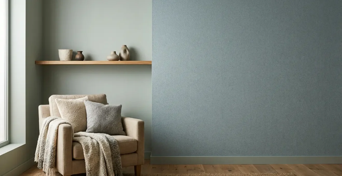
Once you’ve committed to a low-saturation palette, the next crucial decision is hue, most commonly a choice between cool greys and warm beiges. This isn’t just a matter of taste; it’s a strategic choice based on the principles of atmospheric perspective. This artistic concept explains that cool, desaturated colors (like blues and greys) tend to recede into the distance, while warm colors (like reds, oranges, and beiges) appear to advance. In interior design, this means a cool grey can make a wall seem farther away, visually expanding a small space.
A cool, muted grey with blue or green undertones is a master of illusion. It absorbs more light and “pushes” the walls back, creating a sense of airy, open depth. This makes it an excellent choice for smaller rooms or spaces you want to feel more expansive and serene. In contrast, a warm, sandy beige with yellow or pink undertones does the opposite. It advances, making walls feel closer and creating a cozier, more intimate, and enveloping atmosphere. It’s ideal for large, cavernous rooms that you want to feel more snug and welcoming.
The image below illustrates how two identical spaces can feel dramatically different based on this single choice between a cool, receding grey and a warm, advancing beige.
However, this effect is heavily influenced by natural light. North-facing rooms receive cooler, indirect light, which can make a cool grey feel sterile and cold. In these spaces, a warm beige is often better, as its inherent warmth balances the cool light. Conversely, south-facing rooms are flooded with warm, intense light, which can make a beige look overly yellow or even pinkish. Here, a cooler grey helps to neutralize that warmth, creating a more balanced and sophisticated look.
With the right base tone selected, the next challenge is to build a rich, layered scheme that avoids the dreaded pitfall of feeling monotonous or flat.
How to layer 3 shades of the same color without it looking boring?
A common fear with monochromatic muted palettes is that they will result in a boring, one-dimensional space. The key to avoiding this is to create depth and interest not through different colors, but through subtle variations in shade and, more importantly, finish. Layering a single muted hue—like a sophisticated greige or a soft sage—in different sheens is a professional technique for adding richness and complexity. The way a surface interacts with light is just as important as the pigment itself.
Imagine using the same base color in three different forms. First, use an ultra-matte finish on the main walls. Matte paint absorbs light, which makes the color appear deeper and softer, creating a velvety, immersive backdrop. Second, paint the trim, moldings, and doors in the exact same color, but with a satin or eggshell finish. This subtle sheen will catch the light differently, creating a delicate contrast that defines the room’s architecture without introducing a new color. Finally, incorporate accent pieces like a side table, a vase, or a picture frame painted in a semi-gloss or high-gloss lacquer of the same hue. This creates a point of high reflection, a jewel-like accent that adds a touch of luxury and prevents the scheme from feeling flat.
As color expert Kathy Kuo notes in the Homes and Gardens Design Guide, texture plays a parallel role:
Muted colors – like sage, dusty rose, and slate blue – often look great rendered in luxurious textures like velvet, linen, and boucle.
– Kathy Kuo, Homes and Gardens Design Guide
This combination of varied finishes and textures creates a dynamic, multi-sensory experience. The room remains serene and cohesive, but it is filled with subtle details that engage the eye and invite touch. The table below outlines how to strategically apply different finishes for maximum effect.
| Surface Type | Recommended Finish | Visual Effect | Light Interaction |
|---|---|---|---|
| Walls | Ultra-matte | Absorbs light, creates depth | No reflection, pure color |
| Trim/Moldings | Satin/Eggshell | Subtle sheen, defines edges | Soft light bounce |
| Furniture/Accents | Semi-gloss/Lacquer | Creates contrast, adds luxury | High reflection, color appears lighter |
However, all this careful layering can be instantly undone by one common and critical mistake: improper lighting.
The lighting error that turns your beautiful beige wall pink at night
You’ve chosen the perfect, calming beige. During the day, it’s a dream. But at night, under artificial light, it takes on a sickly, pinkish or yellowish cast. This frustrating phenomenon, where colors shift dramatically under different light sources, is a classic example of metamerism. It occurs because the pigment in your paint and the light from your bulbs are an inseparable pair. If the light source is poor, the color perception will be distorted, no matter how expensive the paint.
The culprit is almost always a low Color Rendering Index (CRI) in your lightbulbs. CRI is a scale from 0 to 100 that measures how accurately an artificial light source reveals the true colors of objects compared to natural daylight. Cheap LED or fluorescent bulbs often have a low CRI (sometimes below 80), meaning they emit a very limited spectrum of light. They may appear bright, but they are “missing” certain color wavelengths. When this incomplete light hits your complex beige pigment, it can only reflect the colors that are present in the light, causing an unpredictable and often unpleasant color shift.
To preserve the integrity of your muted palette, investing in high-CRI lighting is not a luxury; it is a necessity. Look for bulbs with a CRI of 90 or higher. As one industry report highlights, using CRI 90+ lighting ensures 90% color accuracy compared to natural sunlight. This guarantees that the soft, earthy beige you fell in love with at the paint store remains that same soft, earthy beige in your living room at 9 PM. It maintains the pigment purity of your design, ensuring the calming atmosphere you’ve worked so hard to create remains consistent day and night. Also, pay attention to the light’s temperature (measured in Kelvins); a warm white (2700K-3000K) is generally best for creating a cozy, relaxing ambiance in living areas.
With color and light in harmony, we can then consider the strategic use of contrast to ground the space and give it definition.
When to add a “punch” of black to anchor a muted palette?
In a soft, low-saturation environment, there is a risk of the space feeling hazy or undefined. While the goal is to reduce visual noise, a complete lack of contrast can make a room feel adrift. This is where a strategic “punch” of black comes in. However, its role is not to add a “pop” of excitement, which would contradict our calming mission. Instead, black serves as an anchor—a grounding element that gives the eye a place to rest and adds structure to the softness.
The key is to use black sparingly and with graphic precision. Think of it not as a color, but as a form of punctuation. Thin, linear elements are most effective. Consider the sharp, clean line of a thin black metal picture frame against a soft greige wall, the dark legs of a minimalist chair, or the slender stem of a modern floor lamp. These elements don’t shout; they define. They create a visual framework that holds the muted colors in place, preventing them from bleeding into one another.
The close-up below demonstrates this principle in action. The sharp, matte black edge provides a textural and tonal contrast that emphasizes the softness of the surrounding muted green, making it appear even more velvety and serene by comparison.
The best time to add this anchor is when your layered palette feels complete but slightly “floaty.” If you step back and your eye wanders without a clear focal point, a touch of black can provide the necessary structure. It adds a sophisticated, intentional quality to the design, clarifying the boundaries between different surfaces and objects. This small dose of high contrast enhances the overall calmness by providing a quiet, stable reference point within the gentle sea of muted tones.
Even with a perfectly balanced and anchored palette, there’s another common error that can leave a home feeling sterile and impersonal.
The “showroom effect” error that makes your home feel cold and uninviting
You have followed all the rules: a perfectly balanced muted palette, sophisticated layering, and high-CRI lighting. Yet, the space feels cold, impersonal, and strangely unlivable. This is the “showroom effect.” It occurs when a design is technically perfect but lacks the human element—the sensory layers that transform a house into a home. A space designed purely for the eyes can feel sterile because we experience our environment with all of our senses. As a foundational study on home decor and stress highlights, “Environmental design plays a major role in reducing stress and anxiety as well as promoting health and well-being.”
This well-being comes from creating a rich, multi-sensory experience that goes beyond color. A muted palette is the canvas, not the entire masterpiece. To combat the showroom effect, you must intentionally engage the other senses: touch, sound, and smell. This is the practice of sensory layering. It’s about adding elements that feel good, sound comforting, and smell familiar. The goal is to create a space that not only looks calm but *feels* calm on a deeper, more visceral level.
This means incorporating a variety of textures: a plush velvet cushion, a chunky knit throw, the cool smoothness of a ceramic vase, and the organic grain of a wooden bowl. It means considering the soundscape: the soft rustle of linen curtains, the quiet hum of an air purifier, or a calming playlist. It means introducing gentle, natural fragrances through essential oil diffusers, beeswax candles, or fresh eucalyptus. And most importantly, it means displaying personal items—photographs, treasured books, and handmade objects—that tell your story. These imperfect, personal touches are what breathe life and warmth into a muted scheme, making it uniquely yours.
Action Plan: Overcoming the “Showroom Effect”
- Scent the Space: Introduce comforting fragrances. Use essential oils like lavender or sandalwood, burn natural candles, or place fresh herbs like rosemary in a vase to create a signature scent for your home.
- Curate a Soundscape: Add soft background noise. Consider a white noise machine, a small indoor water feature, or create a playlist of calming, instrumental music to buffer jarring outside sounds.
- Layer Tactile Fabrics: Focus on touch. Layer plush, soft, and natural fabrics throughout the room. Think velvet cushions, a faux fur throw on a chair, and a soft wool rug underfoot.
- Display with Personality: Showcase your life. Arrange personal photographs, travel mementos, and meaningful art at varying heights on shelves and walls. Mix new items with vintage or handmade pieces that have history and visible imperfections.
- Integrate Natural Elements: Bring the outside in. Add houseplants with interesting leaf shapes, a vase of fresh flowers, or a bowl of smooth river stones or pinecones to connect the space to the natural world.
The strategic use of texture is so powerful that it deserves its own dedicated focus, especially when working with the ultimate muted canvas: a white room.
How to layer 3 different textures to warm up a white room instantly?
A white room is the ultimate muted canvas, but it’s also the most susceptible to feeling cold and clinical. The most effective way to infuse it with warmth and personality is through a deliberate and dramatic layering of textures. The goal is to create a symphony of tactile sensations that engage the senses and add visual weight, preventing the white from feeling flat. A simple and powerful framework is to layer three distinct categories of texture: a hard natural element, a soft woven fabric, and a plush comfort material.
First, introduce a hard natural texture to ground the space. This provides a solid, organic foundation. Materials like a raw wood coffee table, a rattan armchair, a slate coaster, or a large stone planter bring an element of the outdoors inside. Their cool, smooth, and sometimes rough surfaces offer a strong contrast to the softness of a typical living space and add a sense of permanence and stability.
Next, layer in soft woven textures for balance and structure. These are the everyday fabrics that make a room functional and comfortable. Think of linen curtains that diffuse light beautifully, a jute or sisal rug that adds natural roughness underfoot, or cotton throw pillows with a visible weave. These materials are breathable and structured, adding a layer of medium visual weight that bridges the gap between the hard and plush elements.
Finally, add a plush comfort texture as the top layer. This is the invitation to touch and relax. Materials like a bouclé sofa, a sheepskin throw draped over a chair, or a deep-pile velvet cushion are irresistibly cozy. Their primary role is to add a sense of luxurious softness and warmth. These light, inviting textures are what make a room feel truly comfortable and lived-in. The following table provides a quick reference for combining these categories.
| Texture Category | Material Options | Visual Weight | Tactile Quality |
|---|---|---|---|
| Hard Natural | Wood, Stone, Rattan | Heavy/Grounding | Cool, Smooth |
| Soft Woven | Linen, Cotton, Jute | Medium/Balanced | Breathable, Structured |
| Plush Comfort | Velvet, Bouclé, Sheepskin | Light/Inviting | Warm, Cozy |
For those looking to take textural layering to the next level, there is one final technique that combines color, texture, and practicality in a single application.
Key Takeaways
- True calm comes from reducing “visual noise”—a function of a color’s saturation and its interaction with light, not just its hue.
- Monochromatic palettes gain depth by layering different finishes (matte, satin, gloss) of the same color, which manipulates light reflection.
- The Color Rendering Index (CRI) of your lightbulbs is critical; low-CRI lighting will distort even the most perfectly chosen muted color.
Textured Wallpapers: Creating Visual Depth and masking Wall Defects
For the ultimate fusion of color and texture, textured wallpaper offers a sophisticated and highly effective solution. Unlike flat paint, these wallpapers bring a tangible, three-dimensional quality to your walls, creating a level of visual depth that is impossible to achieve with color alone. Materials like grasscloth, linen, cork, or paintable embossed papers add a subtle pattern and tactility that can instantly elevate a muted color scheme from simple to luxurious.
One of the greatest advantages of textured wallpaper is its ability to create a dynamic play of light and shadow across the wall surface. A grasscloth wall, for example, will catch the light in thousands of different ways throughout the day, its appearance subtly shifting and adding a sense of life and movement to the room. This inherent texture is a powerful tool for making a space feel warmer and more enveloping, wrapping the room in a soft, tactile layer.
Beyond aesthetics, textured wallpapers serve a highly practical purpose: they are brilliant at masking minor wall imperfections. Older homes with uneven plaster, small cracks, or previous repairs can be challenging to paint, as a flat finish can highlight these flaws. A textured wallpaper, particularly an embossed or “paintable” variety, provides a uniform surface that effectively conceals these defects. You can then paint over it with your chosen muted hue, achieving the perfect color while benefiting from a flawless, texturally rich finish. This dual-functionality makes it an incredibly smart investment for both aesthetic depth and practical problem-solving.
By understanding the interplay of saturation, light, texture, and personal touches, you can move beyond simply decorating and begin to actively curate a home that serves as a true sanctuary for a quiet mind. Start today by analyzing a single room—not for what color to paint it, but for how the light falls and what sensory experiences it lacks.