
Contrary to popular belief, selecting a statement light fixture is not a matter of taste, but a technical discipline of curating scale, color, and shadow to sculpt a room’s atmosphere.
- The “Rule of 12” provides a mathematical starting point for a fixture’s diameter, ensuring it is proportional to the space.
- Harmony is achieved not by matching, but by balancing finishes with the 70-20-10 rule and creating a “chromatic dialogue” between bulb temperature and interior materials.
Recommendation: Treat your lighting plan as an architectural element. Test every aspect, from shadow patterns to sightlines, before installation to ensure the fixture enhances, rather than overwhelms, your design.
For a designer, the final 10% of a project is where a space transcends from being well-decorated to being truly memorable. This is the realm of the “jewelry” of the room—those final, transformative touches. And no element serves this role more powerfully than a sculptural light fixture. Yet, the common approach often falls short, focusing on finding a “pretty” object or simply matching finishes. This reduces a potentially dynamic element to a passive decoration.
The true potential of statement lighting is often missed. We discuss size in generic terms and fear mixing metals, leading to safe but sterile environments. We select bulbs as an afterthought, ignoring their profound impact on the texture and mood of our carefully chosen materials. This process overlooks the fundamental power of light as a medium in itself—a tool for sculpting space, directing focus, and crafting an emotional landscape.
But what if the key wasn’t finding a fixture that fits in, but one that actively defines the space? This guide moves beyond the platitudes of style-matching. We will treat the selection of sculptural lighting as an act of curation. It’s a process rooted in principles of proportion, material harmony, chromatic dialogue, and even the deliberate choreography of shadows. It’s about understanding that the fixture is not just an object, but the source of an essential architectural material: light itself.
This article will provide a framework of professional rules and considerations. We will explore how to master scale, mix metals with confidence, select the perfect color temperature for your finishes, and use light to create intimacy and drama. Prepare to see your fixtures not as accessories, but as the primary tool for shaping the experience of a room.
Summary: Sculptural Lighting: A Curator’s Framework for Defining Space
- The “Rule of 12” for sizing a chandelier so it doesn’t look tiny
- How to mix brass and chrome fixtures without it looking like a mistake?
- 3000K vs. 4000K: which bulb temperature flatters your interior finishes best?
- The shadow effect: why you must test a perforated fixture before installing it?
- How high to hang a foyer chandelier to avoid head bumps and visual clutter?
- Why reliance on overhead lights kills the intimate atmosphere of a room?
- How to choose a pendant that doesn’t block the view across the room?
- Dimmer Switches: Transforming Room Atmosphere and Saving Energy
The “Rule of 12” for sizing a chandelier so it doesn’t look tiny
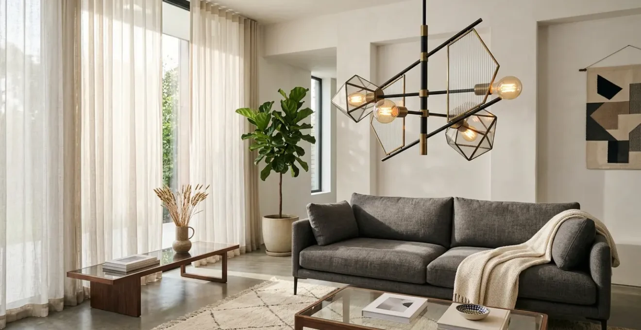
The single most common misstep in selecting a statement fixture is a failure of scale. A piece that feels grand in a showroom can shrink into insignificance in a large room, while an oversized fixture can oppress a smaller space. To move from guesswork to precision, designers rely on a foundational guideline known as the “Rule of 12”. This simple formula provides a mathematical starting point for determining the ideal diameter of a chandelier, ensuring its proportions are in harmony with the room’s dimensions.
The calculation is straightforward: measure the length and width of the room in feet, add those two numbers together, and the sum is the ideal diameter for your fixture in inches. For example, a room that is 14 feet wide and 16 feet long (14 + 16 = 30) calls for a chandelier with a diameter of approximately 30 inches. This rule establishes a baseline of proportional balance, preventing the fixture from appearing lost or comically small. As a detailed guide on statement lighting notes, this first step is crucial for how the fixture will illuminate and elevate your home.
However, this rule is a starting point, not an absolute. The concept of visual weight is equally important. An airy, open-frame fixture made of thin metal or glass can often be 10-15% larger than the rule suggests without overwhelming the space. Conversely, a dense, heavy-looking fixture with solid shades or a complex, busy structure might need to be 10-15% smaller to avoid feeling visually cluttered. For rooms with ceilings over 10 feet, add approximately 3 inches to the diameter for each additional foot of height to maintain presence in the expanded vertical volume. Mastering this interplay between mathematical proportion and perceived mass is the first step in curating light like an expert.
How to mix brass and chrome fixtures without it looking like a mistake?
The fear of mixing metal finishes often leads designers to create “matchy-matchy” spaces that lack depth and character. The belief that all fixtures, hardware, and accents must share the same finish is a design myth. In reality, a curated mix of metals like brass and chrome can add a layer of sophistication and visual interest. The secret isn’t in avoiding the mix, but in controlling it with a clear and intentional strategy. The most effective method is the 70-20-10 rule, a proportional approach that ensures harmony over chaos.
This principle dictates a hierarchy of finishes. First, establish a dominant metal, which will comprise about 70% of the metallic elements in the room. This is typically used for the main architectural elements and the largest light fixture. Next, introduce a subordinate metal for about 20% of the finishes, often used for accent lighting, faucets, or smaller hardware to provide contrast. Finally, a third metal can be used for the remaining 10% in small details like cabinet knobs or picture frames, adding a final touch of complexity.
To unify this scheme, consider two key tactics. The first is to incorporate a “bridge” element—a single light fixture or piece of furniture that naturally contains two or three of the chosen metals. This piece explicitly tells the story of your metallic palette. The second, and perhaps more subtle, is to match textures. A brushed brass fixture will coexist more peacefully with a brushed nickel accent than with a polished chrome one. As noted by design professionals, layering fixtures effectively is key to a balanced room. The table below illustrates common successful pairings.
| Primary Metal | Compatible Secondary | Bridge Element | Success Rate |
|---|---|---|---|
| Brushed Brass | Matte Black | Mixed metal fixture | 95% |
| Polished Chrome | Brushed Nickel | Shared texture | 90% |
| Antique Bronze | Warm Brass | Warm undertones | 88% |
| Matte Black | Any Metal | Neutral bridge | 98% |
3000K vs. 4000K: which bulb temperature flatters your interior finishes best?
A sculptural fixture is only half of the equation; the bulb within it is the other half. The choice of bulb, specifically its color temperature measured in Kelvin (K), is a critical curatorial decision that creates a chromatic dialogue with the room’s finishes. A common mistake is to select a temperature without considering the materials it will illuminate. A 4000K bulb that looks crisp and clean in a contemporary gallery can make warm wood tones appear sallow and lifeless. Conversely, a warm 2700K bulb can make cool gray marble look muddy.
Generally, warmer temperatures like 2700K are excellent for enhancing the richness of materials like oak, walnut, and cherry wood, creating a cozy, inviting atmosphere. A neutral 3000K is often the most versatile choice, providing a clean white light that works well in transitional spaces with mixed materials. For cooler palettes, like rooms with white walls, concrete, or blue-toned marble, a 3500K or 4000K bulb will accentuate their crispness and modern feel. Beyond Kelvin, the Color Rendering Index (CRI) is paramount. For a high-end design where color accuracy matters, lighting experts recommend a minimum CRI of 95+ to ensure that textiles, woods, and art are rendered truly and vibrantly.
The image below illustrates how drastically different color temperatures can alter the perception of the exact same materials, transforming the mood from warm and intimate to cool and energizing.
Ultimately, the most sophisticated solution for a sculptural piece is a dim-to-warm LED. These bulbs mimic the behavior of incandescent lighting, gradually shifting from a neutral 3000K at full brightness to a very warm 2200K when dimmed. This provides ultimate flexibility, allowing the fixture to provide clean, functional light during the day and a soft, intimate glow in the evening, adapting the room’s emotional landscape on command.
The shadow effect: why you must test a perforated fixture before installing it?
When selecting a fixture that is perforated, woven, or has a complex geometric structure, designers often focus solely on the object itself and the light it emits. They overlook its third, equally important output: the shadows it casts. This “shadow effect” is not a side effect; it is a powerful design element that can either enhance or destroy a room’s ambiance. Unforeseen, busy patterns projected across walls and ceilings can create visual clutter, while a thoughtfully chosen pattern can add texture, depth, and a dynamic, sculptural quality to the space. Therefore, testing the shadow play of a perforated fixture is a non-negotiable step in the curation process.
The character of the shadow depends on the size and density of the fixture’s openings, its material, and the type of bulb used. A point-source bulb (like a clear filament LED) will create sharp, defined shadows, while a frosted bulb will produce softer, more diffuse patterns. The projected shadows can become an intentional part of the design narrative, creating a dappled light effect reminiscent of sunlight through leaves or casting dramatic geometric shapes that animate a plain wall. However, if not tested, these same patterns can create a moiré effect with wallpaper, cast unflattering shadows on faces in a dining area, or make a serene space feel chaotic.
The goal is to engage in a deliberate choreography of shadows. Before committing to installation, especially for a significant investment, it’s essential to mock up the effect. This allows you to control the narrative the shadows will tell, ensuring they contribute positively to the room’s emotional landscape rather than introducing unintended visual noise.
Action Plan: Testing the Shadow Effect Before Installation
- Mock-up & Projection: Create a cardboard template mimicking the fixture’s perforations and use a smartphone flashlight held at the proposed installation distance to project the pattern onto walls.
- Contextual Check: Observe the projected shadows at different times of day and in the evening to see how they interact with natural light and other fixtures. Check for jarring moiré effects with existing patterns in wallpaper or textiles.
- Dimming Simulation: Test the shadow’s appearance and intensity with both direct and dimmed light levels. Notice how the pattern softens or sharpens, as this will be part of its daily performance.
- Visual Documentation: Photograph the shadow patterns from key viewpoints within the room. This documentation is crucial for comparing different fixture options or placement heights.
- Placement Review: Before the final installation, confirm the chosen height and position won’t cast undesirable shadows on primary task areas (like a kitchen island) or on people’s faces when seated.
How high to hang a foyer chandelier to avoid head bumps and visual clutter?
The foyer or entryway presents a unique lighting challenge. It’s often a space with high ceilings and multiple viewing angles—from the front door, from an upper-level landing, and from adjacent rooms. Hanging a sculptural chandelier here is not just about illumination; it’s about creating a dramatic first impression. The correct height is a delicate balance between making a statement, ensuring practical clearance, and composing a beautiful view from all sightlines.
As a rule of thumb for clearance, the bottom of the fixture should be at least 7 feet from the floor. This ensures even the tallest guests can pass underneath without feeling crowded or needing to duck. For foyers with a second-story landing, the primary compositional goal is to position the fixture so its center is visible from that upper level, rather than having the viewer look down on its top. In a single-story foyer, a common guideline from design experts is to hang chandeliers so the bottom is 30-36 inches above the top trim of the front door. This creates a pleasing visual connection to the architecture.
The illustration shows an ideal placement in a two-story foyer. The chandelier is high enough for clearance but low enough to be a focal point from the entry and a beautiful object when viewed from the second-floor landing, acting as a lynchpin that connects both levels.
Ultimately, the final decision should be made after considering all perspectives. Before installation, have someone hold the fixture at the proposed height while you view it from the front door, from the top and bottom of the staircase, and from the entrances to any adjoining rooms. This multi-angle check ensures the chandelier is not just a light, but a perfectly composed sculpture in space, free of visual clutter and creating an immediate sense of arrival and wonder.
Why reliance on overhead lights kills the intimate atmosphere of a room?
A room lit solely by a central overhead fixture—no matter how beautiful—will almost always feel flat, harsh, and devoid of intimacy. This “top-down” lighting strategy creates a uniform, shadowless environment that is functional for a utility space but disastrous for a living room, dining room, or bedroom where atmosphere is key. The harsh glare and lack of nuance are the antithesis of a curated emotional landscape. True atmospheric design comes from layered lighting, a technique that mimics the complexity of natural light by using multiple sources at different heights and intensities.
Inspired by museum and stage design, this approach divides lighting into three distinct roles. Ambient light provides the general, overall illumination for the room, which can come from a central sculptural piece or recessed lighting. Task lighting is focused and directional, illuminating specific activities like reading in a chair or chopping vegetables on a counter. Finally, accent lighting is used to draw the eye, highlighting architectural features, artwork, or creating pools of interest. A successful scheme, as detailed by guides on home lighting, integrates all three to build a rich, inviting, and functional space.
An effective way to conceptualize this is the “campfire effect.” Humans are evolutionarily drawn to light sources that are at or below eye level, which create a sense of community and safety. You can replicate this by surrounding a primary seating area with several light sources at varying heights: a floor lamp in one corner, a table lamp next to a sofa, and wall sconces to provide a soft perimeter glow. The central overhead fixture, your sculptural piece, then acts as the “moonlight,” providing a general, often dimmed, ambient wash over the entire scene. This strategy of using 3-5 light sources per room creates pockets of intimacy and visual interest, inviting people in rather than putting them on stage.
How to choose a pendant that doesn’t block the view across the room?
In open-plan spaces, over a kitchen island, or in a room with a prized window view, a sculptural pendant must make a statement without creating a visual roadblock. The goal is to add an artistic element to the space while preserving sightlines and maintaining a sense of openness. This requires a careful selection of fixtures based on their visual permeability—their ability to be seen without obstructing the view through and beyond them. Choosing the right form is a strategic decision that balances presence with transparency.
Fixtures with high visual permeability often feature “ghostly” or open-frame designs. A pendant made of clear glass or acrylic, for example, defines a shape in space but allows the eye to travel right through it. Similarly, wire-frame fixtures or those composed of thin, linear elements create a strong sculptural presence while feeling light and airy. An open ring or rectangular pendant can be particularly effective, acting as a frame for the view beyond it rather than a barrier. This approach favors rhythm and suggestion over a solid, dominant mass.
Conversely, a large, single pendant with a solid or opaque shade will have the highest visual impact but also the greatest view obstruction. This is not necessarily a negative—it is a powerful choice for defining a zone, such as anchoring a dining table in a large, open room. The key is intentionality. The decision should be based on whether the primary design goal is to create a dominant focal point or to add a layer of sculptural detail while celebrating the surrounding space. The following table provides a hierarchy of fixture types based on their typical impact on sightlines.
| Fixture Type | View Obstruction | Best Application | Visual Impact |
|---|---|---|---|
| Open Ring/Rectangle | 5% | Framing views/art | High |
| Glass/Acrylic Ghost | 10% | Minimal barrier | Medium |
| Wire Frame | 15% | Sculptural presence | High |
| Multiple Small Pendants | 20% | Rhythm creation | Dynamic |
| Single Large Pendant | 40% | Statement focal point | Dominant |
Key Takeaways
- Scale is non-negotiable: Use the “Rule of 12” as a baseline for diameter, then adjust for visual weight and ceiling height to ensure perfect proportion.
- Light is a material: The bulb’s color temperature (Kelvin) and CRI create a dialogue with your finishes; choose it as deliberately as you choose paint.
- Curate the entire scene: A single statement piece fails without layered lighting (ambient, task, accent) and the ultimate control of a dimmer system.
Dimmer Switches: Transforming Room Atmosphere and Saving Energy
A sculptural light fixture without a dimmer switch is a missed opportunity—like having a high-performance car stuck in first gear. Dimmers are the final and most crucial element of control, transforming a static object into a dynamic tool for shaping a room’s atmosphere. They are the instruments that allow a designer to conduct the emotional landscape of a space, shifting it from bright and functional to intimate and dramatic with a simple touch. This ability to modulate intensity is what truly brings a layered lighting scheme to life.
The impact is profound. By dimming the main fixture to 60% and accent lights to 40%, you can create the perfect “Dinner Party” scene. For focused work, the task lighting can go to 100% while ambient light drops to 30%. A “Movie Night” might call for the main fixture to be at a mere 10% glow, with perimeter sconces at 20% to provide a soft, cinematic boundary. With modern smart systems, these scenes can be pre-programmed and recalled instantly, giving the user effortless control over the mood. As an added benefit, dimmers are energy-efficient; since LEDs are most efficient at lower power, dimming fixtures can significantly reduce electricity consumption.
However, compatibility is key. Not all dimmers work with all LED fixtures. It’s essential to match the dimmer type (such as ELV, MLV, or 0-10V) to the specifications of the fixture’s LED driver. A mismatch can result in flickering, buzzing, or a limited dimming range, completely undermining the desired effect. For the ultimate in atmospheric control, “dim-to-warm” technology is the gold standard. These advanced fixtures not only reduce brightness but also warm the color temperature as they dim (e.g., from 3000K to 2200K), perfectly mimicking the intimate glow of an incandescent bulb or candlelight. This makes the dimmer not just a control, but a transformative tool for atmosphere.
By treating each fixture as a deliberate act of curation—grounded in the principles of scale, material harmony, color, shadow, and layering—you elevate lighting from a mere utility to an art form. The result is a space that is not just illuminated, but alive with a carefully composed narrative and a distinct emotional character. To put these concepts into practice, the next logical step is to begin auditing your current or planned spaces against this professional framework.