
In summary:
- Your home’s constant traffic jams are not due to lack of space, but poor “kinetic ergonomics”—the science of movement in a confined area.
- The solution is to stop guessing and start measuring: identify invisible “desire lines,” maintain specific clearance widths, and prioritize pathways over storage.
- Choose furniture designed to prevent collisions (recessed legs, rounded corners) and test layouts with tape or cardboard before committing.
- By treating your home like a dynamic system, not a static floor plan, you can engineer a smooth, collision-free environment for your family.
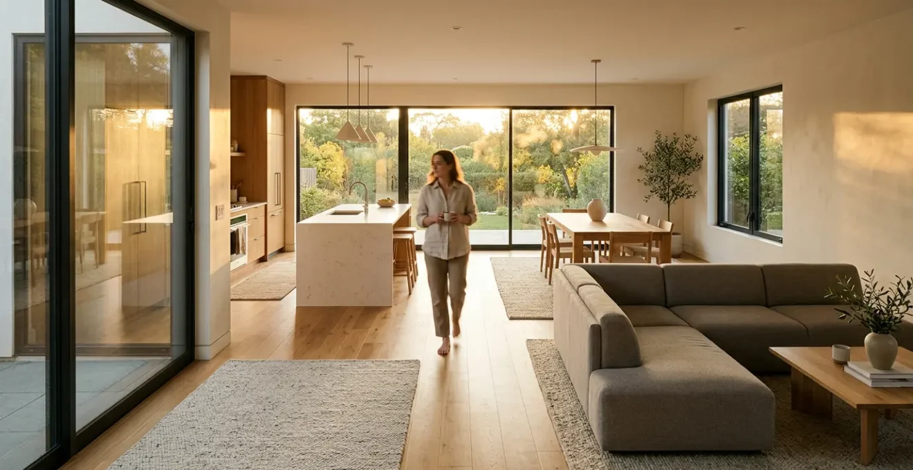
That feeling of constantly bumping into family members in the hallway, or the frustrating dance around the kitchen island during the morning rush, is a common reality in busy households. Many assume the problem is a lack of square footage or poorly chosen furniture. We add storage, buy smaller tables, and still, the house feels like a series of frustrating bottlenecks. The conventional wisdom tells us to create “open spaces,” but this often leads to vast, undefined rooms that are just as chaotic.
The issue runs deeper than simple decor. It’s about a fundamental misunderstanding of how we move. We often arrange our homes for how they look when empty, not for how they function when filled with people in motion. This leads to placing furniture directly in the path of natural, efficient routes—the invisible cow paths we instinctively create to get from point A to point B.
But what if the solution wasn’t about adding more space, but about understanding the physics of movement within the space you already have? The key is to shift your perspective from interior design to kinetic ergonomics. Instead of just placing furniture, you will learn to map your home’s “desire lines” and engineer a layout that guides movement, reduces friction, and eliminates those daily collisions before they happen. This isn’t about guesswork; it’s about a logical, safety-conscious approach to reclaiming your home’s flow.
This guide provides a systematic approach to diagnosing and solving traffic flow issues. We will move from understanding the core problems to implementing practical, data-driven solutions, transforming your home from a source of friction into a space of fluid movement.
Summary: A Strategic Guide to Unclogging Your Home’s Arteries
- Why your kitchen feels crowded even when empty of furniture?
- How to calculate the exact clearance needed between sofa and coffee table?
- Walkway width vs. storage depth: which should you sacrifice in a narrow room?
- The mistake of placing furniture across natural “desire lines” in your home
- In what order should you map out traffic paths before buying large rugs?
- Traffic flow vs. storage: which priority matters more in narrow spaces?
- The “shin buster” error: why leg placement matters for traffic flow
- Functional Floor Plan: Rethinking Your Home’s Architecture for Modern Living
Why your kitchen feels crowded even when empty of furniture?
The kitchen is often the heart of the home, but it’s also a primary zone for traffic congestion. The feeling of being crowded, even in a seemingly spacious kitchen, rarely comes from the furniture itself but from the “negative space”—the pathways between counters, islands, and appliances. This is where the principles of a professional kitchen workflow become essential in a residential setting. A kitchen isn’t just a room; it’s a workspace with distinct zones for prepping, cooking, and cleaning. When these zones are poorly laid out, paths cross, and bottlenecks form.
The core issue is insufficient clearance. Design standards are not arbitrary; they are based on the ergonomics of human movement. For example, according to kitchen design experts, you need a minimum of 36-48 inches of clearance around kitchen islands to allow for comfortable passage and for appliance doors (like a dishwasher or oven) to open without blocking the entire walkway. When this space is compromised, even by a few inches, the entire room’s flow breaks down.
Think of your kitchen’s main pathways as arteries. The route from the refrigerator to the sink, and then to the stove, forms a classic “work triangle.” If a trash can, a kitchen cart, or even a poorly placed rug obstructs this triangle, you introduce unnecessary friction. This forces detours, awkward turns, and the inevitable “excuse me” shuffle. The goal is to create a layout where movement is intuitive and unimpeded, allowing for multiple people to work or pass through without collision. It’s about designing for the dynamic reality of a busy family, not for a static showroom photo.
How to calculate the exact clearance needed between sofa and coffee table?
Moving from the kitchen to the living room, the same principles of kinetic ergonomics apply, but the measurements change. The space between a sofa and a coffee table is one of the most common “friction points” in a home. Too little space, and you have a shin-level obstacle course. Too much space, and the table becomes useless, out of reach for setting down a drink or a book. Calculating this distance isn’t a matter of aesthetics alone; it’s about balancing functionality with safe and comfortable movement.
The ideal clearance depends on the path’s function. Is it a primary walkway used to cross the room, or just a space for your legs when seated? A common mistake is applying a single measurement to all gaps. Path prioritization is key. A major thoroughfare requires significantly more space than a secondary path. For the gap between a sofa and coffee table, the absolute minimum is typically 14-18 inches, which allows just enough room for your legs and for a person to pass sideways. However, if this area serves as a main circulation route, this distance becomes dangerously inadequate.
To determine the right clearance, you must analyze the room’s flow. A comprehensive set of guidelines can provide a data-driven starting point for your layout. The following table breaks down clearance recommendations based on the type of activity and movement required in the space.
| Activity Type | Minimum Clearance | Recommended Clearance | Use Case |
|---|---|---|---|
| Secondary Paths | 18 inches | 24 inches | Occasional movement |
| Main Walkways | 30 inches | 36 inches | Primary circulation routes |
| Pass-Through Areas | 36 inches | 42 inches | Two people passing |
| Behind Seated Guests | 36 inches | 48 inches | Walking behind chairs |
By using this matrix, you can move from guessing to making informed, logical decisions. Measure your current layout against these standards. If the path in front of your sofa is a main walkway to a balcony or another room, aiming for the 30- to 36-inch recommendation will instantly improve the room’s flow and perceived space. This isn’t about losing usable area; it’s about making the entire room more functional and safe.
Walkway width vs. storage depth: which should you sacrifice in a narrow room?
In narrow spaces like hallways, entryways, or long, thin rooms, the ultimate conflict arises: walkway width versus storage depth. The desire for more storage often leads to a critical error: installing deep bookshelves or consoles that shrink the primary circulation path to an uncomfortable squeeze. This decision must be governed by a strict rule: flow almost always trumps storage. A cluttered-looking but easily navigable hallway is functionally superior to a sleek, minimalist passage that’s too narrow for two people to pass comfortably.
Interior design experts recommend a minimum of 2-3 feet (24-36 inches) of clear space for a functional walkway. The 36-inch standard is the gold standard for main arteries, as it allows two people to pass one another without turning sideways and accommodates tasks like carrying laundry baskets or groceries. Sacrificing this width for a few extra inches of shelf depth creates a permanent bottleneck that impacts the home’s usability every single day. The frustration of these “squeeze points” far outweighs the benefit of slightly deeper storage.
The solution in a narrow room is not to compromise the walkway, but to rethink the nature of storage itself. Instead of deep furniture, think vertical. This is where clever design can resolve the conflict. Tall, shallow storage units that extend to the ceiling maximize storage volume without encroaching on precious floor space. This maintains the critical walkway width while still providing ample room for essentials.
spatial efficiency > movement freedom.”/>
As this image demonstrates, using the vertical plane is the key to escaping the walkway-versus-storage dilemma. Floor-to-ceiling built-ins or tall, slim cabinets create an “escape route” for your storage needs, preserving the integrity of the home’s primary circulation paths. Before adding any furniture to a narrow space, mark a 36-inch pathway on the floor with painter’s tape. Any storage solution you consider must fit outside this line.
The mistake of placing furniture across natural “desire lines” in your home
Perhaps the single most significant error in home layout is ignoring “desire lines.” This term, borrowed from urban planning, describes the paths people naturally choose to take between two points, regardless of the designated walkways. In your home, this is the straight line from the front door to the kitchen, the worn patch of carpet from the sofa to the bathroom, or the diagonal cut across the living room to get to the back door. Placing a chair, a plant, or the corner of a sofa directly on one of these lines creates a constant, low-grade source of friction and frustration.
You are essentially building a dam in the middle of a river. People will still try to follow the path of least resistance, leading to awkward maneuvering, accidental bumps, and a feeling that the room is working against them. Identifying these invisible pathways is the first step toward a truly ergonomic layout. It requires observation, not just measurement. Watch how your family moves during the busiest times of day. Where do they cut corners? Where do scuff marks appear on walls? These are the clues to your home’s true circulatory system.
Case Study: Casino Traffic Flow Mastery
Commercial spaces like casinos are masters of orchestrating human movement. As noted in an analysis of traffic flow in public spaces, casinos use strategically placed furniture and zonal planning not to block, but to guide patrons along specific paths. Seating at gaming tables and the layout of slot machine banks create clear, intuitive walkways. This ensures a logical flow of traffic, prevents congestion, and maintains unobstructed emergency exits. This demonstrates how intentional furniture placement can control and optimize human movement patterns, a principle directly applicable to a busy family home.
To design with your home’s desire lines, you must first make them visible. Once you know where the main currents of movement are, you can arrange your furniture to create channels that respect and facilitate this natural flow, rather than obstructing it. The following checklist provides a practical method for diagnosing your home’s hidden pathways.
Action Plan: Revealing Your Home’s Invisible Desire Lines
- Observe Wear Patterns: Inspect rugs and high-traffic flooring for areas that show more wear. These are your primary arteries.
- Check for Scuff Marks: Look for marks or fingerprints on walls, especially at corners and in tight passages where people brush against them.
- Map Morning Rush Paths: Track the movement of every family member during the 15 busiest minutes of the morning. Draw these lines on a floor plan.
- Note Accumulation Points: Identify where keys, bags, mail, and shoes naturally accumulate. These are “pause points” that should be kept clear of primary traffic.
- Perform the Laundry Basket Test: Carry a full laundry basket through your most common routes. If you have to turn sideways or maneuver carefully, you’ve found a bottleneck.
In what order should you map out traffic paths before buying large rugs?
A large area rug can define a space, add warmth, and absorb sound, but it can also be a major traffic flow disruptor if chosen or placed incorrectly. A common mistake is to buy a rug based on the room’s dimensions and then try to arrange furniture and pathways around it. This is a backward approach. The rug should serve the layout; the layout should not be compromised by the rug. The correct sequence is to define your traffic paths first, position your furniture second, and only then determine the ideal rug size and placement.
Think of a rug as creating an “island” in your room. Your main traffic arteries—the desire lines you identified—must flow freely around this island, not be forced to cross it. A rug that extends into a major walkway can become a tripping hazard and visually clutter the path. As a rule of thumb, there should be a clear border of flooring visible between the edge of the rug and the wall in any high-traffic area. This border acts as a dedicated walkway. A clearance of at least 18 inches is recommended for these pathways.
The best way to avoid a costly mistake is to “audition” your rug size and placement before you buy. Using painter’s tape to outline the potential rug on the floor is a simple but incredibly effective technique. This allows you to live with the proposed layout for a day or two and test it against your family’s natural movement patterns. Does the tape force you to take an awkward detour? Do you find yourself cutting across the corner? This real-world test provides invaluable data.
practical demonstration > minimalist clarity.”/>
This image perfectly illustrates the method. The painter’s tape creates a clear boundary, allowing you to visualize not just the rug, but the negative space around it—the critical pathways. By following a logical sequence, you ensure the rug becomes a functional destination for a seating area, not an obstacle in a circulation route.
Your Roadmap: The Proper Sequence for Rug Planning
- Step 1: Map Major Arteries: First, identify and mark the primary traffic arteries that pass through the room using your desire line analysis.
- Step 2: Position Primary Furniture: Arrange your main seating pieces (sofas, chairs) to create a functional zone, respecting the major arteries.
- Step 3: Tape the Boundaries: Use painter’s tape to mark the potential rug boundaries on the floor, ensuring it anchors the seating area.
- Step 4: Live with the Layout: Leave the tape in place for at least 48 hours to test the flow during different times of the day.
- Step 5: Verify Your Borders: Ensure the edge of the taped “rug” is at least 18 inches away from walls in any area that serves as a traffic path.
Traffic flow vs. storage: which priority matters more in narrow spaces?
We’ve established that flow generally trumps storage, but in the tightest spaces, the decision becomes more nuanced. When every inch counts, the choice isn’t just *if* you should sacrifice one for the other, but *when*. The deciding factor should be the frequency and type of use. Not all pathways and not all storage needs are created equal. A logical framework is needed to make the right trade-off.
Start by categorizing your pathways. Is it a primary, daily-use artery like the main hallway, or a secondary, occasional-use path like the space on one side of a guest bed? Primary arteries require uncompromising clearance. The National Kitchen and Bath Association (NKBA) guidelines, for instance, recommend a robust 42-48 inches between a kitchen island and countertops to accommodate multiple users and open appliances. While this is a kitchen-specific rule, the principle of protecting high-frequency work zones is universal. In a hallway, this translates to maintaining a 36-inch minimum at all costs.
For secondary paths, however, you have more flexibility. The side of a bed that is not on the direct path to the bathroom can be reduced to 24 inches to allow for a deeper dresser. The key is to analyze the peak traffic times. A hallway might seem fine most of the day, but if it becomes a major bottleneck for 15 minutes every morning as the whole family gets ready, then its flow priority is extremely high. The “One-Trip Test” is an excellent real-world diagnostic: if you can’t carry a full laundry basket through the space without turning sideways, the path is too narrow for its function. This simple test cuts through theoretical measurements and gives you a practical, pass/fail result.
The “shin buster” error: why leg placement matters for traffic flow
Sometimes, the biggest improvements to traffic flow come from the smallest details. We can map desire lines and measure clearances perfectly, but if the furniture itself is a physical hazard, we will still have friction. This brings us to the “shin buster” error: selecting furniture with legs or corners that protrude, creating micro-obstacles right at shin and knee height. It’s a design flaw that turns a clear path into a minefield of painful collisions.
The problem lies with furniture whose legs are flush with its corners or edges. Coffee tables with sharp corners and four distinct legs, bed frames with protruding footboards, or dining chairs whose legs splay outward are common culprits. When navigating a tight space, our bodies anticipate the main surface of the furniture, but not these nearly invisible protrusions. This is why pedestal bases for tables and recessed or inset legs for consoles and sofas are ergonomically superior. They create a natural “toe-kick” space, allowing your feet to pass underneath the edge of the furniture, which dramatically reduces the chance of collision.
Coworking spaces like WeWork are a great example of this principle in action. They must accommodate high traffic in dense, multi-functional environments. They specifically choose furniture with rounded corners and recessed legs to minimize collision points and improve flow in tight areas. This selection of safety-conscious furniture is a key part of their strategy for creating versatile, efficient layouts. You can apply the same logic at home. When shopping for new furniture, run your hand along the edge and bottom. Do the legs stick out? Is there space for your toes to pass underneath? A piece of furniture that is 3 inches narrower but has protruding legs is often more of an obstacle than a wider piece with an inset base.
Your Checklist: Identifying and Eliminating Shin Busters
- Scan for Protrusions: Look for any furniture legs that extend beyond the main surface or edge of the piece.
- Assess Bed Frames: Favor bed frames with rounded corners or designs where the footboard and side rails are recessed from the mattress edge.
- Check Dining Chairs: Choose chairs that can be tucked fully under the table, ensuring their legs do not splay out into the walkway when pushed in.
- Favor Pedestal Bases: When possible, select coffee tables and dining tables with a central pedestal base instead of corner legs.
- Inspect Console Tables: Look for console or entry tables where the legs are inset at least 2-3 inches from the front edge.
Key Takeaways
- Effective traffic flow is not about having more space, but about understanding and designing for human movement (kinetic ergonomics).
- Prioritize clear pathways over storage depth in narrow areas. A 36-inch walkway is the gold standard for main arteries.
- Identify and map your family’s “desire lines” (natural paths) and arrange furniture to support, not obstruct, these routes.
Functional Floor Plan: Rethinking Your Home’s Architecture for Modern Living
Optimizing traffic flow ultimately involves more than just rearranging furniture; it’s about rethinking the functional architecture of your home. The previous steps provide the tools to diagnose and fix individual bottlenecks. The final step is to integrate these lessons into a holistic vision for how your spaces are used throughout the day. A room is rarely single-purpose in a busy family home. The dining room may be a breakfast spot in the morning, a homework hub in the afternoon, and an entertainment space in the evening. A functional floor plan must be fluid enough to accommodate these shifting needs.
This is where the concept of time-of-day zoning becomes a powerful tool. Instead of a fixed layout, you create a flexible configuration that adapts to the primary function of the space at different times. This might mean having a dining table that can easily expand or contract, or using modular seating that can be reoriented from a conversation group to a TV-viewing setup. The key is to anticipate the different traffic patterns and functional requirements of each “zone” and ensure the layout can support them.
The following table illustrates how a single multi-purpose room can be zoned for different functions throughout the day, each with its own layout and lighting considerations, to maintain optimal flow and utility.
| Time Period | Primary Function | Furniture Configuration | Lighting Needs |
|---|---|---|---|
| Morning (6-9am) | Focus Zone/Breakfast | Clear dining table, accessible coffee station | Bright task lighting |
| Afternoon (3-6pm) | Homework Hub | Expanded table space, supply storage accessible | Natural light + desk lamps |
| Evening (7-10pm) | Entertainment Space | Seating oriented to conversation/TV | Layered ambient lighting |
| Weekend Days | Parallel Play Zone | Multiple activity stations | Zone-specific lighting |
By adopting this dynamic view, you move from a static floor plan to a living, breathing functional architecture. You are no longer just placing furniture; you are choreographing the daily life of your family. This approach, which marries the principles of ergonomic clearance, desire lines, and time-based zoning, is the ultimate solution to eliminating bottlenecks and creating a home that moves with you, not against you.
By systematically applying these principles of kinetic ergonomics, you can transform your home from a series of frustrating obstacles into a fluid, efficient, and safe environment. The process begins with observation, proceeds with logical measurement, and culminates in a home that truly supports the dynamic life of your busy family.