
The key to a larger-feeling living room isn’t just choosing smaller furniture; it’s about mastering the flow of light and movement with a visually light coffee table.
- Glass and tables with inset legs create uninterrupted visual pathways, tricking the brain into perceiving more space.
- Strategic clearance and rug placement act as invisible guides for traffic, eliminating physical and visual friction.
Recommendation: Prioritize a table’s leg design and transparency over its surface area to fundamentally improve your room’s kinetic and visual flow.
For anyone living in a compact apartment, the living room often feels like a puzzle with one piece too many. The culprit is frequently a bulky coffee table, a solid, immovable object that dictates movement, blocks light, and creates a sense of confinement. The common advice is to simply downsize or choose transparent materials. While well-intentioned, this advice barely scratches the surface of a much more profound concept: spatial dynamics.
The feeling of an open, fluid space has less to do with the size of your furniture and more to do with the invisible pathways it creates. It’s about understanding how the eye travels across a room and how your body navigates it. This isn’t just interior design; it’s the ergonomics of daily living. Instead of just replacing one block with a slightly smaller one, what if the solution was to eliminate the block altogether, at least from a perceptual standpoint?
This guide approaches the coffee table not as a static object, but as a critical tool in choreographing movement and light. We will move beyond the platitude of “buy a glass table” to explore the science of visual weight, the engineering of safe materials, and the art of styling that enhances, rather than clutters. By treating your living room as a system of flow, you can unlock a sense of spaciousness you didn’t think was possible.
This article will guide you through the principles of selecting and integrating a coffee table that serves your space. We’ll cover everything from the perceptual magic of glass to the critical calculations for clearance, ensuring your living room becomes a haven of effortless flow.
Summary: A Guide to Fluid Space with Delicate Coffee Tables
- Why glass tables make a small room feel 20% larger?
- Tempered vs. Annealed glass: which is mandatory for homes with pets?
- How to style a two-tier glass table without it looking like a junk pile?
- The “shin buster” error: why leg placement matters for traffic flow
- How to pair a visually light table with a rug so it doesn’t get lost?
- How to calculate the exact clearance needed between sofa and coffee table?
- Why using small furniture in a small room actually makes it look smaller?
- Area Rugs: The Secret to Anchoring Furniture and Defining Space in Any Room
Why Glass Tables Make a Small Room Feel 20% Larger?
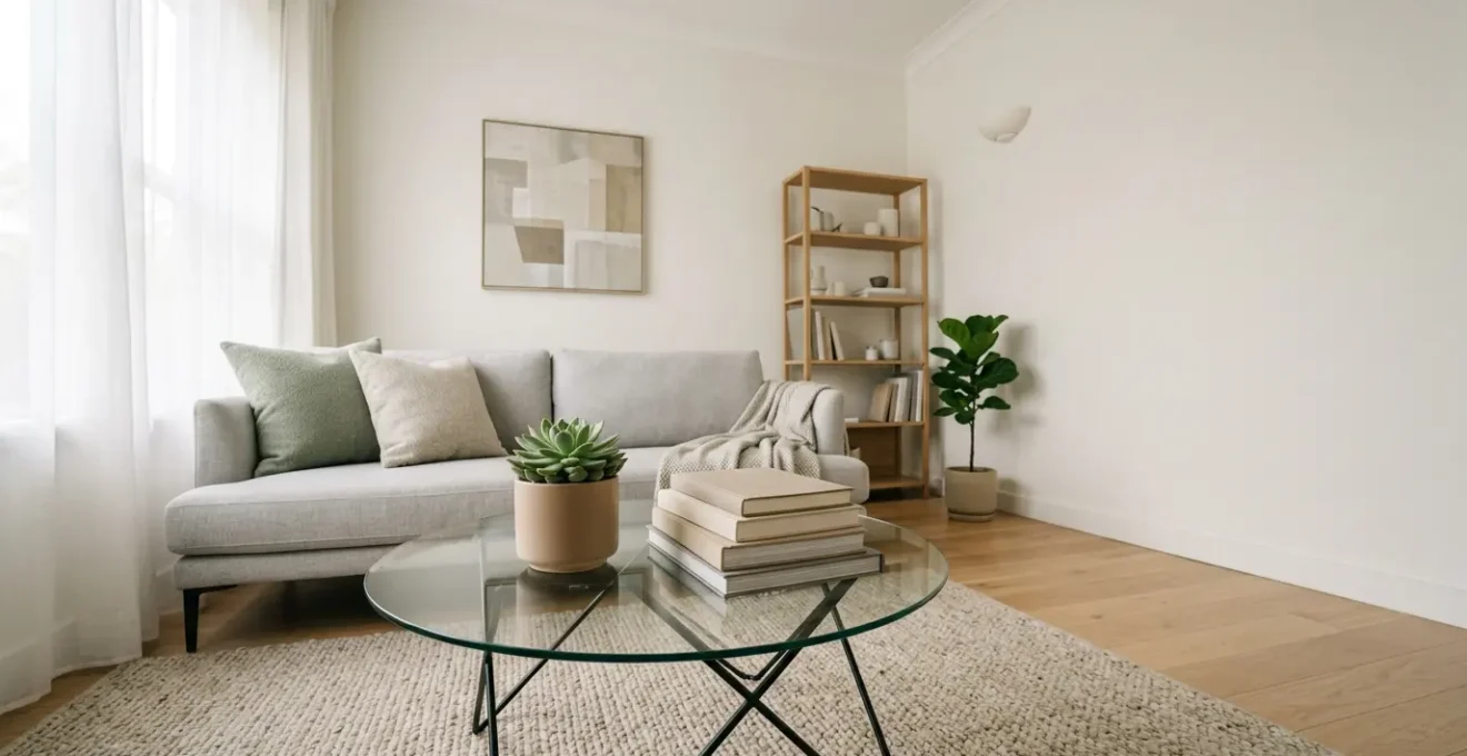
The power of a glass coffee table in a compact room is a fascinating trick of human perception. It’s not just that the table is transparent; it’s that it preserves the most critical element for perceiving space: an uninterrupted floor. When your eye can travel from one end of the room to the other without hitting a solid visual barrier, your brain interprets the area as larger and more open. This creates long, clean visual pathways that enhance the sense of depth.
A solid, opaque table, no matter how small, acts as a full stop. It breaks the room into smaller, disconnected zones. A glass table, by contrast, allows light to pass through and bounce off the floor and rug beneath, maintaining visual continuity. This effect is amplified when paired with slim, reflective legs that minimize the table’s physical footprint. The result is a functional surface that performs its duty without visually consuming valuable square footage.
This principle is well-documented in practice. One designer’s project, for instance, chronicled how replacing solid furniture with glass tables in a 1000 sq ft home dramatically enhanced sightlines. The continuous visibility of the flooring made the entire home feel significantly larger while retaining full functionality. The key is to think of the table not as an object, but as a filter for light and vision.
Tempered vs. Annealed Glass: Which Is Mandatory for Homes with Pets?
When selecting a glass coffee table, especially in a home with active children or pets, safety is non-negotiable. The primary distinction you’ll encounter is between annealed and tempered glass. Annealed glass is the standard, basic glass we see in many picture frames. When it breaks, it shatters into large, dangerously sharp shards. For furniture, this poses an unacceptable risk of serious injury.
Tempered glass, on the other hand, is a true safety material. It undergoes a process of extreme heating and rapid cooling that fundamentally changes its structure. This process makes it incredibly durable; in fact, tempered glass is 4 to 5 times stronger than standard annealed glass, making it far more resistant to impacts from dropped toys or a jumping pet. More importantly, if it does break under extreme force, it crumbles into small, blunt, pebble-like cubes rather than sharp daggers. This dramatically reduces the risk of cuts and injuries.
This safety difference is so significant that industry safety standards mandate its use. As ASTM International, the standards organization, states:
ASTM standards require that tempered glass, rather than annealed glass, be used in the construction of furniture to minimize the risk of injury
– ASTM International, ASTM F2813 Standard Specification
For any home, but especially one with pets or kids, the choice is clear. A table made with tempered glass isn’t a luxury; it’s a mandatory safety feature. The following table breaks down the key differences to consider.
| Feature | Tempered Glass | Annealed Glass |
|---|---|---|
| Break Pattern | Small, blunt cubes | Large, sharp shards |
| Impact Resistance | 4-5x stronger | Standard strength |
| Pet Safety Rating | Highly recommended | Not recommended |
| ASTM Compliance | Meets F2813 standards | Does not meet safety standards |
| Scratch Resistance | Superior surface hardness | More prone to scratching |
How to Style a Two-Tier Glass Table Without It Looking Like a Junk Pile?
A two-tier glass table doubles your surface area, but it also doubles the potential for clutter. The key to elegant styling is to think vertically, using what we call a “Z-Axis” strategy. This means creating a deliberate visual relationship between the top and bottom shelves, rather than treating them as two separate, flat surfaces. The goal is to create balance and purpose, turning storage into a curated display.
The illustration below shows how objects of varying heights and textures can be arranged to create a harmonious composition across both levels. Notice the interplay between the functional items on top and the more decorative, anchoring pieces below. This creates depth and prevents the table from looking like a transparent storage box.
To achieve this look, you must assign a clear purpose to each tier. The top shelf should be reserved for daily, functional items—a remote, coasters, a current book—neatly contained within a tray. The bottom shelf is for display: a stack of beautiful art books, a sculptural object, or a woven basket. This separation of purpose is the first step to conquering clutter. One of the most effective techniques is placing a single, solid opaque object on the bottom shelf to visually anchor the entire transparent structure.
Action Plan: The Z-Axis Audit for Flawless Two-Tier Styling
- Points of Contact: Identify your two tiers (top and bottom) as distinct but visually connected zones for styling.
- Collect: Inventory your decor. Separate functional items (remotes, coasters) from display pieces (books, sculptures).
- Coherence: Assess your items against the vertical styling rule. Do their heights vary to create interest? Is there a color connection (e.g., a 60/30/10 palette) across both tiers?
- Memorability/Emotion: Check for a unique visual anchor. Is there one striking, opaque object on the bottom shelf to ground the table’s transparency?
- Integration Plan: Assign items to their designated tier (top for function, bottom for display). Use a decorative tray on the top shelf to immediately contain small items and create structure.
The “Shin Buster” Error: Why Leg Placement Matters for Traffic Flow
We’ve all experienced it: the painful, clumsy collision with the corner of a coffee table leg. This “shin buster” moment is more than just a minor annoyance; it’s a symptom of poor flow dynamics. In a compact space, the placement of a table’s legs is just as important as the size of its top. Traditional designs with legs at all four corners create the widest possible physical footprint, creating hazardous corners that jut out into your primary traffic pathways.
To improve flow, you must consider tables with a smarter leg design. A pedestal base or a table with inset legs (legs positioned inward from the corners) dramatically reduces the floor-level obstruction. This clears up valuable corner space, making it easier to navigate around the table, especially in tight quarters or when getting up from a sofa. This design choice is a core principle of creating better kinetic clearance—the real-world space needed for comfortable movement.
A case study by interior designers highlighted this perfectly, showing that switching from corner-leg tables to pedestal or inset-leg designs significantly reduced collision incidents. In one 800 sq ft apartment, a cantilever base even maximized legroom for an L-shaped sofa. This decision is about reclaiming floor space where it matters most: in your path of travel.
| Base Type | Traffic Flow Rating | Best For | Drawbacks |
|---|---|---|---|
| Pedestal | Excellent | Maximum foot clearance | Less stable for tall items |
| Inset Legs | Very Good | Corner collision prevention | Slightly reduced stability |
| Sled Base | Good | Easy rug sliding | Potential trip hazard |
| Cantilever | Excellent | L-shaped sofas | Weight distribution limits |
How to Pair a Visually Light Table with a Rug So It Doesn’t Get Lost?
A glass coffee table can sometimes feel like it’s floating away, especially on a light-colored floor. The secret to grounding it without sacrificing its airy quality is to pair it with the right area rug. The rug acts as a visual anchor, defining the seating area and providing a backdrop that makes the table ‘pop’. However, the wrong pairing can either swallow the table or create a busy, chaotic look.
The first rule is to prioritize texture over pattern. A highly textured rug—like a chunky wool knit, a natural jute, or a high-pile shag—creates a rich tactile contrast against the smooth, hard surface of the glass. This material difference provides enough visual interest to anchor the table without overwhelming it. If you do opt for a pattern, choose one with a strong border or a concentrated central medallion. This creates a natural “frame” for the table to sit within.
Size and shape are also crucial. For round glass tables, a large round rug is a perfect partner, as it mirrors the shape and eliminates all sharp corners from the seating area, further enhancing the room’s flow. For rectangular tables, ensure the rug is large enough to extend beyond the table on all sides. As a general guideline for small spaces, design experts recommend that round glass tables of 60-80 cm diameter work optimally, as they provide a functional surface without creating obstructive corners.
How to Calculate the Exact Clearance Needed Between Sofa and Coffee Table?
One of the most common layout mistakes is incorrect spacing between the sofa and the coffee table. Too close, and the space feels cramped and impassable. Too far, and the table becomes useless, impossible to reach without awkwardly leaning forward. The ideal distance is a precise balance of ergonomic comfort and easy passage, a concept we call kinetic clearance. This isn’t a one-size-fits-all number; it depends on how you use your space.
The simplest way to find your ideal distance is with the “Ergonomic Reach Test.” Sit on your sofa as you normally would and extend your arm to place a drink on the table. The spot where your hand comfortably rests is your baseline. For most people, this is between 14 and 18 inches (35-45 cm) from the edge of the sofa. This ensures the table is functional for its primary purpose. If your living room is a high-activity zone for board games or laptop use, you might add a couple of inches for more legroom.
Interestingly, visually light tables give you a bit more flexibility. Staging professionals have found that because glass and acrylic tables don’t create a solid visual barrier, they can be placed 3-4 inches closer to the sofa than an opaque table while maintaining the same feeling of openness. This allows you to reclaim precious inches in your traffic path without sacrificing comfort.
Why Using Small Furniture in a Small Room Actually Makes It Look Smaller?
It’s one of the most persistent and counter-intuitive myths in interior design: to make a small room look bigger, fill it with small furniture. In reality, this approach often has the opposite effect. A room filled with numerous small, disconnected pieces—a tiny sofa, a miniature coffee table, several small side tables—creates a busy, cluttered, and fragmented visual field. Your eye has no place to rest, and the brain registers the space as chaotic and even smaller than it is.
The solution is to use fewer, but more appropriately scaled, pieces. A single, well-proportioned sofa makes a stronger, more calming statement than two tiny armchairs. A correctly sized coffee table anchors the space more effectively than a cluster of small tables. By reducing the number of individual items, you create fewer visual interruptions. This allows the eye to flow smoothly across the room, perceiving it as a larger, more serene, and unified whole.
This principle is about managing visual weight, not just physical size. A few larger pieces create a sense of substance and calm, while many small pieces create visual “noise.” As interior staging experts Amy Monroe and Katie Knitter explain:
Multiple small, disconnected items make a room feel like a cluttered miniature set. Fewer, correctly-scaled pieces create fewer visual interruptions, allowing the brain to perceive the space as larger and more serene.
– Amy Monroe and Katie Knitter, Becoming Home Interior Staging Service
Therefore, when choosing a delicate coffee table, the goal isn’t just to find the smallest one. The goal is to find one whose visual lightness allows you to use a functionally appropriate size without adding to the room’s visual clutter.
Key Takeaways
- Flow Over Form: The best coffee table for a small space is one that prioritizes visual pathways and kinetic clearance, not just a small footprint.
- Safety Is Structural: Always choose tempered glass for furniture, as its strength and safe shattering pattern are non-negotiable in any home.
- Scale and Anchor: Use fewer, correctly-scaled furniture pieces and a textured rug to anchor your seating area and avoid a cluttered, miniature look.
Area Rugs: The Secret to Anchoring Furniture and Defining Space in Any Room
In the symphony of a well-designed room, the area rug is the conductor. It doesn’t just add color or texture; it performs the critical function of spatial anchoring. A rug is the tool you use to define the “lounge zone,” visually grouping your sofa, chairs, and coffee table into a cohesive unit. This act of definition is paramount in an open-plan or compact living room, as it creates “rooms within a room” without building a single wall. By doing so, it leaves the surrounding bare floor to act as clear, designated traffic lanes, instinctively guiding movement.
The scale of the rug in relation to the furniture is also a key factor in perceived space. The rug should be large enough that at least the front legs of your sofa and any armchairs are sitting on it. This extends the visual footprint of the seating area, drawing the eye outward and making the entire zone feel more expansive. A common rule of thumb from interior design guidelines recommends that a coffee table should be about two-thirds the length of your sofa, and the rug should be large enough to frame this pairing generously.
When combined with a visually light coffee table, a bold rug can truly shine. The transparency of the glass allows the rug’s pattern and texture to become a feature, adding personality and depth without creating clutter on the tabletop. The rug and table work in tandem: the rug anchors the space, and the table provides function without obscuring the beautiful foundation you’ve laid.
By applying these principles of flow, light, and scale, your coffee table transforms from a simple piece of furniture into a powerful instrument for shaping your living environment. The result is a space that not only looks larger but feels more intuitive, comfortable, and effortlessly fluid to live in. Begin today by assessing your current layout through this new lens of flow dynamics.