
The secret to a gallery-worthy art collection isn’t a massive budget, but mastering the visual alchemy that elevates affordable prints into high-impact statements.
- Success lies in manipulating an artwork’s perceived value through strategic sizing, framing, and lighting, not in the price of the piece itself.
- Creating a cohesive look comes from intentionally connecting art to your space using color theory and balanced layout principles.
Recommendation: Stop hunting for expensive originals and start treating every affordable canvas print as the raw material for a sophisticated, curated design project.
The desire to fill a large, empty wall with a captivating piece of art often clashes with a sobering reality: the gallery price tag. For many decorators, the dream of a large-scale, statement artwork feels unattainable, pushing them towards generic posters or leaving walls disappointingly bare. The common advice—trawl flea markets or buy small prints—often fails to satisfy the craving for a substantial, curated look that anchors a room and expresses a personal style. This can lead to a collection that feels disjointed or a space that lacks a true focal point.
But what if the barrier to a sophisticated art collection isn’t money? What if the real secret lies not in what you buy, but in how you present it? The distinction between a cheap-looking print and a piece that exudes high-end appeal is often a matter of technique. It’s about understanding the subtle but powerful principles of scale, framing, lighting, and composition. This is the art of visual alchemy: transforming the accessible into the aspirational.
This guide moves beyond the hunt for bargains and dives into the practical strategies of the affordable art consultant. We will deconstruct the methods used to give inexpensive canvas prints the visual weight and presence of gallery-commissioned pieces. From mastering the foundational rules of scale to creating harmony with color and light, you will learn how to build a collection that looks thoughtfully curated and dramatically more valuable than its actual cost.
In the following sections, we will explore the core pillars of building an impressive art collection on a budget. This roadmap will equip you with the savvy and artistic principles needed to transform your space with confidence.
Summary: A Guide to Elevating Affordable Art
- The “2/3rds Rule”: how wide should your canvas be compared to your sofa?
- Canvas floater frames: how to make a cheap print look like an expensive original?
- How to pull a color from your rug to choose the right abstract art?
- Picture lights vs. Spotlights: which fixture highlights texture best?
- Landscapes vs. Abstracts: can you mix genres on the same wall?
- Grid vs. Salon style: which layout suits your collection type best?
- When to add a “punch” of black to anchor a muted palette?
- Contemporary Design: Achieving a “Now” Look That Doesn’t Age Quickly
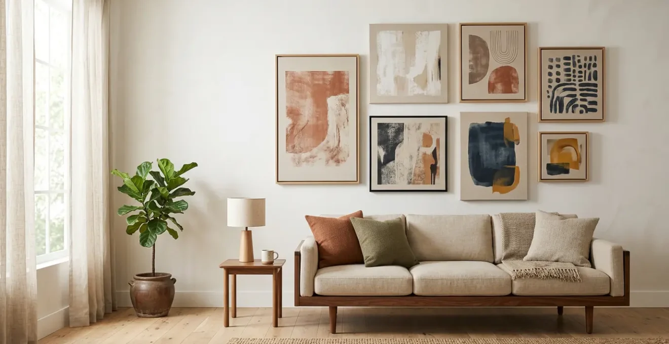
The “2/3rds Rule”: How Wide Should Your Canvas Be Compared to Your Sofa?
The single most common mistake in hanging art is choosing a piece that is too small for its space. An undersized canvas above a large piece of furniture, like a sofa or headboard, can look lost and insignificant, instantly cheapening the feel of the room. To achieve a professional, balanced look, decorators rely on a foundational principle: the 2/3rds Rule. This guideline dictates that your artwork should be approximately two-thirds the width of the furniture it hangs above. This creates a pleasing sense of proportion and ensures the art feels anchored and intentional, rather than like an afterthought.
For example, if you have an 84-inch sofa, you should look for art (or a grouping of art) that fills a horizontal space between 56 and 63 inches. As confirmed by interior design experts, for an 84-inch sofa, artwork should be 56 to 63 inches wide to maintain this crucial visual balance. This ratio creates a powerful relationship between the objects, making them read as a single, cohesive vignette. It’s also wise to hang the art 6-8 inches above the furniture to create a visual connection without awkward gapping.
While the 2/3rds rule is a powerful starting point, it’s not an unbreakable law. The goal is always spatial harmony. If you find a piece you love that’s slightly smaller, you can add visual weight by choosing a wider frame. If you’re creating a gallery wall, the entire grouping should collectively follow the rule. The key is to avoid the “floating stamp” effect of a lone, small piece on a large wall.
Action Plan: Mastering Artwork Scale
- Measure Your Furniture: Before you shop, get the exact width of your sofa, console, or headboard. Calculate two-thirds of this number to define your target art width.
- Create a Template: Use painter’s tape or cut-out craft paper to mark the target dimensions on your wall. This allows you to visualize the scale in your actual space before committing to a purchase or drilling holes.
- Account for the Frame: When calculating the final size, always include the width of the frame. A chunky frame can add several inches of visual weight, helping a slightly smaller print meet the 2/3rds proportion.
- Group for Impact: If one large piece is out of budget, create a diptych (two pieces) or triptych (three pieces) that, when hung together, collectively fill the 2/3rds width. This is a savvy way to achieve large-scale impact with smaller, more affordable prints.
- Anchor to Furniture, Not Walls: Always relate the art’s width to the furniture below it, not the total width of the wall. This grounds the arrangement and creates a strong, intentional focal point.
Canvas Floater Frames: How to Make a Cheap Print Look Like an Expensive Original?
Once you’ve nailed the scale, the next step in your visual alchemy is framing. A standard, budget-friendly canvas print can be instantly elevated with the right presentation, and no method is more effective than the canvas floater frame. Unlike traditional frames that cover the edge of the canvas, a floater frame creates a gap between the artwork and the frame’s edge. This gap creates a subtle shadow line, making the canvas appear as if it’s “floating” within the frame. It’s a sophisticated, gallery-standard look that adds depth and perceived value to even the most inexpensive print.
The magic of the floater frame is its ability to provide a clean, finished edge without looking bulky. This modern style mimics how original paintings are often displayed, lending an air of authenticity and importance to your piece. You can find ready-made floater frames online or at craft stores, or even build a simple one yourself as a DIY project. The investment in a floater frame, often minimal, pays huge dividends in visual impact.
Case Study: The Sub-$10 Vintage-Style Masterpiece
To prove that budget and beauty can coexist, a compelling case study from The Painted Hive demonstrates a brilliant technique. By printing a vintage image, mounting it on a blank canvas, and then covering it with a layer of tissue paper and matte sealant, the creator achieved the textured, imperfect look of an authentic oil painting. The tissue paper allows the canvas texture to peek through, creating an incredible sense of depth and age. The final cost for each high-impact artwork was under $10, showcasing how creativity and simple materials can produce a result that looks priceless.
Beyond framing, you can enhance the “original art” feel with texture. Applying a thin layer of clear matte medium, like Mod Podge, with a foam brush can mimic the brushstrokes of a painting. For a more professional finish, use a brayer (a small roller) to smooth out any air bubbles when mounting a print to canvas. These small, savvy touches are central to the art of intentional curation, transforming a mass-produced item into something that feels unique and personal.
How to Pull a Color From Your Rug to Choose the Right Abstract Art?
The difference between a piece of art that simply hangs on a wall and one that truly belongs in a room is spatial harmony. The most effective way to achieve this is by creating a color conversation between your art and your existing decor. A common designer trick is to pull a color from your area rug—the room’s other major “canvas”—and use it to inform your art selection. This doesn’t mean the art has to be a perfect match; instead, it’s about creating a subtle, unifying thread that ties the entire space together.
There are a few strategic ways to approach this. You can choose a piece of abstract art where the rug’s dominant color is a major component, creating a serene and cohesive look. Alternatively, for a more dynamic and high-contrast effect, you can pull a minor accent color from the rug’s pattern. Imagine a mostly neutral rug with a few threads of deep navy blue; selecting an abstract piece where navy is a key player will make both the rug and the art pop. This “anchor and echo” technique creates a sophisticated visual rhythm.
A more advanced technique is to match color temperature. As the table below illustrates, if your rug features warm tones (terracotta, mustard, cream), choosing abstract art with a similarly warm palette will create a subliminal sense of harmony, even if the colors themselves are different. This method ensures the pieces feel like they were chosen for each other, a hallmark of professional interior design. A simple but effective color strategy guide can help you visualize these approaches.
| Strategy | Visual Effect | Best For | Example |
|---|---|---|---|
| Dominant Color Match | Serene, cohesive | Minimalist spaces | Beige rug with neutral canvas |
| Accent Color Pull | Energetic, dynamic | Statement pieces | Pull minor blue from multicolor rug |
| Temperature Matching | Subliminal harmony | Professional look | Warm rug with warm-toned art |
Picture Lights vs. Spotlights: Which Fixture Highlights Texture Best?
Lighting is the final, transformative touch in making art look expensive. Proper illumination can bring a simple canvas print to life, drawing attention to it as a focal point and dramatically enhancing its colors and textures. Without it, even the most beautiful piece can fall flat, especially in the evening. The two primary options for accenting art are picture lights and spotlights, each offering a different effect. A picture light is a linear fixture mounted directly above the artwork, casting a dedicated, even wash of light across its surface. This classic, gallery-style approach feels formal and intentional, clearly signaling that the piece below is important.
A spotlight, on the other hand, is typically mounted on the ceiling and aimed at the artwork. This method offers more flexibility and can create a more dramatic effect. By positioning the light at a steep “grazing angle,” you can create tiny shadows across the canvas surface, which is the absolute best way to highlight texture. If you’ve added a matte medium finish to your print to simulate brushstrokes, a grazing spotlight will make that texture pop, adding to the illusion of an original painting. For a budget-friendly option, you can even use wall-mounted under-cabinet LED bars to achieve a similar effect.
Regardless of the fixture you choose, the most crucial factor is the quality of the light itself. Look for bulbs or fixtures with a high Color Rendering Index (CRI). CRI is a measure of how accurately a light source reveals the true colors of an object. For artwork, professional lighting specifications show that a CRI of 90+ renders artwork colors accurately, making them appear richer and truer to the artist’s intent. Many cheap LEDs have a low CRI, which can make colors look dull or washed out. Investing in a high-CRI light is a small detail that makes a world of difference.
Landscapes vs. Abstracts: Can You Mix Genres on the Same Wall?
Absolutely. In fact, mixing art genres is a hallmark of a confident and personally curated collection. A wall that features only one style can sometimes feel a bit flat or formulaic, like a hotel lobby. A dynamic mix of landscapes, abstracts, portraits, and line drawings tells a more interesting story and creates a richer visual experience. The key to successfully pulling off this “high-low mix” of styles is not to create chaos, but to find a unifying element that ties the disparate pieces together.
The most powerful unifying tool is a consistent color palette. As one expert guide suggests, you should use consistent color palettes across different genres as the unifying thread. You could have a moody landscape photograph next to a vibrant abstract painting, and they will feel harmonious if they both share a common color, such as a deep green or a warm ochre. Another effective strategy is consistent framing. Hanging a collection of different genres in identical frames (e.g., all simple black floater frames) creates an immediate sense of order and cohesion.
When arranging a mixed-genre wall, it’s helpful to apply the “Anchor & Echo” principle. Start with one large “anchor” piece—this could be your favorite landscape or a bold abstract—and then surround it with smaller “echo” pieces from other genres that pick up on its colors or themes. The affordability of canvas prints is a huge advantage here, as it frees you up to experiment with multiple pieces and custom sizes without breaking the bank. You are no longer on a years-long search for one perfect piece; you can build a dynamic, evolving collection over time.
Grid vs. Salon Style: Which Layout Suits Your Collection Type Best?
Once you’ve curated several pieces, the final step is arranging them on the wall. The layout you choose can dramatically alter the mood of your room. The two classic approaches are the Grid and Salon styles, and each is suited to a different type of collection. The Grid layout is formal, organized, and modern. It involves hanging pieces of the same size and orientation in a precise geometric pattern, with equal spacing between each one. This style works best for a series of prints—for example, a set of four botanical illustrations or six architectural photographs from the same artist. The clean lines of a grid demand precision and create a calm, structured visual effect.
The Salon style, in contrast, is dynamic, eclectic, and full of personality. It involves hanging a collection of artworks in various sizes, orientations, and genres in a dense, clustered arrangement. This style originated in the grand salons of 17th-century Paris and is perfect for showcasing a diverse collection acquired over time. It tells a story and feels deeply personal. While it may look random, a successful salon wall is carefully planned to feel balanced, with smaller pieces clustering around larger anchor pieces and a consistent (but tighter) spacing between frames.
To avoid a chaotic mess, planning is essential, especially for a salon wall. Before hammering any nails, lay out your collection on the floor to experiment with different arrangements. A fantastic pro tip is to use digital tools like Canvy or ArtPlacer, which use augmented reality to let you preview the layout on your wall through your phone. Alternatively, you can trace each frame onto craft paper, cut them out, and tape the templates to your wall to easily adjust the composition until it feels right.
| Layout Style | Best For | Spacing Rule | Visual Effect |
|---|---|---|---|
| Grid Layout | Series collections, same artist | 3-6 inches apart | Formal, organized |
| Salon Style | Eclectic collections, mixed sources | 2-3 inches apart | Dynamic, storytelling |
| Structured Salon | Hybrid approach | Hidden grid alignment | Controlled eclecticism |
When to Add a ‘Punch’ of Black to Anchor a Muted Palette?
In the world of design, a room filled with only soft, muted, or mid-tone colors can sometimes feel a bit weak or “floaty.” Without a point of deep contrast, the eye doesn’t know where to land, and the decor can blend into an undefined, pleasant-but-unmemorable wash. This is where a strategic “punch” of black becomes an essential tool. A small, intentional dose of black acts as a visual anchor, grounding the entire palette, adding definition, and making all the other colors appear more crisp and vibrant. In art curation, this can be the element that injects a dose of sophistication into your collection.
A simple way to determine if your room needs this anchor is the “Is It Floating?” test. Squint your eyes while looking at your room. If the shapes of your furniture, decor, and art all blur together into a single mass, your space is likely “floating” and would benefit from a touch of black. This doesn’t mean you need a large, dark painting. The punch of black can be delivered in more subtle, savvy ways. A thin, black floater frame around a light-colored abstract piece can provide all the definition you need. Similarly, a black picture light mounted over a neutral artwork adds an anchoring point of contrast while also highlighting the piece.
The key is to use black as a powerful accent, not a dominant color. A good guideline is the classic 60-30-10 rule of interior design, where 60% of your room is a dominant color, 30% is a secondary color, and a mere 10% is a powerful accent. Using black for that 10%—through frames, a single piece of art, a light fixture, or a decorative object—is often all it takes to bring a room into sharp, sophisticated focus. This small touch is a powerful secret weapon in the decorator’s toolkit.
Key Takeaways
- Scale and Frame First: The perceived value of a canvas print is determined more by its size relative to furniture (the 2/3rds rule) and its frame than by its price tag.
- Curation Through Connection: Create a cohesive collection by linking pieces through a shared color palette pulled from your room, or by using consistent framing to unify different art genres.
- Light is Your Final Touch: The right lighting—whether a focused picture light or an angled spotlight—is the final step that transforms a simple print into a dramatic focal point by highlighting texture and color.
Contemporary Design: Achieving a “Now” Look That Doesn’t Age Quickly
Building an art collection is a long-term project, so the ultimate goal is to create a look that feels contemporary and relevant today but won’t feel dated in five years. The key to achieving this timeless appeal lies in a balanced approach to collecting, blending enduring personal taste with a nod to current trends. A savvy way to structure this is by applying the 80/20 Rule to your collection. This means dedicating 80% of your collection to “timeless” pieces that you deeply and personally connect with, regardless of what’s currently in vogue. These are the anchors of your collection—the landscapes, abstracts, or portraits that speak to you on an emotional level.
The remaining 20% of your collection is where you can play with trends. Use this portion for smaller, less expensive, and easily swappable prints that feel very “now.” This allows you to experiment with a new color trend, a popular graphic style, or a theme you’re currently interested in without a major commitment. If the trend fades, you can easily swap out these smaller pieces for something new, keeping your space feeling fresh while your core 80% remains a constant, solid foundation.
To find that relevant 20%, focus on emerging living artists from platforms like Etsy or local art fairs. Owning a piece by a contemporary artist, even a simple print, adds a layer of cultural relevance to your collection. Grouping several smaller, affordable pieces into a gallery wall is another excellent, budget-friendly strategy. It allows you to build your collection incrementally over time, refining your display as your taste evolves. This approach ensures your home reflects not just a static design, but your own evolving story.
Now that you’re armed with the strategies to select, elevate, and arrange your art, the next step is to start curating with confidence. Begin by identifying the first wall you want to transform and apply these principles to create a focal point that truly reflects your style.