
The colors and materials you choose for your home do far more than fill space—they shape how you feel, move, and live within your walls. A rough brick surface can evoke industrial character, while a soft velvet cushion invites you to sink in and relax. The right shade of grey can make a room feel expansive and serene, whereas an overly saturated color might leave you feeling restless without understanding why.
Understanding the interplay between colors and materials is essential for creating spaces that balance beauty with practicality. Whether you are drawn to the raw authenticity of exposed concrete or the organic warmth of natural wood, each choice carries implications for maintenance, durability, acoustics, and emotional wellbeing. This resource explores the foundational principles behind selecting textures, tones, and surfaces that work harmoniously together—and reveals the common mistakes that can undermine even the most thoughtful designs.
From the psychology of muted color schemes to the technical requirements of water-resistant tiles, from the surprising durability of velvet to the biophilic benefits of wood grain, the topics covered here will equip you with the knowledge to make confident decisions for every room in your home.
Industrial materials like brick, concrete, and metal have moved from factories and lofts into mainstream residential design. Their appeal lies in authenticity—these surfaces tell a story of structure and permanence. Exposed brick walls, for instance, can increase perceived property value by creating a distinctive focal point that buyers find memorable and desirable.
The primary obstacle with industrial textures is physical comfort. Concrete floors, while stunning and easy to clean, conduct cold and create an unforgiving surface for bare feet. Solutions include:
Industrial rooms often suffer from two interconnected problems. First, the lighting mistake that transforms character into gloom: relying solely on overhead fixtures without layered lighting creates harsh shadows that emphasize the coldness of raw materials. Second, hard surfaces like brick, glass, and metal reflect sound waves rather than absorbing them, creating an echo chamber effect that makes conversations exhausting.
Addressing these issues requires strategic intervention—textile wall hangings, upholstered furniture, and multiple light sources at varying heights can transform a cold industrial space into a cozy retreat without sacrificing its distinctive aesthetic.
Color psychology is not merely decorative theory—it has measurable physiological effects. Highly saturated colors trigger alertness responses in the nervous system, which explains why fast-food restaurants favor bright reds and yellows. For residential spaces where relaxation is the goal, low-saturation tones create a fundamentally different neurological experience.
Both options work beautifully in muted palettes, but they serve different spatial purposes. Cool greys tend to recede visually, making walls appear to push back and expand the perceived room size. Warm beiges, conversely, advance slightly, creating intimacy in large or impersonal spaces. The choice depends on whether you want to open up a cramped room or make a cavernous one feel more embracing.
The fear of muted palettes is boredom—but the solution lies in thoughtful layering. Using three shades of the same color family creates depth when you vary:
Strategic placement of black accents—a lamp base, picture frames, or furniture legs—provides the visual anchor that prevents muted rooms from feeling washed out or unfinished.
A common frustration occurs at night when that perfect beige wall suddenly appears pink or yellow. This happens because artificial light sources have varying color temperatures. Incandescent bulbs cast warm tones that shift neutral colors dramatically. Testing paint samples under your actual evening lighting conditions prevents this costly surprise.
Selecting tiles for bathrooms, kitchens, and entryways involves more than aesthetic preference. The wrong choice can lead to slip hazards, grout deterioration, and even structural damage to your subfloor from moisture penetration.
While both are fired clay products, porcelain tiles are manufactured at higher temperatures with finer clays, resulting in a denser, less porous material. For heavy water zones—shower floors, tub surrounds, pool decks—porcelain is effectively the only appropriate choice. Its water absorption rate of less than 0.5% prevents the freeze-thaw cracking and mold penetration that plagues ceramic in wet environments.
The R-rating system measures slip resistance, with higher numbers indicating better grip. For family bathrooms where children and elderly residents may walk with wet feet, an R10 rating represents the minimum safe threshold. Shower floors specifically require R11 or higher to prevent dangerous slips on soapy surfaces.
Large format tiles reduce grout lines, which translates to approximately 50% less cleaning time over the tile’s lifespan. However, smaller mosaic tiles provide better slip resistance on shower floors due to increased grout texture. The color choice for grout deserves attention too: grey grout typically hides grime accumulation better than white over a five-year period, though epoxy grouts in either color outperform cement-based alternatives.
Many homeowners focus exclusively on tile selection while neglecting the waterproof membrane beneath. This invisible layer protects your subfloor from moisture that inevitably penetrates grout lines. Failure to properly install or maintain this membrane allows water to silently rot structural elements—damage that often goes undetected until expensive repairs become unavoidable.
Research consistently demonstrates that natural materials, particularly wood, produce measurable wellness benefits. Studies show that simply touching natural wood surfaces can lower blood pressure and reduce stress hormones—effects that synthetic wood-look materials do not replicate.
Mixing oak, walnut, and pine in a single room can create either sophisticated depth or chaotic confusion. The key lies in maintaining a consistent undertone—woods with warm yellow or orange undertones should be grouped together, while those with cooler grey or red undertones form a separate harmonious family. Limiting a room to two or three species maximum prevents visual competition.
The finish you choose determines both appearance and maintenance requirements:
Wood is hygroscopic, meaning it absorbs and releases moisture based on environmental conditions. The humidity mistake that causes new floors to buckle typically occurs during winter when heating systems dramatically reduce indoor humidity. Maintaining relative humidity between 35% and 55% year-round prevents the expansion and contraction cycles that damage wood installations.
For environmentally conscious selections, both FSC-certified and reclaimed wood offer ethical alternatives to conventional lumber. Reclaimed wood typically carries a lower carbon footprint since it requires no new forest harvesting and often features unique character markings from its previous life.
Velvet’s reputation as a fragile, high-maintenance fabric belongs to an earlier era. Modern performance velvets are engineered to withstand daily household demands, often outperforming linen and cotton blends in abrasion resistance tests.
The distinctive sheen that makes velvet appear to change color from different angles results from its pile construction—millions of tiny fibers that catch and reflect light directionally. This optical quality, while beautiful, means velvet requires consistent pile direction during installation to avoid a patchwork appearance.
Pet owners often avoid velvet unnecessarily. Removing cat or dog hair takes approximately 30 seconds using a velvet brush or slightly damp rubber glove—both methods lift hair without damaging the pile. Pressure marks from sitting can be reversed through light steaming, which relaxes crushed fibers back to their upright position.
Velvet creates particularly effective visual tension when paired with natural wood. The contrast between soft, light-absorbing fabric and hard, warm-toned timber satisfies our instinctive attraction to textural variety. This combination delivers both tactile interest and psychological comfort—the sensory richness that makes a house feel like a home.
The journey through colors and materials ultimately reveals a consistent theme: successful interior design balances emotional resonance with practical performance. Whether you are softening an industrial loft, calming a family room with muted tones, or selecting tiles that will protect your home for decades, informed choices prevent costly mistakes and create spaces where you genuinely want to spend time.
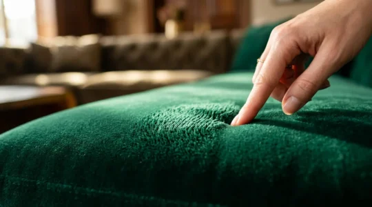
Contrary to popular belief, modern velvet is not a fragile luxury but one of the most resilient and practical upholstery choices for active households. Engineered performance velvets outperform fabrics like linen by a factor of 20 in abrasion tests. The…
Read more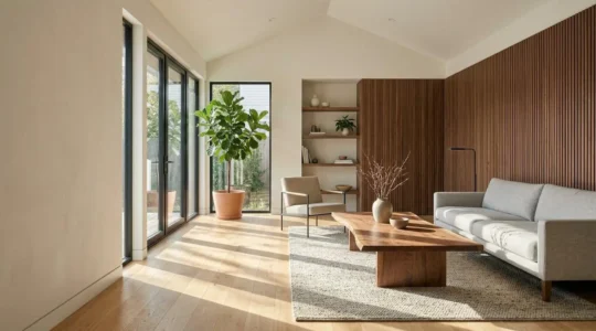
The true power of wood in modern design isn’t its color or style; it’s the scientifically-proven ability to lower stress and create warmth through a deep, sensory connection to nature. Mixing different woods successfully relies on a simple formula based…
Read more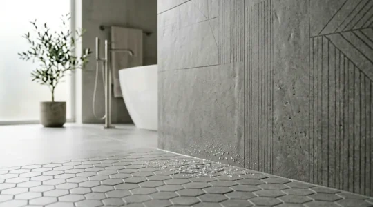
True water resistance isn’t in the tile itself, but in the complete waterproofing system protecting your home’s structure from silent failure. Porcelain’s density, confirmed by an absorption rate of less than 0.5%, makes it the only viable choice for high-moisture…
Read more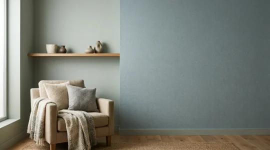
Overwhelmed by visual clutter, many find that simply choosing pale colors isn’t enough to create a truly calm space because the real secret lies in managing light and saturation. A restful home is achieved by reducing “visual noise,” an effect…
Read more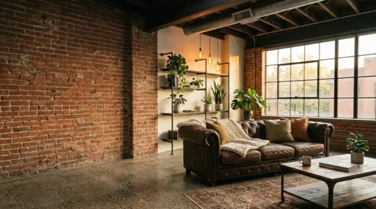
Forget adding fuzzy pillows. True industrial warmth comes not from covering things up, but from mastering the raw materials themselves through a kind of material alchemy. Transforming hard surfaces like concrete into comfortable, heated elements is more effective than simply…
Read more