
A properly chosen area rug is the single most effective tool to fix a “floating” room by establishing its visual gravity.
- Size and placement are about creating a proportional anchor, not just following one simple rule.
- Material and texture provide critical counterpoints to the hard surfaces of furniture and flooring.
Recommendation: Use painter’s tape to outline your ideal rug size on the floor and live with it for 48 hours before you commit to a purchase.
Walk into a room that feels… off. The furniture is stylish, the colors are right, but every piece seems to be drifting in an invisible sea, disconnected and unanchored. This common decorating problem, the “floating room,” often has a single, powerful solution: the area rug. Many guides will offer simple tips like “buy a big rug” or “put the front legs of the sofa on it.” While not incorrect, this advice barely scratches the surface. It treats the rug as a mere accessory rather than what it truly is: a fundamental architectural tool.
The secret to transforming a space lies in understanding how a rug manipulates a room’s sense of scale, proportion, and, most importantly, its visual gravity. It’s not just about adding a layer of texture or a splash of color. It’s about drawing lines, defining purpose, and telling the eye exactly where to land. A well-placed rug grounds a furniture grouping, turning disparate items into a cohesive, intentional whole. It has the power to create invisible walls in an open-concept space and even alter the perceived dimensions of a room.
This guide moves beyond the platitudes to explore the foundational principles of using rugs effectively. We will deconstruct the rules of placement, examine the role of material in high-traffic zones, and reveal how color and pattern can solve complex design challenges. By the end, you’ll see your floors not as a blank canvas, but as the key to unlocking a room’s full potential.
To help you navigate these core concepts, this article is structured to build your expertise from the ground up. We’ll start with why rugs are so crucial for anchoring a space and move through sizing, material, and advanced techniques for defining your home.
Summary: How to Use Area Rugs to Anchor and Define Your Rooms
- Why furniture looks awkward and “floating” without a rug to anchor it?
- How to apply the “legs on/legs off” rule for perfect rug sizing?
- Wool vs. synthetic: which rug material lasts longer in high-traffic hallways?
- The “postage stamp” error: why buying a rug too small ruins the room’s scale
- How to choose the right rug pad to protect floors and prevent slipping?
- How to use area rugs to create invisible “walls” between living and dining?
- Cool greys vs. warm beiges: which muted tone pushes walls back effectively?
- How to pair a visually light table with a rug so it doesn’t get lost?
Why furniture looks awkward and “floating” without a rug to anchor it?
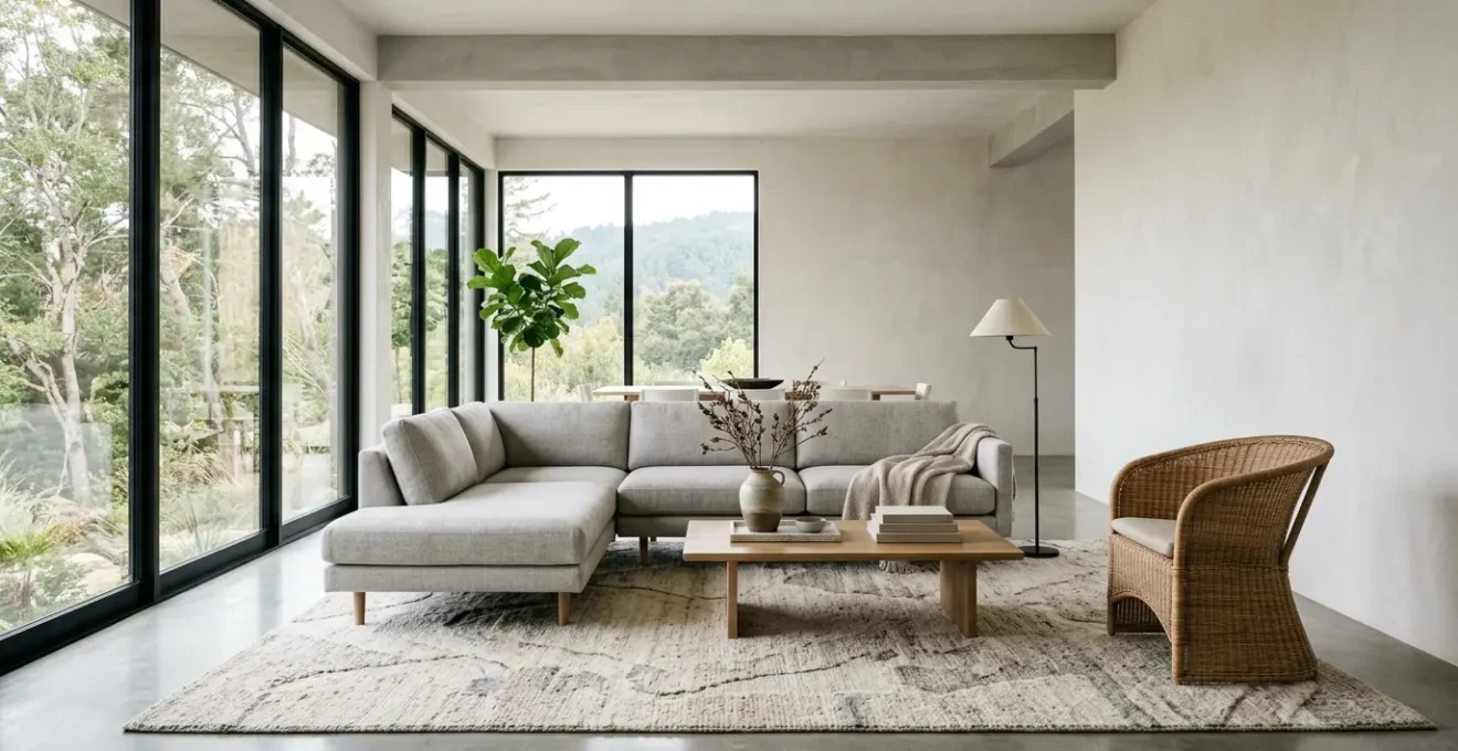
The awkward, “floating” look of a room without a rug stems from a lack of visual gravity. Without a defined foundation, furniture pieces appear as isolated islands, untethered to each other or the space they inhabit. The human eye seeks order and connection; a rug provides a clear visual anchor that gathers these disparate elements into a unified, purposeful grouping. It creates a focal point, an “island” of cohesion that signals this is a designated area for conversation, relaxation, or dining. This grouping effect makes a room feel more organized, intentional, and psychologically comfortable.
A rug doesn’t just sit there; it actively defines the negative space around it. The border of the rug establishes a clear perimeter for the furniture grouping, making the arrangement feel deliberate rather than random. It’s this delineation that transforms a collection of chairs and tables into a “living room.” Furthermore, the texture and color of a rug provide a textural counterpoint to the hard surfaces of floors and furniture legs, adding a layer of softness and warmth that grounds the entire setup. According to design experts, even the spacing is key, with an ideal distance of 16-18 inches between the coffee table and sofa to create a functional and visually pleasing connection.
Your Action Plan: Ground Your Furniture Grouping
- Identify the Anchor Point: Center your planned rug location on a major architectural element like a fireplace or a large window to create a natural focal point.
- Test the Connection: Use painter’s tape to outline the rug’s perimeter. Place your furniture so at least the front legs of major pieces (sofa, armchairs) are on the tape.
- Assess the Island: Step back and evaluate. Does the taped area create a clear, defined “island” for the furniture? Does it feel balanced and intentional?
- Check for Balance: Ensure the furniture is distributed evenly on the taped area. Avoid having all pieces crowded to one side. The goal is a sense of equilibrium.
- Live With It: Leave the painter’s tape on the floor for 24-48 hours. Walk through the space to test traffic flow and get a feel for the new proportions before committing to a purchase.
How to apply the “legs on/legs off” rule for perfect rug sizing?
The “legs on/legs off” rule is the most common piece of rug advice, but it’s often treated as a rigid command rather than a flexible guideline. Understanding the *why* behind each option is key to making the right choice for your specific room. The goal is to achieve a proportional anchor—a rug that feels perfectly scaled to both the furniture and the room itself. There are three primary approaches, each suited to different spaces and effects.
All Legs Off: Best for smaller rooms or when using a smaller 5’x8′ rug. The furniture fully surrounds the rug, which acts as a central accent, like a “tray” for the coffee table. This method defines the space without the rug needing to be massive, but it can sometimes lead to the “postage stamp” effect if not balanced carefully. Front Legs On: This is the most popular and versatile method, typically using an 8’x10′ rug in a standard living room. Placing only the front legs of the sofa and chairs on the rug visually connects all the pieces. It creates a generous, unified look that anchors the seating area while still allowing some flooring to show. All Legs On: This is the most luxurious and unifying option, ideal for large rooms or open-concept spaces. Using a 9’x12′ or larger rug, all furniture in the grouping rests completely on it. This creates a very clear, “room within a room” effect, establishing a strong and cohesive zone.
The best way to visualize these options is to see them in context. The diagram below illustrates how each placement strategy dramatically alters the feel and scale of a living room arrangement.
As you can see, the choice isn’t arbitrary. It’s a strategic decision based on your room’s dimensions and the degree of visual connection you want to create. The larger the room, the more of the furniture should be on the rug to maintain a sense of proportion and avoid the furniture feeling lost.
Wool vs. synthetic: which rug material lasts longer in high-traffic hallways?
When selecting a rug for a high-traffic area like a hallway, durability becomes the primary concern. The choice between wool and synthetic materials (like nylon, polypropylene, or polyester) is not just about feel, but about how the rug will perform and age under constant foot traffic. For sheer longevity and graceful aging, wool is the undisputed champion. Wool fibers have a natural crimp and elasticity that allows them to bounce back from crushing, resisting the unsightly matting that plagues synthetic rugs over time. It’s this inherent resilience that explains why vintage wool rugs can last for decades, often looking better with age.
However, synthetic rugs have their own advantages, primarily in stain resistance and cost. Materials like polypropylene are “solution-dyed,” meaning the color is part of the fiber itself, making them highly resistant to fading and spills. This can be a major benefit in a busy hallway where mud or coffee might be a concern. But this durability comes at a cost to its physical structure; synthetic fibers crush more easily and do not have wool’s ability to recover, leading to visible traffic patterns over time.
Ultimately, the choice depends on your priorities. Wool is a long-term investment in a material that ages gracefully. Synthetics offer a practical, often more affordable solution for dealing with stains. To make the best choice for your hallway, consider these key criteria:
- Pile Height: Choose a low-pile construction (under 0.5 inches) for any high-traffic area. It’s easier to clean and less of a tripping hazard.
- Weave Density: A tightly woven rug will resist matting and crushing far better than a loose one, regardless of material.
- Color and Pattern: Darker colors or intricate patterns are your allies in a hallway, as they are excellent at hiding dirt and wear.
- Material Choice: For natural resilience and longevity, choose wool. For superior stain resistance and budget-friendliness, opt for solution-dyed nylon or polypropylene.
The “postage stamp” error: why buying a rug too small ruins the room’s scale
One of the most common and disruptive mistakes in interior design is the “postage stamp” rug: a rug so small it appears to float aimlessly in the middle of the room, with furniture huddled awkwardly around it. This error fundamentally misunderstands the purpose of a rug. Its job is not to be a tiny island of color but to be a proportional anchor for the furnishings. A rug that is too small makes the furniture around it look oversized and disjointed, breaking the room into smaller, disconnected zones instead of unifying it.
The Dwell Home Furnishings Design Team explains this perfectly, stating that the goal is to prevent the rug from looking like an afterthought. As they note in their guide on area rug tips from interior designers:
The reason is that you don’t want the rug to float like an island in the middle of the room. The idea when choosing a rug size is to anchor the area rug to the furnishings. The rug will direct the eye to the seating area, where the pieces will all fit together visually and spatially.
– Dwell Home Furnishings Design Team, Area Rug Tips from Interior Designers
To avoid this, you must also consider the negative space—the bare floor around the rug. A properly sized rug should leave a consistent border of flooring exposed, typically between 18 to 24 inches from the walls. This border acts as a “frame,” making the room feel larger and more intentional. If a rug comes too close to the walls, it can paradoxically make the room seem smaller and cramped. If you fall in love with a rug that is too small, a great designer trick is to layer it on top of a larger, neutral rug (like jute or sisal) that is the correct size for the room.
How to choose the right rug pad to protect floors and prevent slipping?
A rug pad is the unsung hero of any room with an area rug. It’s a non-negotiable component that serves three critical functions: it prevents the rug from slipping, which is essential for both safety and maintaining the room’s visual anchor; it protects your flooring from scratches and color transfer; and it adds a layer of cushioning that enhances comfort and extends the life of the rug by absorbing impact. However, not all rug pads are created equal, and choosing the wrong one can be worse than using no pad at all. The right material depends entirely on the type of floor you have.
Using a pad made of the wrong material can lead to discoloration or chemical reactions with your floor’s finish. For instance, PVC pads can permanently damage hardwood and vinyl floors, while a pure rubber pad may not provide enough grip on top of wall-to-wall carpeting. The key is to match the pad material to the floor surface for optimal grip and protection. A felt pad provides cushioning, while a rubber pad provides grip. Often, the best pads are a combination of both.
This table breaks down the best rug pad choices based on your flooring type, ensuring you get the right combination of grip, cushion, and protection. As highlighted in a comprehensive guide on rug pads, material compatibility is key to floor safety.
| Floor Type | Recommended Pad Material | Avoid | Key Benefit |
|---|---|---|---|
| Hardwood | Natural Rubber | PVC with plasticizers | No chemical reactions |
| Carpet | Felt/Rubber combo | Pure rubber only | Grips both surfaces |
| Vinyl/Laminate | 100% Felt | Rubber-backed pads | Prevents discoloration |
| Tile/Stone | Natural Rubber + Felt | Thin pads only | Cushioning + grip |
When purchasing, remember to size the pad correctly. It should be 1-2 inches smaller than your rug on all sides, allowing the rug’s edges to taper down to the floor naturally. This prevents a visible bump and ensures the pad remains hidden.
How to use area rugs to create invisible “walls” between living and dining?
In an open-concept floor plan, the lack of walls can make the space feel vast but undefined, with furniture groups looking like “isolated islands.” Area rugs are the most effective tool for combating this, acting as perceived boundaries that create distinct “rooms” without building a single wall. By placing a separate, complementary rug under your living room grouping and another under your dining set, you clearly delineate the function of each area. This simple act provides the visual cues our brains need to register separate zones, bringing order and intention to a large, open space.
The key to success is twofold: defining the space and coordinating the styles. For the dining area, the rule is absolute: the rug must be large enough so that all chairs, even when pulled out, remain completely on the rug. This prevents chair legs from catching on the edge. A common guideline suggests you need 36 inches of minimum clearance from the edge of the dining table to the edge of the rug on all sides. This ensures smooth movement and a generous visual foundation.
For the living area, you can apply the standard “front legs on” or “all legs on” rule to anchor the seating. The crucial part is ensuring the two rugs relate to each other without matching perfectly. They should share a complementary color palette, a similar style (e.g., both are geometric, or both are vintage-inspired), or a consistent level of formality. This creates a cohesive flow, so the eye moves smoothly from one “room” to the next, appreciating both their distinct functions and their shared design language.
Cool greys vs. warm beiges: which muted tone pushes walls back effectively?
The color of your area rug does more than just add to the decor; it actively manipulates the perception of space. Muted tones are particularly effective at this, but the choice between a cool grey and a warm beige is a strategic one that depends on the room’s natural light. The principle is simple: cool colors recede, while warm colors advance. Therefore, a cool-toned grey rug will generally do a better job of “pushing walls back” and making a room feel more expansive than a warm beige, which tends to create a cozier, more enclosed feeling.
However, this rule must be applied in the context of your room’s lighting. The direction your windows face dramatically affects the quality of light, which in turn interacts with the rug’s undertones. To choose the most effective color for spatial expansion, follow these guidelines:
- North-facing rooms: These rooms receive cool, indirect light throughout the day. A cool grey rug can make the space feel chilly and stark. Here, a warm beige or greige is a better choice to counteract the cool light and add warmth without visually shrinking the space.
- South or West-facing rooms: These rooms get intense, warm light, especially in the afternoon. A warm beige rug can appear overly yellow or orange. In this case, a cool grey rug is perfect for balancing the warm light and creating a serene, spacious feel.
- Low-contrast patterns: To maximize the feeling of space, choose a rug with a low-contrast pattern or a solid color. High-contrast patterns can visually fragment the floor, making the room feel busier and smaller.
- Material Sheen: Consider the material’s finish. A rug with a slight sheen (like one made of viscose or silk) will reflect more light than a matte material (like jute or a flat-weave wool), further enhancing the sense of spaciousness.
While grey and beige are timeless, current trends also show a move towards earthy, nature-inspired tones. Dark, mossy greens can also create a sense of depth and calm, acting as a neutral foundation that brings the outdoors in.
Key Takeaways
- A rug’s primary job is to provide a proportional anchor for furniture, not just cover the floor.
- The “postage stamp” error is the most common mistake; always size up if in doubt and leave 18-24 inches of bare floor around the edges.
- A quality rug pad is non-negotiable; it protects your rug, your floor, and secures the room’s visual anchor.
How to pair a visually light table with a rug so it doesn’t get lost?
Visually light tables, such as those made of glass, acrylic, or thin wire frames, pose a unique design challenge: they can easily get “lost” when placed on a rug, especially one that is too pale or patternless. The solution lies in creating a strong textural and visual counterpoint. The rug must provide the character, weight, and definition that the table itself lacks. Instead of a subtle foundation, the rug needs to become a bold statement piece that both grounds the table and elevates it into a focal point.
The most effective strategy is to choose a rug with significant personality. This can be achieved through bold pattern, rich texture, or deep color. As noted in a report on contemporary rug trends, there is a strong preference for bold, geometric patterns, with Southwestern and Native American-inspired designs being particularly popular. Their vibrant colors and striking lines create a dynamic base that a simple glass table can sit upon without disappearing. The key is contrast: the simplicity of the table allows the complexity of the rug to shine.
The style of the table should guide your choice of rug pattern and texture. A sleek, minimalist glass table can handle a large-scale, high-contrast geometric pattern, while a table with a more detailed metal base might call for a subtler micro-pattern to avoid visual clutter. This chart provides a general guide for creating a successful pairing.
| Table Style | Recommended Pattern | Rug Texture | Color Strategy |
|---|---|---|---|
| Simple glass waterfall | Large-scale geometric | High pile/shag | Bold contrast colors |
| Acrylic with metal base | Subtle micro-pattern | Low-medium pile | Monochromatic scheme |
| Lucite pedestal | Abstract organic | Textured weave | Rich jewel tones |
| Wire frame glass | Solid with texture | Carved or embossed | Deep saturated hues |
In every case, the rug is doing the heavy lifting, providing the visual weight needed to anchor the ethereal quality of the table and create a balanced, sophisticated look.
Now that you understand the principles of visual gravity, proportion, and textural contrast, the next step is to assess your own space. Begin the process not with a shopping trip, but with a roll of painter’s tape. Outlining your ideal rug on the floor is the most powerful way to see and feel how a simple rectangle can fundamentally redefine your room.